Critique Club Review:
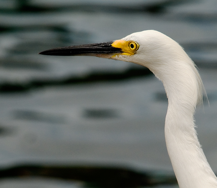
Color, Saturation, and Hue: Colors are accurate, nothing is over saturated, hues are good for the challenge. The whites are nice and white.
Brightness and contrast: Brightness is very good. Contrast might be just a little bit high. Looking at the bird's bill, the detail gets lost on the lower half. I would have liked to seen some detail there. There is great detail in the white of the bird's feathers though.
Focus and depth of field: Focus is nice and sharp, depth of field is shallow to help isolate the subject.
Unfortunately while the shallow depth of field should have helped you, it also hindered you in this image. The water is renedered very softly, but then the waves formed large dark patterns to distract the eye in a couple of places. Perhaps sharper here would have worked better. Or as already suggested, an alternate background. Perhaps if you had been able to take the image from a lower angle to include the horizon and some sky.
I like the compostion, and I think the picture would stand the test of time, and look good hanging on the wall even a couple of years later.
|