Critique Club Review:
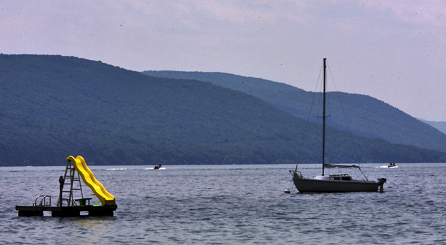
Color, Saturation, and Hue: Nothing is over saturated, the yellow pops well.
Brightness and contrast: The yellow is nice and bright, but the rest of the scene comes across as a bit cool, as if a little under exposed.
Focus and depth of field: Focus is sharp. Depth of field appropriate.
I really like the yellow slide. It pops quite nicely. However, the larger scale of the sailboat competes heavily for the attention of the eye. The passing boats compete to a smaller extent. I think I would have liked a little tighter crop here.
The horizon at lakes edge appears to be off level a bit. A little rotation and crop will fix this. There appears to be a little sensor dust, or are they birds, in the sky and above the foreground hill (and in front of the background hill) to the left of the sailboat.
The colors in the hills look a little over processed. Possibly over sharpened.
There not much that could be done with the sky, the weather is what it is. But either a more dramatic day, or possibly change the angle so the mountains take more space. Sunrise or sunset could work here too.
I like this picture. I gave you a 6 in the voting. I think this subject has a lot of potential. I'd like to see it done again, with more isolation of the slide. The idea of this nice bright yellow slide, the embodiment of fun, is sitting alone and unused is a good choice.
|