|
|
|
Showing 1271 - 1280 of ~1613 |
| Image |
Comment |
| 09/04/2006 09:08:10 PM | Mesmerized by What Lies Aheadby LoreneComment: Critique Club Review:
This picture should have scored higher. Good lighting, great color saturation. Less depth of field, or a little different location, would have helped prevent the hand rail and steps from distracting from the subject. When I cover the steps and hand rail, his face almost jumps out of the picture. When not covered they compete for attention. Otherwise a very good picture. I love that far away look in his eyes. Definetly hard to capture with this age group. Good job! |  Photographer found comment helpful. Photographer found comment helpful. |
| 09/04/2006 09:02:09 PM | Ivy and Palmby BlindBatComment: Critique Club Review:
Your picture is loaded with detail, which tends to defeat the goal of a soft focus photo. What happens is that the eye still struggles to make out the detail, and the viewer comes away frusrtrated. In this case the detail is not lost, but neither is a soft focus effect gained.
The bark of the palm tree tries to steal the eye away from the ivy. The rings pull the eye up, up, up. Your lighting and color saturation are good. This just wasn't the ideal subject for a soft focus photo. |
| 09/04/2006 03:20:23 PM | Golden Oldieby jonnieComment: Critique Club Review:
Overall a very good photograph. Lighting, contrast, saturation are all done well. Detail is only lost at the very tip of a couple of the flower's leaves. Still only minor. In another challenge this picture would have scored much better. As it is, the challenge was "soft focus", you used depth of field to isolate your subject quite well. The idea of soft focus, is that the subject of the picture has a soft focus. Your technique is very good, it just didn't meet the challenge. |
| 09/04/2006 02:11:22 PM | Rock & Rope Hall of Fameby dmakiComment: Critique Club Review:
You did a very good job of lighting the rope. Great contrast,depth of field, and detail. You can almost feel every fibre. You did use depth of field to isolate the rope. However, the background is still busy and distracting. The spires of the high rise buildings, are almost like arrows pointing your eyes to the top of the page. I really like the rope in the picture, the more I look at it, the more it almost seems 3-D, nearly jumping off the page. It's the background that did you in. It needs to compliment the rope, not compete. | | Photographer found comment helpful. |
| 09/04/2006 02:05:02 PM | Bang!!by escondrillasComment: Critique Club Review:
I'm no prude, and nudity does not offend me. I'm just not sure what the nudity is saying here. To really work, the entire piece has to stay on message. I like the juxtaposition of the sharply defined hand, with the soft focus of the rest of the picture. The soft focus looks almost as if it were sharpened after it was taken, as it does appear to be a bit grainy. I like your idea of going against tradition, usually soft focus images are dreamy, romantic, fairy tale, type efforts. Yours is the opposite, which is a good start. Each element just needs a reason, and to reinforce the message of the others. Good lighting, and contrast. The colors are almost like a sepia photo, which works well here. |
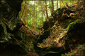
| 09/04/2006 01:56:23 PM | Hocking Hillsby timfythetooComment: Critique Club Review:
This is a very good photo and hard to critique. If only you would make mistakes. ;-)
This would be great large picture, wonderful mural. If anything, it might be a bit busy for the small format allowed for the challenges. Great saturation, focus, depth of field, contrast, and exposure. About the only other possible improvement that comes to mind, and I'm a bit iffy about this, would be to darken the rocks on the left side of the picture to create more of a frame, than to compete. But... then again this is a no subject challenge, and if you frame the subject, there you go. You wind up with a subject in a no subject challenge.
Personally, I'd like to have a 16x20 of this hanging on my wall. | | Photographer found comment helpful. |
| 09/02/2006 03:25:28 PM | ! When The Best Magic Begins !by Dr.ConfuserComment: Critique Club Review:
Excellent sunset picture. Great saturation, almost looks like Kodachrome. There is nothing here really to improve upon. I think you already hit upon the only problem. You tried to squeeze it into a challenge on Magic & Mystery. You didn't do so bad 30 out of 127. (Top third of the class.) But you would have done much better with in in a challenge where it fit closer to the theme. Not that there is no magic in a sunset, but the voters are a picky lot. | | Photographer found comment helpful. |
| 09/02/2006 03:19:12 PM | The Lost Maiden Of The Campgroundsby TommyMoe21Comment: Critique Club Review:
It took a bit to see this one. The exposure of the campers is good. The lost maiden however, is competing with the rest of the picture, or it could be said the rest is competing with her. The movment here does a little harm as I initially took the arms of the maiden as flame or smoke. While trying to figure out what it is, the eye keeps getting pulled away by the light at the door to the RV.
Had this been done round a campfire, or other area that more complimented the maiden, it might have been more effective. |
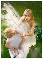
| 09/02/2006 02:33:03 PM | The magic featherby TUBORGComment: Critique Club Review:
You made the top 10, hard to critique that. Color is well saturated, contrast is great. Exposure is really good. The bits of cloud at the bottom of the picture do compete a bit for attention. The only other technical issue, is that center of interest is about dead center in the frame. A rule of thirds purist would not grade the picture as highly for that reason alone. (I'm not one of them.) But I do think a bit off center would have helped. | | Photographer found comment helpful. |
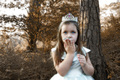
| 09/02/2006 02:26:45 PM | This frog BETTER turn into a prince!by walrus451Comment: Critique Club Review:
I like the soft focus, and model's eyes really grab the attention. Kids are tough to work with, and here is would have helped to have her looking at the object of her "affection". One downside of the manipulation is that is almost leaves a wintery feel, which leaves the view wondering, if the frogs are active in the winter, and are they ever that color?
Good exposure and contrast control. Detail is everywhere. A little less depth of field might have helped remove the few background distractions. | | Photographer found comment helpful. |
|
Showing 1271 - 1280 of ~1613 |
Home -
Challenges -
Community -
League -
Photos -
Cameras -
Lenses -
Learn -
Help -
Terms of Use -
Privacy -
Top ^
DPChallenge, and website content and design, Copyright © 2001-2026 Challenging Technologies, LLC.
All digital photo copyrights belong to the photographers and may not be used without permission.
Current Server Time: 07/17/2026 12:40:22 PM EDT.
|