|
|
|
Showing 1221 - 1230 of ~1613 |
| Image |
Comment |
| 09/12/2006 10:07:42 PM | pinochio! have you been lying again?by yianisnComment: Critique Club Review:
Meets challenge well. Good focus, though had you used a shallow depth of field to isolate the subject from the background, it might have helped a bit. The texture in the background is OK. But, if you look to the lower left, the tecture on the wall starts getting emphasized by the lighting angle. The pattern is fine, but once it starts going 3-D it starts to compete with the silhouette.
I like the highlite on the shoulder closest to the camera. This really helps make this image. It provides a shape to the shoulder, that otherwise would have been a blob.
The only other problem I see is the top of the hat disappears into the darkness. The candle-light really works and makes this composition. Any other source would not have worked so well. Perhaps raising the candle a bit, or a slightly different angle to get the tip of the hat out of the darkness. The brightness is about as bright as you dare go. Any brighter and the lightest areas would have burned out. Message edited by author 2006-09-12 22:09:53. |
| 09/12/2006 09:59:44 PM | The Silent Standby JudiComment: Critique Club Review:
Nice sharp focus on the subject. I really like the way the gold of the sun fades into a rose colored sky. A take without the tree present might increase the feeling of solitude. The way the umbrella gives a good strong silhouette, yet the fabric glows in the sun is great.
There is a little halo along the horizon, but what the heck. I think it adds to the mood of the piece, and the picture might not be as strong without it.
If there is anything that I would really change, it would be the border. It could be an optical illusion that the bottom is thicker than the top. I would have prefered a more symetrical border, personally.
I have no idea why anyone voted a 1-2-3 on this piece, even accounting for different tastes. Good job! (notice I did not say sir. ;-) |  Photographer found comment helpful. Photographer found comment helpful. |
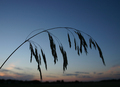
| 09/12/2006 08:15:22 PM | Grassby TwylaComment: Critique Club Review:
Focus, sharper is better, escpecially for silhouettes. The grass runs into the skyline of the town, which distracts a bit. Color saturation and hue are all fine.
You've already heard from the rule of thirds police. The rule can be broken, but it's best to have a reason in mind when you do.
I like the arch of the grass. I think no town, and maybe even no clouds, could have made it pop even more. (I'm thinkin a few minutes later in the evening where a timed exposure could have lightened the sky a bit, and captured a few stars, might have made for an interesting effect.) |
| 09/12/2006 08:05:53 PM | Longing For West Texas...by 777STANComment: Critique Club Review:
You've already heard from others about the need for more contrast to take the silhouette darker. Focus is good. I like the color of the piece, and the texture that helps isolate the background from the hat.
The bolo tie hanging from off frame, and the window frame/prop for the hat, distract the eye somewhat. Perhaps a different angle, and maybe using just the Stetson for a subject might have helped. (Most people see cowboy hat and think Texas anyway.)
Perosnally, I'd like to see a similar picture in a different challenge where it doesn't have to be a silhouette. The warmth of the colors, and the earth tones on the ledge could work to make a really wonderful picture. It holds the interest quite well as it is. | | Photographer found comment helpful. |
| 09/12/2006 07:55:46 PM | Bon Voyageby TUBORGComment: Critique Club Review:
Congratulations on making the top 10!
Wow! Great photo! Focus, and depth of field are spot on. The exposure, color, saturation and hue, all work very well together. I was wondering about teh need for the flash, but see taht without it, the neck of the guitar would have been lost into the arm. Good move.... The highlites along the right leg, and left hand distract just a tiny bit. Not badly, just a little. I might have liked the picture just a bit better had the hat been black also.
The clouds are amazing. Makes you wonder if he is glad not to be on the boat. Great texture to the whole piece. I particularly liked the angle of the shot. Too many cameras never leave the eye level of the photographer. The angle really helped make this picture. Definetly a picture I could hang on my wall, and never tire of. | | Photographer found comment helpful. |
| 09/12/2006 04:38:43 PM | Spanish Mossby tjh952Comment: Critique Club Review:
Focus appears good, depth of field appears a bit shallow. Color, saturation, and hue are fine, except for the area on the middle left where the lighter part of the clouds are burned out and featureless.
The vegetation along the right would have worked better if it were more into the frame, to frame the photo, or cropped out completly. As it stands, it creates a distraction more than a point of interest.
The major strand of moss is dead center, and essentially cuts the picture in two. If I could reach it and it wassn't illegal, I would have trimmed it off by about half, so it would be a little longer than the strand to its right. Rule of thirds purists would have voted you down for this centering. (I'm not one.) But this is a picture where centering is possibly not the best position. Since I can't see what was out side the frame, I don't know what constraints you were dealing with.
I do like the colors and texture of the clouds. You can almost feel the weather. |
| 09/12/2006 04:26:15 PM | Taking flightby SunshyneComment: Critique Club Review:
Definetly meets the challenge.
Focus and depth of field are done well. I think I have to agree with some of the other comments, that a different crop would have helped some. There is so much dark beach, and dark sky, that the impact of of the great capture of the birds in flight, is muted. With the sun so hight above the horizon, you wound up having to make everything else dark to keep the sun and it's reflection in check. With this crop, the result is a picture that appears somewhat dim. Had you cropped out the featurless dark areas of the sky, and and perhaps almost all or all of the beach, the birds would have been more of a stand out feature. Another tactic could have been to wait until sunset or just after when the sky is still well lit. Unfortuately, birds don't fly on cue.
Overall I enjoyed this pciture, and congratualtions on capturing a really interesting flight image. | | Photographer found comment helpful. |
| 09/12/2006 02:38:26 AM | La Paz Parkby tucancrComment: Critique Club Review:
Focus and depth of field are good, though the palm to the left on the far side of the lake looks a bit soft. Part of your image is silhouetted, but at the same time the tree on the left you've used to frame the picture, looks almost as if it was lit by a fill flash.
I like the clouds in the sky, and the colors on the water are good. But at the same time, the sunny areas are burned out and featureless.
I would really like this picture best, if the small silhouetted tree in the center were gone, because it competes with the shore detail on the far side of the lake, and the framing tree on the left were fully silhouetted. Unfortunately we cannot help where trees choose to grow, and cutting down trees in a park can cause much trouble for the photographer.
Speaking of frames, it looks as if you added a frame, and then cropped the picture. There is a line down the left side of the picture, and a thicker one across the bottom. I'm not sure how this came about, but checking for things like this will also help boost your scores.
I like your choice of subject, and overall it is a pretty picture. I hope to see more of your work in the future.
| | Photographer found comment helpful. |
| 09/12/2006 02:27:11 AM | The Last Goodbye by cutlassdude70Comment: Critique Club Review:
Two ribbons in two weeks, and I'm supposed to critique this? Talk about intimidating.....
Technically this picture is about flawless. Focus is razor sharp, contrast is great, color, saturation and hue work well to lend the right mood to the piece. Artistically, this picture has real punch and you have taken a sihouette and told quite a story.
Is there anything that could be improved here? If there was anything at all, and this would be the absolutely smallest of things, perhaps the border. And even then I'm not sure what I would want to see different. I've noticed on several of the silhoutte shots, the border seems to run into the silhouette. This border is thinner, so the effect is just about un-noticeable.
So, what would it take to make this picture #1? Perhaps better relations between the USA and the rest of the world. People from all different countries vote in these challenges, so anything that is political, or patriotic, runs the risk of getting some lower votes from people who aren't quite so impressed with the good old US of A.
Congratulations on taking a risky subject, making a statement, and turning it into an amazing photo and a ribbon winner. No small feat indeed. | | Photographer found comment helpful. |
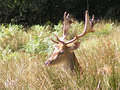
| 09/11/2006 09:44:47 PM | Bambi as an adultby animalComment: Critique Club Review:
Meets the challenge. (I do believe there was a Bambi II, though not sure what age he was supposed to be then. Close enough eh...)
Focus is good. Depth of field could have been better, blurring the background through a shallow depth of field could have helped with background distractions.
The biggest problem I see is that the image comes across as over exposed. The sunlit surfaces of the antlers, and the area between the eyes look burned out and devoid of any detail. The colors of the grass come across as washed out and pale. A bit less exposure, about one or two f-stops would have given you more color and vibrance to your picture.
I'm not a rule of thirds purist, but I have to agree that a little less centered subject would have improved this picture. (Sometimes the deer just don't sit where you want them.) |
|
Showing 1221 - 1230 of ~1613 |
Home -
Challenges -
Community -
League -
Photos -
Cameras -
Lenses -
Learn -
Help -
Terms of Use -
Privacy -
Top ^
DPChallenge, and website content and design, Copyright © 2001-2026 Challenging Technologies, LLC.
All digital photo copyrights belong to the photographers and may not be used without permission.
Current Server Time: 07/18/2026 03:43:32 AM EDT.
|