|
|
|
Showing 1201 - 1210 of ~1613 |
| Image |
Comment |
| 09/15/2006 12:16:54 AM | A new lifeby bryantbusComment: Critique Club Review:
Focus is very good. Depth of field could have been used to soften the background. As it is the swag of cloth trys to lead the eye out of the picture, and the partial architectural element does not really seem to have a purpose. Either or both, elements could be out of the picture with no harm done. The whites of his shirt are blown out in the highlights, but it actually comes across as luminous, so it does work for me.
The skin tones work well for pastels, so it meets the challenge.
If anything, the sharp darkness of the hair against the pastel skin, is the point I would notice most. I would really like to see this picture done soft focus, for a dreamy - fantasy type of presentation.
Very well done, and I'm sure this couple will treasure this picture till the end of time. |  Photographer found comment helpful. Photographer found comment helpful. |
| 09/14/2006 08:27:37 PM | Swallowtail Gardenby _eugComment: Critique Club Review:
Focus is very good, depth of field suffers where you have already noted at the tails. Good separation between the subject and the background.
Subject is a little bit centered, but not a critical problem. i like the overall composition.
Color saturation and hue are done very well. Brightness is good, but a little brighter wouldn't hurt. Contrast is good.
There does appear to be a halo along the butterfly's right antenna. Looks like overprocessing, but could be a jpeg artifact.
Overall a nice picture with good colors. Could see it hanging on my wall. | | Photographer found comment helpful. |
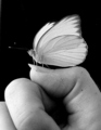
| 09/14/2006 06:46:48 PM | Harley Davidson Dyna Glideby fauxtographyComment: Critique Club Review:
Contrary to what people say size does matter, especially in photographs. In any challenge, you should take advantage of the size allowances and the kilobytes allowed to get the most detailed entry possible.
Smaller photos can hide softness of focus, and other ills, and all to often the voters suspect that is what has been done.
Overall I like the composition, lighting, exposure, contrast, brightness. B&W was an excellent choice for this piece. I don't believe color would have worked nearly was well. I really can't judge shapness at this size. There does not apprear to be any artifacts from over processing.
I like this picture a lot, and had it been full size you would have scored much higher. | | Photographer found comment helpful. |
| 09/14/2006 06:30:15 PM | Tiger Swallowtailby TlemetryComment: Critique Club Review:
Focus and depth of field: Focus is good, depth of field went a bit shallow, resulting in severe softness at the upper tip of the butterly's wing. You did a good job of isolating distracting background, but at the cost of the full sharpnes of the subject. A possible remedy is to either wait until the wings are in a flatter position to minimize the depth of field needed, or to take the picture from a different angle so that less depth of field is required.
A different angle would have hidden the bee, but I do not see the bee as a central player in this story. As it is the bee is partially hidden already.
Color saturation and hue are good. The yellows in the butterfly look a tiny but pale, but it could be that it is just the coloring of this insect. Brightness and contrast are done very well.
As this is an advanced editing challenge, I might have taken the opportunity to darken the light highlites in the background just a bit, to reduce distraction. | | Photographer found comment helpful. |
| 09/14/2006 05:32:39 PM | Black & Whiteby kanoComment: Critique Club Review:
Focus and depth of field are done well.
Lighting, color, contrast, saturation and hue are also done very well. The whites look bright without losing detail, and the blacks are black but not featureless.
The crop is a bit tight on the right, he has no arm. The umbrella is at a bit of an odd angle and seems to distract a little.
Personally, I would like to see their faces. This pose has more of a snapshot feel, than a crafted piece. Upon continued reflection, I think getting rid of the umbrella completely would further focus attention on the difference in their hair and clothing. |
| 09/14/2006 05:26:17 PM | Textures in Black and Whiteby Blue MoonComment: Critique Club Review:
I like the sharp defintion against the background. I have no idea what color this creature is, but it sure makes me want color in this shot. There definetly is some sort of pattern or grid across the image. Could be an artifact of a filter used in processing. Looks almost like a screen. I find the sand a little bit distracting, which would be more minimized in a color view. Littlegett's suggestion of only the butterfly in color is a great idea.
Focus, depth of field, lighting, brightness, and contrast are all very well done. | | Photographer found comment helpful. |
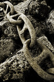
| 09/14/2006 04:48:39 PM | Linkedby marvinComment: Critique Club Review:
Oh, very nice! Very bold and powerful.
Focus, depth of field, exposure, lighting, brightness and contrast are all excellent!
You've taken a piece of chain, lying on the ground, and made art.
I particularly like the texture of the piece and the way the chain takes the eye on a journey through the picture. You can alomst feel the cold hardness of the chain, and the roughness of the rock, just sitting here.
I could easily see this hanging in a gallery.
So why didn't you do better in the voting? Borders are a gamble here, but this on might benefit from one. Other than that, I honestly have no idea. Your picture must have been near the back of the list, as the highest ranked photos had more views and total votes. I think that some get fatigued as they go through and not as selective when they vote later in the session. | | Photographer found comment helpful. |
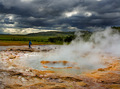
| 09/14/2006 04:36:56 PM | Scorched earthby jsonComment: Critique Club Review:
Focus and depth of view are very good.
Color, saturation, hue, and lighting overall ae done well.
The clouds may be just a tiny bit overdone. They are to the point where they are beginning to compete with the subject.
The person in the background adds scale to the piece which helps, but with the dark clothing and background the placement is distracting. The posing of the person makes the photo look a bit more like a snapshot than a thought out piece. The mid-stride position here is not the most flattering. Perhaps putting the person on the dirt or grass on the far side of the water would help. In this way, the person would not intterupt the flow, yet still give a sense of scale.
As it is, this is a very good picture, and a little scary for the safety of the person so close to the action.
Nice job!
| | Photographer found comment helpful. |
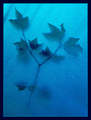
| 09/14/2006 03:45:10 PM | Spirit of a treeby timmiComment: Critique Club Review:
Excellent photograph! Even more impressive once you find out how it was done.
Color, saturation, hue, lighting, focus, depth of field are all done quite well. The texture seems to be distracting for some, and a plus for others. I find it a tiny bit distracting, depending where in the frame I'm looking, and at the same time think the picture would not be as good without it. (Lots of help that is, I'm sure.) I guess I would like the texture better if it were just a little less pronounced. But if it were gone, then it would just look like a blurry picture. After sitting here squinting at the picture, barely visible texture and keeping the rippled shadows in the fabric, would be really appealing to me.
As is, it is a very effective photo and communicates well the message of the photographer. | | Photographer found comment helpful. |
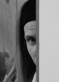
| 09/14/2006 03:35:57 PM | Don't!by wingyisleedsComment: Critique Club Review:
Focus and depth of field: Focus appears soft, as there doesn't appear to be any point in the frame that appears sharply in focus. ISO was boosted to 400 to get a reasonable shutter speed, but still came out on the dark side, and grainy. The edge of the door almost overwhelms the subject due to the size and lack of detail. Cropping the door thinner would have helped some. As is, only the photographers write-up really idicates this is a door, as opposed to a wall or other object.
Were this shot redone with a lighter exposure, and depth of field that isolated the background, I think it would do much better. I really like the composition, and the face of the subject really communicates with the viewer. | | Photographer found comment helpful. |
|
Showing 1201 - 1210 of ~1613 |
Home -
Challenges -
Community -
League -
Photos -
Cameras -
Lenses -
Learn -
Help -
Terms of Use -
Privacy -
Top ^
DPChallenge, and website content and design, Copyright © 2001-2026 Challenging Technologies, LLC.
All digital photo copyrights belong to the photographers and may not be used without permission.
Current Server Time: 07/18/2026 03:41:27 AM EDT.
|