| Author | Thread |
|
|
09/14/2006 05:37:25 PM |
Thx for all your comments
Live and learn ;-)
Message edited by author 2006-09-18 10:11:58. |
|
|
|
09/14/2006 03:35:57 PM |
Critique Club Review:
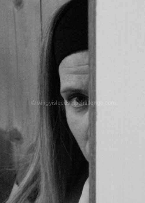
Focus and depth of field: Focus appears soft, as there doesn't appear to be any point in the frame that appears sharply in focus. ISO was boosted to 400 to get a reasonable shutter speed, but still came out on the dark side, and grainy. The edge of the door almost overwhelms the subject due to the size and lack of detail. Cropping the door thinner would have helped some. As is, only the photographers write-up really idicates this is a door, as opposed to a wall or other object.
Were this shot redone with a lighter exposure, and depth of field that isolated the background, I think it would do much better. I really like the composition, and the face of the subject really communicates with the viewer. |
|
 Photographer found comment helpful. Photographer found comment helpful. |
Comments Made During the Challenge  |
|
|
09/07/2006 02:02:57 PM |
|
Needs more contrast and better focus. |
|
| Photographer found comment helpful. |
|
|
09/04/2006 03:09:16 PM |
|
| Photographer found comment helpful. |
|
|
09/03/2006 08:35:42 PM |
|
a bit too grainy, dark, and somewhat out of focus for me... |
|
| Photographer found comment helpful. |
|
|
09/03/2006 10:26:59 AM |
|
very noisy and grainy. the half face composition can be interesting but the right side has no interest would have been better to jsut crop it at the line on the face IMO. |
|
| Photographer found comment helpful. |
|
|
09/02/2006 04:04:44 PM |
|
kinda odd and noisy. i dont really know what to make of it. 5 |
|
| Photographer found comment helpful. |
|
|
09/02/2006 09:04:53 AM |
|
Might be better if eye was sharper and not in the center of the frame. |
|
| Photographer found comment helpful. |
|
|
09/02/2006 08:49:05 AM |
|
It looks a little blurry but I like her facial expression |
|
| Photographer found comment helpful. |
|
|
09/02/2006 05:41:31 AM |
|
a good shot, but more variation of tone would help it. if the flat planes on the left and right darkened as they approached the edges, that would draw the eye in more. and there is an issue with focus as well. |
|
| Photographer found comment helpful. |
|
|
09/01/2006 02:33:13 PM |
|
| Photographer found comment helpful. |
Home -
Challenges -
Community -
League -
Photos -
Cameras -
Lenses -
Learn -
Help -
Terms of Use -
Privacy -
Top ^
DPChallenge, and website content and design, Copyright © 2001-2026 Challenging Technologies, LLC.
All digital photo copyrights belong to the photographers and may not be used without permission.
Current Server Time: 06/30/2026 04:41:25 AM EDT.