|
|
|
Showing 1131 - 1140 of ~1613 |
| Image |
Comment |
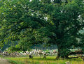
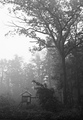
| 09/23/2006 01:40:49 PM | Shade of the old oak treeby justamistereComment: Critique Club Review:
Color, saturation, hue, brightness and contrast are all very good. Focus is nice and sharp. By choosing an early morning light, you have put a lot of nice texture and detail into the picture that would not be there had you taken this photo at noon.
The lump of dirt, or debris at the lower left corner is distracting. As is the square rock in line with the trunk. I'm torn as to whether or not the foreground weeds makes a nice frame, or a bit of distraction.
I think I would have liked a shallower depth of field here. The trees in the background, and the grass in the background are fine. The wall of rocks and wood pieces?, is distracting and takes away from the theme of a peaceful morning.
I do like the chairs for a sense of scale. It tells the view up front how massive this tree is. A bit closer together, like they were waiting for a couple to enjoy them, might be a bit better.
Overall a nice picture that well meets the challenge. |
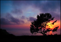
| 09/23/2006 01:31:39 PM | Alone Stood the Tree ~ On the Cliffs of the Seaby Breeee123Comment: Critique Club Review:
Fantastic sunset! With the mist and fog, it almost looks like the sea is on fire.
Color, saturation and hue are excellent. Focus and depth of field are great.
For me, I might have liked it a bit better if the crop had been tighter. A little less sky above the tree, and trim some off the left, possibly even as tight as where the shore starts to rise in elevation at the left third of the frame. In these two area, the color starts to fade and/or go dark. There really isn't much there to hold interest and is not necessary to the story.
However, as your score shows. Either way this is a really nice picture. One I could see hanging on my wall. Congratulations on a well deserved top ten finish. |  Photographer found comment helpful. Photographer found comment helpful. |
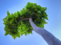
| 09/23/2006 03:19:51 AM | Reach for the Sky(ler)by freakin_hilariousComment: Critique Club Review:
Interesting photo. Great focus and depth of field. Detail is held well throughout the image.
Color, saturation, and hue are very good. Lighting, brightness, and contrast are excellent as well.
I like the detail in the leaves. You can spend a fair amount of time wandering around looking at the detail in each one.
Originally I though the sky was a bit empty. But upon reflection, I think this works best the way it is. All the rich variation of detail and colors in the leaves is the key here. Anything else would be distraction. | | Photographer found comment helpful. |
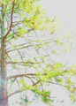
| 09/23/2006 03:13:26 AM | Regal Pineby 777STANComment: Critique Club:
Hard to say what happened here. But it is much too bright. The lower left third of the frame, the glare makes it look as if it were shot through a window into the sun.
The unusual colors, and the way some of the limbs run parallel, it almost appears to be a double exposure. But under close inspection it appears not to be the problem either.
Color, saturation, and hue appear to be way off; if a realistic rendition were intended. But there isn't enough there to tell the viewer an abstract interpretation is required. Brightness is too bright, contrast is a bit low.
The sky has become washed out and a blank canvas, just begging for detail such as clouds or a brilliant blue color.
I'm thinking this picture might work better in black and white, with a bit more contrast it would wind up looking like a Japanese ink drawing. | | Photographer found comment helpful. |
| 09/23/2006 03:00:16 AM | the watchtowerby robaComment: Critique Club Review:
Pretty photo!
The colors of clouds in the sunset are amazing. Focus and depth of field are very good.
I find the benches under the tree, especially the dark one, and the fence railing where it distrupts the shoreline distracting. I would certainly recommend cloning out the dark bench.
As I look at the picture, and the more I look at the picture, it seems to me that the clouds in the sunset and the tree are at odds. Those clouds are on fire, and the tree starts to be a distraction from them.
The pale blankness of the sky above the clouds, and the top of the tree are just not strong enough to hold the stage against those clouds. I find myself wishing for a shorter crop, and the tree more minimized or out of the picture entirely.
Overall quite a nice photo. I could see it hanging on my wall. Congratulations of a top 40 finish. | | Photographer found comment helpful. |
| 09/23/2006 02:50:18 AM | Alone and forgottenby diablo2097Comment: Critique Club Review:
The lighting is so harsh and dramatic, it takes a moment to figure this one out. It is almost as if the eyes have to adjust to the lighting.
The large amount of negative space and sharp contrasts, add to the drama. I have to agree that the title doesn't fit the picture. Forgotten doesn't come to mind. But, then again I try not to vote titles. Can't say the same holds true for all. I do factor meeting the challenge into my vote, but you've certainly done that here.
I agree with you, a fog would have really added to this piece. The tree is alone, and looks a little forlorn physically. But the lighting says center stage, star of the show. So there is a bit of presentation tension.
Overall, a very interesting photo and one I could see hanging in a gallery. Nice job. | | Photographer found comment helpful. |
| 09/23/2006 02:43:23 AM | Nature's Playgroundby JulieGComment: Critique Club Review:
Fascinatng picture.
Your score suffered some because this picture doesn't really meet the challenge. I usually subtract 1 point for this when I vote. Others subtract dreadfully more.
I like that you did this in black and white. All the adjustmens give it sort of an old movie feel. I half expect Tarzan to show up at any minute.
I would like this picture better if the smaller foreground tree were not in the way. The relationship between the large tree and the structure would be more dramatic then.
The sky is a bit bright. It's left as an almost featureless blank canvas. As this is an advanced editing challenge, dodging and burning here would help.
Overall, I like this picture. It has sort of a dreamy/fairytale fascination.
| | Photographer found comment helpful. |
| 09/22/2006 05:41:52 PM | Freedomby Rino63Comment: Critique Club Review:
I'm afraid I have to join the chorus on this one. I don't see Gary Larson in this one. I realize that some people feel that a photo should be judged on merit alone, challege be hanged. However, I do feel that part of the score is the challenge, and that if the challeges were ignored then we would have un-ending free studies. I still would not have voted this image as low as some have. (I figure meeting the challenge or not is worth about 1 point.)
This is an interesting photo, good colors, saturation, and hues. Brightness is fine and contrast is very good. The focus and depth of field is excellent.
The drawback I do see is the sky. Pale and featureless, you've left a blank spot on the canvas. Cropping the sky our would have help a fair amount. Or catching it earlier or later in the day, when there is more color.
Overall a nice picture that should have been voted a bit higher. | | Photographer found comment helpful. |
| 09/22/2006 01:02:10 PM | "Objects in mirror appear closer than they are"by jeroweComment: Critique Club Review:
Great Photo!
Wasn't sure if your title as satire or an error. How can an object be closer than it is? (Different universe than the one I'm used to?) Still thast has little influence on the picture itself, and we know what you meant.
This challenge is tough to call. Because the aim is a tribue to Gary Larson, so many of the photos are highly manipulated.
I like the shallow depth of field here. It is spot on. The model is soft so as not to compete witht the eye. The door fades to softness so as not to distract the viewer from the eye.
There is a little too much negative space for my taste. But not bad. About the only thing I can think of that I would have liked to see, was if you could have done the eye in color.
As is, this is an excellent photo. Personally, given the level of manipulation that was allowed, I think you should have scored much higher. I hindsight I think others may come to agree, this was a very good representation of Larson, with a minumum of processing. I liked the challenge, I like the pictures, I do feel though that the levels of manipulation allowed turned the challenge into a drawing contest for some people.
Based on pure photo qualitied, and not graphic artist renderings, I think you should have been in the hunt for a ribbon.
Congratulations on your top 40 finish.
| | Photographer found comment helpful. |
| 09/21/2006 09:30:40 PM | The Pinnacleby kari1Comment: Critique Club Review:
Very interesting photo.
Color saturation and hue are very good. Brightness and contrast are good overall. A couple of teh highlights on the "fronds" of the "tree" are washed out and very close to burn out. Still acceptable though.
Very nice blue on the sky. Cloud pattern isn't the best, but I'm not sure how to get clouds to do what the photographer wants. ;-)
I would agree with other comments that cropping the bottom to hid the mesh would result in a cleaner, less distracting picture.
Overall I like this picture, and with the suggested crop I would have given it a 7 or 8. Without, about a 6. | | Photographer found comment helpful. |
|
Showing 1131 - 1140 of ~1613 |
Home -
Challenges -
Community -
League -
Photos -
Cameras -
Lenses -
Learn -
Help -
Terms of Use -
Privacy -
Top ^
DPChallenge, and website content and design, Copyright © 2001-2026 Challenging Technologies, LLC.
All digital photo copyrights belong to the photographers and may not be used without permission.
Current Server Time: 07/19/2026 01:07:37 PM EDT.
|