| Photograph Information |
Photographer's Comments |
Challenge: Far Side: Gary Larson Tribute (Advanced Editing IV*)
Camera: Canon EOS-350D Rebel XT
Lens: Sigma 18-50mm f/2.8 EX DC for Canon
Location: Parking lot, Southern Arkansas University
Date: Sep 13, 2006
Aperture: 3.2
ISO: 400
Shutter: 1/6
Galleries: Humorous, Black and White
Date Uploaded: Sep 14, 2006
|
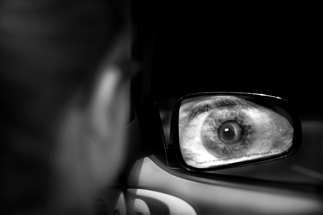
By far my favorite Far Side choice. My second is the "midvale school for the gifted", but i figured it would be overdoon, so i chose this one. hopefully this one won't be.
i took a picture of an eyeball, printed it off. took another sheet of paper, took it to my car, bent the edges to get a "mold", then went inside and traced the bent edges of the paper, then cut it out. then, put the cut out on top of my print of the eyeball, and drew around the edge of the "mold"
then, just taped the print of the eyeball to my car, and got my good friend Raegan to model for me. i blurred her out since i didn't have any light, and it just added a little more focus on the eyeball, which was my main subject anyway
post processing:
ran through neat image to fix a little noise from my iso400, which wasn't much. then, i dodged/burned the eye, and then the inside of my car to give it somewhat of a cartoon look.
other than that, just converted to black and white. i liked the colors, but they were really dull, plus the majority of the far side comics you see is in black and white, so thought i'd stick with this :)
i really hope you all enjoy this as much as i enjoyed doing it. i LOVED this challenge, and thanks for having it. can't wait to see the other great creative submissions.
good luck!
-Jon Ed Rowe |
| Author | Thread |
|
|
09/22/2006 01:02:10 PM |
Critique Club Review:
Great Photo!
Wasn't sure if your title as satire or an error. How can an object be closer than it is? (Different universe than the one I'm used to?) Still thast has little influence on the picture itself, and we know what you meant.
This challenge is tough to call. Because the aim is a tribue to Gary Larson, so many of the photos are highly manipulated.
I like the shallow depth of field here. It is spot on. The model is soft so as not to compete witht the eye. The door fades to softness so as not to distract the viewer from the eye.
There is a little too much negative space for my taste. But not bad. About the only thing I can think of that I would have liked to see, was if you could have done the eye in color.
As is, this is an excellent photo. Personally, given the level of manipulation that was allowed, I think you should have scored much higher. I hindsight I think others may come to agree, this was a very good representation of Larson, with a minumum of processing. I liked the challenge, I like the pictures, I do feel though that the levels of manipulation allowed turned the challenge into a drawing contest for some people.
Based on pure photo qualitied, and not graphic artist renderings, I think you should have been in the hunt for a ribbon.
Congratulations on your top 40 finish.
|
|
 Photographer found comment helpful. Photographer found comment helpful. |
Comments Made During the Challenge  |
|
|
09/21/2006 12:27:06 PM |
|
| Photographer found comment helpful. |
|
|
09/20/2006 07:22:23 PM |
Returning for comments:
Lol. Very well put together. |
|
| Photographer found comment helpful. |
|
|
09/18/2006 11:16:53 PM |
|
Third one I have seen like this, and unfortunately this one is my least favorite. A good picture, and nicely done, just not my favorite. |
|
| Photographer found comment helpful. |
|
|
09/15/2006 09:54:53 PM |
|
Objects in mirror are closer than they appear... worded wrong but still a great choice. One of my all time favorite Far Sides. |
|
| Photographer found comment helpful. |
|
|
09/15/2006 12:34:01 PM |
|
| Photographer found comment helpful. |
|
|
09/15/2006 08:19:22 AM |
Oh freaking heck that's scary!! Not sure exactly why but, eeeeee!
I obviously think the photo is very visually compelling - maybe would have prefered more of the figure to the left to be in focus but overall the shot works. I like the choice of black and white. |
|
| Photographer found comment helpful. |
|
|
09/15/2006 04:52:23 AM |
|
overall too soft. Doesn't it have to say "Objects in mirror are closer than they appear"? |
|
| Photographer found comment helpful. |
|
|
09/15/2006 01:18:58 AM |
|
Spot on! I love this strip and your recreation is excellent. |
|
| Photographer found comment helpful. |
|
|
09/15/2006 12:27:31 AM |
|
I think this is the best of these shots. The eye looks great. 8 |
|
| Photographer found comment helpful. |
|
|
09/15/2006 12:21:33 AM |
|
hehe great work best of the other 2 Ive seen but sshhh dont tell them that lol |
|
| Photographer found comment helpful. |
|
|
09/15/2006 12:17:05 AM |
|
Your title's reversed! Think you meant they're closer than they appear. Not marking off - that eye is terrific. |
|
| Photographer found comment helpful. |
Home -
Challenges -
Community -
League -
Photos -
Cameras -
Lenses -
Learn -
Help -
Terms of Use -
Privacy -
Top ^
DPChallenge, and website content and design, Copyright © 2001-2026 Challenging Technologies, LLC.
All digital photo copyrights belong to the photographers and may not be used without permission.
Current Server Time: 06/30/2026 02:57:02 AM EDT.