|
|
|
Showing 9311 - 9320 of ~9564 |
| Image |
Comment |
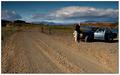
| 06/13/2005 11:47:58 AM | Mom, should I turn left or right at the 3rd corner?by GautiComment: * Greetings from the Critique Club *
I think you did a wonderful job creating a vast expanse with your composition. The road leads you into the shot very nicely and the closeness/familiarity of the model/phone/car are all something that is easy for people to identify with. The road really draws your eye to the sky and landscape - and the sky is fantastic!
The car & model seem to be a bit grainy and dark (which I think detracts a bit from the overall image), but you did a great job creating a "real" feeling/scenario. I think you could increase the lighting for the entire shot a hair or two - to bring out more detail in the foreground and midground. Perhaps reducing the backlighting a touch and adjusting the contrast? This would reduce some of the glare on the car door while increasing some of the detail on the car itself.
Just my 2 cents, but I thought this image was great in the challenge - I know it scored high marks with me. Again, I just have to say that the sky is a masterpiece... Nice work!
Jimmy
|  Photographer found comment helpful. Photographer found comment helpful. |
| 06/12/2005 09:27:49 PM | Fire Waiting To Pourby benlenzComment: * Greetings from the Critique Club *
First of all, I'd like to say that this is an unusually captivating sunset shot! I love the colors and reflections. The colors seem natural and not overprocessed (which is a real compliment these days!).
Secondly, I'd like to add that I think the focus could be better overall. I understand that in these types of shots, clarity is not necessarily the foremost thought (and shouldn't necessarily be), but I think that the lack of focus on the "mainland" is a little distracting. Don't get me wrong, it is still pretty good, I just think that is one area in which you might be able to improve on an already good image.
Thirdly, I'd suggest a different crop on this particular image. The real focus and meaning (IMHO) of this shot is the sunset, so why not crop out some of the incidental landscape on the bottom of the shot. It doesn't really add to the image - it's mostly dark anyway. I think you should leave just enough of the "land" to elicit a feeling of "earth", then concentrate on the beautiful spectacle that is the sunset and it's radiant colors.
I think you have two routes that you could go here... One is embracing the vastness of the sky and capitalizing on its various colors and brightness; the other is cropping out everything above the dark clouds you already have oulined in your color saturation selections.
Either way, I think you can improve on the impact your image represents by bringing out those warm sunset tones in the particular areas you choose to show.
Please don't get me wrong... I think that your current image has a LOT of merit and is extremely pleasing AS IS. I'm just trying to constructively comment on an already pleasant picture.
Just my 2 cents...
Jimmy
|
| 06/12/2005 09:06:18 PM | My Bugby NeuferlandComment: Absolutely adorable shot! I have to ask though... Is he a Silky or is he a Chinese Crested? He looks remarkably like some of the Chinese Cresteds I've been reviewing (I can't believe I'm saying this, but I really want one! LOL).
Really nice use of lighting and sepia tones. It created a very warm setting for your love. I'm jealous & want one now! LOL
Thanks for sharing such an intimate part of your life with us. I only hope that WHEN I have such a soulmate I will be willing to share him/her as well... | | Photographer found comment helpful. |
| 06/12/2005 08:48:12 PM | PICT6477.JPGby BigRComment: Nice composition and subject placement in this shot, but the glare is a bit overwhelming. I think if you were to reduce the backlighting/midtones/highlights/contrast, you would find that you could bring out more detail in the "light" areas of this photo. That would make it more balanced and allow the natural elements present in the shot to speak for themselves.
Just my 2 cents...
Jimmy
| | Photographer found comment helpful. |
| 06/12/2005 08:45:45 PM | PICT6437.JPGby BigRComment: The glare from the light on the left is distracting. I like the pose and expression of the model, but I think it could be even more impactful if the highlights were toned down a bit. For example, I think her lime green shirt and blue fingernails could really be augmented to enhance the overall effect and "feel" of the shot - making it not only more personal, but more universally appealing as well.
Again, just my 2 cents...
Jimmy
| | Photographer found comment helpful. |
| 06/12/2005 08:43:05 PM | PICT6431.JPGby BigRComment: Very cute pic! I really like the fact that he has on red shorts as well!
The little boy obviously loves trains (despite the Spider-Man shirt) - and I think that feeling really comes through in the photograph. I think you might be able to tone down some of the glare with some reduction of backlighting and/or contrast. I use MS Digital Photo Suite (as opposed to PS), but I'm sure there are equivalents in most post-processing packages.
I think the composition and colors are excellent. The clarity is also good - although not quite as strong as the content. The lighting is probably the most obvious element to me that could use a little improvement. I think if you experiment a little with it and contrast, you'll be able to even further improve the quality of the shot.
Overall, a very nice photo.
Just my 2 cents...
Jimmy
| | Photographer found comment helpful. |
| 06/12/2005 08:36:54 PM | Green eyesby LevTComment: * Greetings from the Critique Club *
First of all, let me say that this is truly a beautiful shot! Well done.
Some of my comments would include:
*I can't tell that her eyes are truly green (they look brown to me), so I would probably either change the title or adjust the color saturation.
*The lighting on her face is a little dark. I think you could increase this selectively during post-processing in whatever your application of choice may be.
*I really like the overall lighting of the shot. The hair's a bit messy, but that happens... ;-)
*You managed to catch a good expression (full of mystery) in the model's face.
*I think you made good use of the blurred background effect. Oftentimes this is overused/misused, but you used it both tastefully and in a manner that added to the overall feeling of your image.
*This may sound like an odd question, but did you happen to remove something (or some things) from the floorboard of the pier in the background? I only ask because of the periodic apparent "holes" in the silhouette of the pier's floor. It's not a big deal, but I did notice it and wonder what was up...
*Overall, a very nicely composed & executed shot. I think you could benefit from some additional postprocessing of the image, but that's really a very minor point.
Nice job & a beautiful shot to share - thank you!
Just my 2 cents... | | Photographer found comment helpful. |
| 06/12/2005 08:27:37 PM | sunshineby sigrun_thComment: * Greetings from the Critique Club *
Boy, is this a difficult image to comment on... It's beautiful, please don't get me wrong. It's extremely well composed and the colors are very life-like (not overdone as many images are).
I do have to say though, that the blurriness of the background images is a little distracting (although I realize that they were probably done that way purposefully), and that the sky is a little drab. You could probably punch up the sky colors with some selective processing (if you want your image to appear that way - I'm certainly no expert, but I do know what I like). The most important thing to remember is what YOU feel and what YOU like about the shot.
There are portions of this image that seem abnormally sharp to me (namely the girl and some of the foreground) - did you happen to selectively increase that level of contrast & sharpness? If so, I think you might be better off with a more even-handed approach to this particular shot. (I know that in many instances you want to selectively sharpen, but I'm not sure that it works in your favor in this particular case.)
It really is a beautiful setting & a well-composed shot. Nice job.
Just my 2 cents... :-)
Jimmy
| | Photographer found comment helpful. |
| 06/12/2005 08:21:19 PM | Rose of Fireby bobdaveantComment: * Greetings from the Critique Club! *
I must say that I have to agree with the majority of commenters on this image. It is truly beautiful. The composition, colors, and soft feel of the image are wonderful. It's not very often that you find a photo wherein the entire real estate is filled with a particular image and it works - but this one does.
You've managed to maintain the crispness of the image while it's a close-up, and the colors are not "overdone". I'm not a big fan (usually) of macro flower shots, but this one is certainly exceptional.
You know, as odd as it may sound, it makes me feel like I can almost smell the sweetness of the rose itself. I think your use of lighting and composition are impeccable.
Sorry I don't have more to constructively criticize, but IMHO this one is one for the Portfolio FOR SURE! Extremely nice job!
Just my 2 cents...
Jimmy
| | Photographer found comment helpful. |
| 06/12/2005 08:16:01 PM | "Common"by bladComment: * Greetings from the Critique Club *
I remember this entry from a recent challenge and thinking WOW what a fantastic shot! I LOVE the model & expression on her face. It screams to me of any local urban nursery wherein you know the locals on sight. It has a beautiful "familiar" feel to it and the composition really reinforces this emotion.
The colors & composition are wonderful. I would say that the lighting seems a bit harsh in spots, so if you were to reduce the backlighting and/or increase the contrast a bit, you might find even more detail & hidden treasures to show. Along the same lines, the sky could use a little more color - namely blue. There are several ways in which you can achieve that (as you probably already know), but I think that a little less glare would only further enhance the warm familiar feeling that the shot already conveys.
I'm not crazy about the green border either. I think that the picture speaks for itself without the added color (but that's just my opinion - I know that borders can frequently add a lot to a shot, I'm just not sure that in this particular instance it works in your favor).
Overall, the photo is excellent. I know that I scored it quite highly in the challenge (8-9 if I recollect correctly).
I also find it difficult to really point out many features that warrant reexamination and/or improvement. The lighting glare is the most obvious one to me. A secondary one might be the clarity of the background images - a certain degree of OOF begins to enter the image as you stray from the close-up subjects.
Again, I can't stress enough what a warm familiar feeling this image brought to mind for me. That alone is worth a LOT in my book. When you can evoke that strong of an emotion from the viewer, then you know you've been doing your job well!
Just my 2 cents... | | Photographer found comment helpful. |
|
Showing 9311 - 9320 of ~9564 |
Home -
Challenges -
Community -
League -
Photos -
Cameras -
Lenses -
Learn -
Help -
Terms of Use -
Privacy -
Top ^
DPChallenge, and website content and design, Copyright © 2001-2026 Challenging Technologies, LLC.
All digital photo copyrights belong to the photographers and may not be used without permission.
Current Server Time: 07/18/2026 11:13:49 AM EDT.
|