| Image |
Comment |
| 09/12/2005 12:26:53 AM |
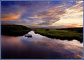
Lotus Mood by librodoComment: Congrats on yet another top 5 finish! Beautiful image... |
 Photographer found comment helpful. Photographer found comment helpful. |
| 09/12/2005 12:26:01 AM |
|
| Photographer found comment helpful. |
| 09/12/2005 12:24:41 AM |
|
| Photographer found comment helpful. |
| 09/12/2005 12:23:10 AM |
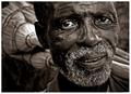
broom vendor by whiteroomComment: I kinda had a feeling this one would ribbon. Great work and congratulations!!! |
| Photographer found comment helpful. |
| 09/11/2005 11:50:46 PM |
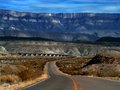
Around the Bendby trnqltyComment: This is a really cool perspective shot. Great focus and composition (although it seems to me that the horizon is off a tad - could be an optical illusion though). Great tonal variations and nice presentation. The landscape seems to go on for days! Great capture! |
| Photographer found comment helpful. |
| 09/11/2005 09:35:53 PM |
Dark & Lightby ladpupmoeComment: * Greetings from the Critique Club *
First let me say that I remember this shot from the D&L Challenge and thought it was creative and good.
Composition:
Really nice use of the space. I like the diagonal corner-to-corner line you used - nice variation on the rule of thirds. I also appreciate the fact that not only are the light and dark areas contrasting, but the blue & yellow are as well.
Lighting:
Good, but perhaps a bit harsh. Some of the highlights, while aren't blown, are a bit bright. However, the contrasting light and dark areas compliment each other well.
Focus:
Good, but not quite tack sharp. The added texture of the underlying material is a nice touch though, and adds yet another layer of contrasting elements (smooth surface vs ribbed).
Overall:
A strong entry IMHO. I think the score probably suffered a bit because of the title - there were so many "Dark & Light" entries. I think that this particular image was underrated because of the varying levels of contrasts you presented.
I also looked through your Portfolio - you have some fantastic stuff! And 200+ challenges? Wow.
Just my 2 cents... Very nice work. |
| 09/11/2005 08:08:54 PM |
Dreamy Lightsby jonasvalComment: *Greetings from the Critique Club*
First off, let me say congratulations on your 11th place finish! I remember this image quite well from the D&L challenge.
Hmmm... What to say about an image that scored a 6.6+... Well, I'll offer some of my observations - please don't weigh them heavily, however, as I'm sure I'll be grasping for areas of improvement! :-)
Composition:
Fantastic! It's very nicely balanced and uses the rule of thirds well. Good title too. I am curious as to the reflections in the water - they don't seem to me to necessarily be coming from the lights. Were they added along with the water blur? Or were they just the result of the long exposure? They don't quite look "natural".
Focus/DOF:
Tack sharp. Outstanding. The water's focus is a puzzler though (to me). Would still like to know how it was achieved. It works well, but is an obvious contrast to the rest of the image's focus.
Color:
VERY magical. The unnatural vividness of the tones really help transport the viewer to another place and time. Great use.
Overall:
WOW... :-) This is really a super piece of work. Glad you finally took that shot! Terrific job - congratulations again!
|
| Photographer found comment helpful. |
| 09/11/2005 07:58:29 PM |
By "D"awns Early "L"ightby Buckeye_FanComment: *Greetings from Critique Club*
First let me say that I think your image did meet the challenge, although the score may have suffered because it includes extra words.
I commented on the image during the challenge, and I stand by what I said (and I now see that a number of other people agree) - the border really detracts from the image IMHO. That point aside,
Composition:
Good - I like the large sky, but I think a little more of the silhouetted "ground" would help the overall feel.
Focus:
Good, but has room for improvement. The sky is a little noisy as well - you might consider running it through Neat Image.
Color:
Beautiful. Really nice rich natural tones in the sky.
Overall:
A very nice shot, but one that could be even better with a few adjustments. Remember, this is just my opinion, so take it or leave it as you like. :-) |
| Photographer found comment helpful. |
| 09/11/2005 03:06:56 PM |
Gum Dropsby CEJComment: Ya know... This image has stuck with me since it first appeared in the challenge (I scored it a 9 btw). I thought it was such a creative use of processing, that I've tried several times to mimic it myself (including a version of my "Crop Circles" shot). I just haven't been able to duplicate the pleasing quality you achieved in this image though. The tones you chose are the key - I'm sure. Just wanted to let you know how much this particular shot influenced me. It's a fantastic example of how you can make the otherwise mundane remarkable. Kudos to you for an outstanding piece of work! |
| Photographer found comment helpful. |
| 09/11/2005 02:01:39 PM |
Chocolate Kissby StrikeslipComment: I just went back to this image because it was posted in a forum thread and hadn't realized it was you Slippy! LOL I should have known! I thought (and still think) that this was a GREAT take on the Dairy challenge. I scored it a 9. Anyone who is willing to go through that deserves a decent score! It's actually a very cool shot in it's own right too. Good composition, crop, color, & focus. Keep it up! |
| Photographer found comment helpful. |
Home -
Challenges -
Community -
League -
Photos -
Cameras -
Lenses -
Learn -
Help -
Terms of Use -
Privacy -
Top ^
DPChallenge, and website content and design, Copyright © 2001-2026 Challenging Technologies, LLC.
All digital photo copyrights belong to the photographers and may not be used without permission.
Current Server Time: 04/29/2026 05:30:24 AM EDT.