| Author | Thread |
|
|
09/11/2005 09:35:53 PM |
* Greetings from the Critique Club *
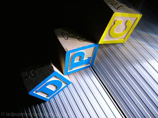
First let me say that I remember this shot from the D&L Challenge and thought it was creative and good.
Composition:
Really nice use of the space. I like the diagonal corner-to-corner line you used - nice variation on the rule of thirds. I also appreciate the fact that not only are the light and dark areas contrasting, but the blue & yellow are as well.
Lighting:
Good, but perhaps a bit harsh. Some of the highlights, while aren't blown, are a bit bright. However, the contrasting light and dark areas compliment each other well.
Focus:
Good, but not quite tack sharp. The added texture of the underlying material is a nice touch though, and adds yet another layer of contrasting elements (smooth surface vs ribbed).
Overall:
A strong entry IMHO. I think the score probably suffered a bit because of the title - there were so many "Dark & Light" entries. I think that this particular image was underrated because of the varying levels of contrasts you presented.
I also looked through your Portfolio - you have some fantastic stuff! And 200+ challenges? Wow.
Just my 2 cents... Very nice work. |
|
Comments Made During the Challenge  |
|
|
09/03/2005 11:22:50 AM |
|
you people amaze me this is a great image |
|
 Photographer found comment helpful. Photographer found comment helpful. |
|
|
09/03/2005 09:05:57 AM |
|
I definitely like this. The textures add a lot to this. It wasn't that impressive as a thumbnail. You have to open it to appreciate it. |
|
| Photographer found comment helpful. |
|
|
09/02/2005 07:02:33 PM |
|
very creative... nice textures |
|
| Photographer found comment helpful. |
|
|
09/02/2005 12:47:47 PM |
|
It is interesting. Not a fan of building-blocks. Good lighting, focus and color. |
|
| Photographer found comment helpful. |
|
|
09/01/2005 01:13:30 PM |
|
good contrast and use of blocks makes this image fun and appealing. |
|
| Photographer found comment helpful. |
|
|
09/01/2005 12:01:32 PM |
|
great idea, well shot and very apt. |
|
| Photographer found comment helpful. |
|
|
08/31/2005 09:14:34 AM |
|
ha ha ha...cute one. I like the strong light and dark shadows. Clever. |
|
| Photographer found comment helpful. |
|
|
08/30/2005 08:43:25 AM |
|
Clever use of light and dark. Interesting grooved base - is that plastic? I think this might have more pow if done in black and white although the high contrast of the blue and yellow is ok by me. |
|
| Photographer found comment helpful. |
|
|
08/29/2005 06:33:07 PM |
PRO: The idea, great idea!
CON: The blownout white infront |
|
| Photographer found comment helpful. |
|
|
08/29/2005 05:52:13 PM |
|
Great idea and a very good outcome. I esp like the contrast between light and shadow. Well done! |
|
| Photographer found comment helpful. |
|
|
08/29/2005 03:14:23 PM |
|
Nice image. The selection of what the blocks are sitting on was a good one. Adds interest and is a strong directional. 7 |
|
| Photographer found comment helpful. |
|
|
08/29/2005 02:58:14 PM |
|
the lined ground in which the blocks are laid is a liability to the attempt. |
|
| Photographer found comment helpful. |
|
|
08/29/2005 11:58:32 AM |
|
Of the "Dark(ness) and Light" titles so prevalent in this challenge; this is the best. Duplicity Leader |
|
| Photographer found comment helpful. |
|
|
08/29/2005 09:43:08 AM |
|
Like the use of DPC with the blocks! |
|
| Photographer found comment helpful. |
Home -
Challenges -
Community -
League -
Photos -
Cameras -
Lenses -
Learn -
Help -
Terms of Use -
Privacy -
Top ^
DPChallenge, and website content and design, Copyright © 2001-2026 Challenging Technologies, LLC.
All digital photo copyrights belong to the photographers and may not be used without permission.
Current Server Time: 06/28/2026 05:55:10 PM EDT.