| Image |
Comment |
| 10/27/2005 10:33:41 AM |
Self Portraitby MakkaComment: Beautiful piece of work. Lighting and focus are spot on. I like the desat too. The blue may be a tad too violet, but I'm splitting hairs. ;-) GREAT job! |
 Photographer found comment helpful. Photographer found comment helpful. |
| 10/27/2005 02:19:57 AM |
Duck Considers Lawsuit For Wrongful Termination. Aflac Denies Claim.by ggbudgeComment: I love the composition of this shot. I wish it was cleaner though. The graininess/OOF is a distraction but is not enough to make it untenable. I can see that the power of communication will overcome the need for Imperialistic impression. Of course, this may be the last thing I am allowed to say, so I guess I better make it count! And in that case...
|
| Photographer found comment helpful. |
| 10/27/2005 02:11:06 AM |
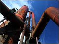
Aged Steelby RikkiComment: I think you've got great lines and composition here, but the depth of tonal range and visual perception are not all that they could be IMHO. I think you could bump up the depth in tones with variation in lighting/exposure settings and burning and in then in again in contrast/color sat variations. I also think you could really increase the viability of the shot by dodging some of the darker areas and leveling out some of the existing contrast. just my 2 cents - I'm happy to provide change... :-) It's a great shot as is - don't get me wrong! |
| Photographer found comment helpful. |
| 10/26/2005 11:44:22 PM |
Distorted Body Imageby tpocComment: I scored this a 9 and tend to agree with havy2008. If you like the shot - enjoy it... I know I did - and do! I think it's GREAT! |
| Photographer found comment helpful. |
| 10/26/2005 11:41:21 PM |
|
| Photographer found comment helpful. |
| 10/26/2005 08:22:12 PM |
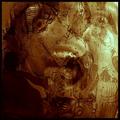
Skepticby ttreitComment: Based on your forum thread, I'm adding this comment. I scored this a 5 for several reasons. I think the crop should have been much tighter - you caught a great expression... zero in on it! Also, the subject is too centered - offset him a bit. Finally, the lighting is a bit harsh and the colors a bit washed out - I think if you had played with the lighting/exposure/contrast and bumped up the color sat a bit, you could have improved the "pop" value. It's not a bad shot at all, I just think it could have been processed better. |
| Photographer found comment helpful. |
| 10/26/2005 02:25:39 PM |
|
| Photographer found comment helpful. |
| 10/24/2005 01:01:50 AM |
|
| Photographer found comment helpful. |
| 10/24/2005 12:28:21 AM |
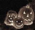
Hobgoblinsby JutildaComment: I like it - very Halloweeny and spooky. Nice job. (Good pumpkin carving too!) |
| Photographer found comment helpful. |
| 10/24/2005 12:21:21 AM |
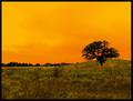
Saffron Skyby JutildaComment: Hey, a 5.9 in this challenge is damn good! Great shot Judy! :-) |
| Photographer found comment helpful. |
Home -
Challenges -
Community -
League -
Photos -
Cameras -
Lenses -
Learn -
Help -
Terms of Use -
Privacy -
Top ^
DPChallenge, and website content and design, Copyright © 2001-2026 Challenging Technologies, LLC.
All digital photo copyrights belong to the photographers and may not be used without permission.
Current Server Time: 05/01/2026 03:32:38 PM EDT.