| Image |
Comment |
| 04/26/2005 01:57:41 PM |
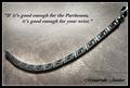
Silver Greek Key Design Bracelet...$129.95by CutterComment: I love the tag line and the composition. I'd ask for a little more DOF on the photo and the rule of putting a Company name in it is that it should be obvious who the company is. I don't get that here. I'd request that it were more pronounced. You could make it bigger and change the font. A small stroke would help. |
 Photographer found comment helpful. Photographer found comment helpful. |
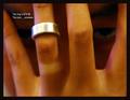
| 04/26/2005 01:53:40 PM |
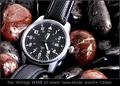
History In The Makingby RedOakComment: Very well done. The reddish rocks add the needed contrast that lets the watch stand out and the photo is incredibly crisp and in focus. I get the impression of a durable watch that is very good looking too. If I were buying the ad I'd request that the text be enlarged a bit, maybe 50% bigger maybe double. Perhaps a different color font. the photo is perfect. Nice, nice job. |
| Photographer found comment helpful. |
| 04/26/2005 12:26:34 PM |
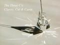
The Three C'sby PollyBeanComment: Great ad. The message is clear and direct. I like that. The photo isn't what I'd recommend. Lose the shadow. (but that might cost the reflection that I believe could be really cool.) A small stroke on the text would make it stand out more |
| Photographer found comment helpful. |
| 04/26/2005 12:23:36 PM |
Untitledby troyloxComment: Great, great ad, Needs more contrast and bigger font (Darker) |
| Photographer found comment helpful. |
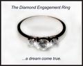
| 04/26/2005 12:22:05 PM |
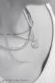
...dream come trueby lilnukeeComment: A great job. palcement is well centered and the text is simple and to the point. A crisper shot of the ring and this could be a finalist. |
| Photographer found comment helpful. |
| 04/26/2005 12:20:39 PM |
Fidelityby ergoComment: I see an incredible Idea here with the photo, I like the eye in the background. However the text is small and the master card idea is played out. The photo a great start even though I'd use more DOF and lighten it a bit. |
| Photographer found comment helpful. |
| 04/26/2005 12:14:51 PM |
640-final.jpgby ebertdjComment: This is one of the better ones I've seen. Your experience is obvious. What doesn't work for DPC works for me. The starlight adds a great touch. I like what the text says, simple and direct, however I'd recommend looking for another font. this one is hard to read. |
| Photographer found comment helpful. |
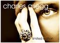
| 04/26/2005 12:09:49 PM |
|
| Photographer found comment helpful. |
| 04/26/2005 12:08:46 PM |
Forever Iceby MatthewComment: The very blurry water/ice is a distraction to an otherwise great shot. the ring's palcement is great as it allows for text to be well placed also. |
| Photographer found comment helpful. |
| 04/26/2005 12:06:30 PM |
CGby whiteroomComment: great, great comp. Great text placement and use of negative space. however the ring doesn't jump out at me and makes it difficult to know what its an ad for. |
| Photographer found comment helpful. |
Home -
Challenges -
Community -
League -
Photos -
Cameras -
Lenses -
Learn -
Help -
Terms of Use -
Privacy -
Top ^
DPChallenge, and website content and design, Copyright © 2001-2026 Challenging Technologies, LLC.
All digital photo copyrights belong to the photographers and may not be used without permission.
Current Server Time: 06/21/2026 08:43:45 AM EDT.