| Author | Thread |
|
|
04/26/2005 12:14:51 PM |
|
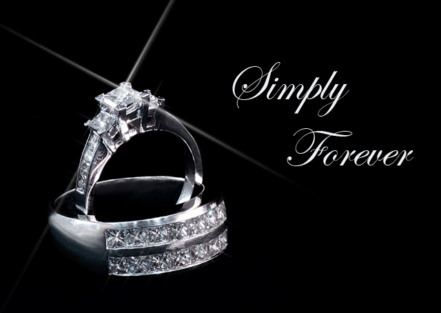
This is one of the better ones I've seen. Your experience is obvious. What doesn't work for DPC works for me. The starlight adds a great touch. I like what the text says, simple and direct, however I'd recommend looking for another font. this one is hard to read. |
|
 Photographer found comment helpful. Photographer found comment helpful. |
|
|
04/25/2005 11:58:48 PM |
What a shame, a lovely photo, be proud of what you created anyway. I can understand the rules and why it was D/Q but I think the starburst makes it ! Good Luck in future !
-Lisa |
|
| Photographer found comment helpful. |
|
|
04/25/2005 11:36:23 PM |
Great shot, too bad. I like the font as well. What font is that?
Maybe you will get a call from that "Marketing Director" guy on the DPC forum. I don't think they would mind the "sparkling light" effects. |
|
| Photographer found comment helpful. |
Home -
Challenges -
Community -
League -
Photos -
Cameras -
Lenses -
Learn -
Help -
Terms of Use -
Privacy -
Top ^
DPChallenge, and website content and design, Copyright © 2001-2026 Challenging Technologies, LLC.
All digital photo copyrights belong to the photographers and may not be used without permission.
Current Server Time: 07/16/2026 11:57:51 PM EDT.