| Author | Thread |
|
|
05/04/2005 09:29:02 PM |
Thank you for entering your photo to the DPChallenge, Jewelry Advertisment.
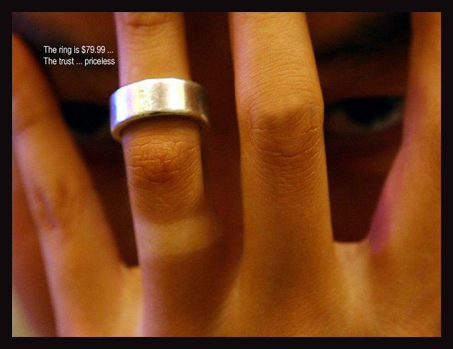
Very interesting take on the photo challenge. From the title and the subject, it is striking and imaginative. There is a strong message here. The ring, the price, and those haunting eyes in the background. All of those play well to an viewing audience. It is also a very subtle but strong message about trust and relationships. The price posted is also another message. I guess its, you can't put a price on trust, even if its a frugal one.
Technically, there are few things wrong. The lighting and the focus need to be reexamined. There is some pixelation on the image. The finger on the far left is very out of focus. The finger on the far right has a "purple" tint to it.
I like the tan spot on the ring finger. It shows that the ring hardly ever comes off, which adds very strongly to the message of the photo. The overall tone of the photo is reddish. It warm and mellow but it seems to blend in too much with all of the elements of the image. The text on the photo is too small. A larger typeface, would have made it more appealing, and less distracting. Its almost like you have to strain to read it. You could have placed the text on the bottom, toward the middle of the frame. That way the ring would be the first thing seen, and then the text would follow.
Overall it appears that you had some lighting issues. I see that you used ISO 800. I am not sure if you use a flash, or other lighting resources. But the reddish tone and cast takes away from a great idea.
Also I'm still not sure of the eyes, they look angry and scary. This might turn some voters off.
Great idea's, you need to work on the lighting, and create a softer approach.
Good luck in your next DPChallenge.
|
|
 Photographer found comment helpful. Photographer found comment helpful. |
Comments Made During the Challenge  |
|
|
05/01/2005 06:38:26 PM |
|
|
|
05/01/2005 12:00:55 AM |
|
Wierd but, this shot is rather 'dark' and 'scary'.. with the eyes in the background. Lighting is quite wrong as there are spots of white, blue and red everywhere. Ring is not sharp enought to make it out properly. text is funny, if a bit non-existant. There's this beige spot on the lower left that bugs me quite a bit too. 5 |
|
| Photographer found comment helpful. |
|
|
04/30/2005 07:44:36 PM |
|
The focus ... on layaway. :) Just kidding with ya! But yeah, needs much more focus - and I didn't see the eyes for a few seconds... |
|
| Photographer found comment helpful. |
|
|
04/30/2005 04:33:37 PM |
It took me a moment to notice the eyes... it adds an almost creepy touch :)
Technically, too much light on the ring and overall this lacks sharpness.
Great idea and sentiment though! |
|
| Photographer found comment helpful. |
|
|
04/30/2005 11:54:25 AM |
|
Kudos for the original idea. image could be sharper and the face lit better |
|
| Photographer found comment helpful. |
|
|
04/29/2005 03:06:02 PM |
|
Different idea, but a little crisper might have added to it. Not sure about the connotation of the text (it gives off some negativity). |
|
| Photographer found comment helpful. |
|
|
04/29/2005 02:25:40 PM |
|
looks to be just a tad soft |
|
| Photographer found comment helpful. |
|
|
04/29/2005 08:07:27 AM |
|
Might consider doing a custom white balance on these low key shots. The human eye can tell white in any light, the camera can not and needs to be told what is white. 4 |
|
|
|
04/29/2005 08:06:12 AM |
|
nice idea, although the ring should have been left in it's natural place or the mark on the finger cloned out or make it clear that the ring in being removed by including the thumb and finger from the other had |
|
| Photographer found comment helpful. |
|
|
04/28/2005 10:16:07 PM |
|
Great symbol of faithfulness ... so put the ring back on! |
|
| Photographer found comment helpful. |
|
|
04/28/2005 06:36:55 PM |
Hmm. Something about this shot bothers me and I can't exactly put my finger on it. The whole image has a terrible yellow/red cast to it and definately could have used some color adjustment in photoshop. Also the composition makes the shot uncomfortable. The fingers look spread awkwardly and forcefully. With words like "trust" int he title I would like to see softer colors with a comfortable hand and the ring all the way on the finger. Tan line where the ring usually goes on the finger is pretty unfortunate as well. Sorry, just full of complaints. I doubt people are really giving you feedback, so I'd like to let it all spill and you can take what you want from it.
Happy shooting,
Chris A |
|
| Photographer found comment helpful. |
|
|
04/27/2005 06:30:43 PM |
|
Clever idea. Focus is a little soft. |
|
| Photographer found comment helpful. |
|
|
04/27/2005 01:14:16 PM |
|
the eyes are kinda creepy. I wouldnt call this a jewelry ad per say, i think this is more in the realms of social propaganda. 6 |
|
| Photographer found comment helpful. |
|
|
04/26/2005 10:18:57 PM |
extremely clever... in fact...
*long pause
yes, very clever.
I heart the composition |
|
|
|
04/26/2005 08:55:44 PM |
|
Ring is not in focus, but knuckle is. To shallow a Depth of Field. Great Idea though. I like it. |
|
| Photographer found comment helpful. |
|
|
04/26/2005 07:32:47 PM |
|
dof needs to be greater to get the sharpness on the ring |
|
| Photographer found comment helpful. |
|
|
04/26/2005 05:27:02 PM |
|
Good idea and content is great. I do believe that the ring should be what is in focus rather than the finger. |
|
| Photographer found comment helpful. |
|
|
04/26/2005 02:59:37 PM |
|
I commented, but don't know that it "went"... love this ad, very clearly stated. Very nice. |
|
| Photographer found comment helpful. |
|
|
04/26/2005 01:18:45 PM |
|
Great idea. However, the color and clear focus on the knuckle instead of the ring shifts the focus of the "ad". |
|
| Photographer found comment helpful. |
|
|
04/26/2005 12:40:00 PM |
|
| Photographer found comment helpful. |
|
|
04/26/2005 12:20:39 PM |
|
I see an incredible Idea here with the photo, I like the eye in the background. However the text is small and the master card idea is played out. The photo a great start even though I'd use more DOF and lighten it a bit. |
|
| Photographer found comment helpful. |
|
|
04/25/2005 09:47:26 PM |
|
The text could be a little larger. It kind of looks out of place. I like the concept though. |
|
| Photographer found comment helpful. |
|
|
04/25/2005 03:33:33 PM |
I like the message/intent of the submission here, but the focus/clarity of the ring is a bit off.
Size of teh text is a bit on the small size too in my opinion. |
|
| Photographer found comment helpful. |
|
|
04/25/2005 10:42:55 AM |
|
Interesting. Definitely sends a message and a good one at that. Not sure that it's "Jewelry Advertisement"... I could see some non-profit or gov't agency picking up on this one. As a photo I like seeing the eyes in the background. The composition with the ring placement is very good. This must be a very shallow DOF, because the two primary knuckles are in great focus but the ring is just outside of being clear. Good job overall. |
|
| Photographer found comment helpful. |
|
|
04/25/2005 10:04:37 AM |
|
| Photographer found comment helpful. |
|
|
04/25/2005 10:02:54 AM |
|
Interestin take on the subject |
|
| Photographer found comment helpful. |
|
|
04/25/2005 02:29:42 AM |
|
need to spread ALL the fingers?nice outside the box idea :-) |
|
| Photographer found comment helpful. |
|
|
04/25/2005 01:30:11 AM |
|
Nice Idea focus on the ring could be sharper but concept is good |
|
| Photographer found comment helpful. |
|
|
04/25/2005 01:25:27 AM |
|
| Photographer found comment helpful. |
Home -
Challenges -
Community -
League -
Photos -
Cameras -
Lenses -
Learn -
Help -
Terms of Use -
Privacy -
Top ^
DPChallenge, and website content and design, Copyright © 2001-2026 Challenging Technologies, LLC.
All digital photo copyrights belong to the photographers and may not be used without permission.
Current Server Time: 06/30/2026 09:52:31 AM EDT.