| Image |
Comment |
| 04/28/2003 02:38:07 AM |
|
 Photographer found comment helpful. Photographer found comment helpful. |
| 04/28/2003 02:37:14 AM |
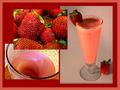
Add Milk and Honey and Blend Wellby GraciousComment: You have the makings of a great idea here. The strawberries look a bit over ripe. The overlap is a bit much and the lighting on the final picture is a little dark. Colors and story are great. The border may be a bit over the top as well. Really close! |
| 04/14/2003 12:06:40 AM |
|
| Photographer found comment helpful. |
| 04/14/2003 12:05:51 AM |
|
| Photographer found comment helpful. |
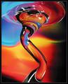
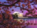
| 04/13/2003 11:02:35 PM |
Shades of Purpleby blemtComment: Beautiful shot, one of my top five this week. The mood is incredible as is the framing and color. Great, great job. |
| Photographer found comment helpful. |
| 04/13/2003 11:01:40 PM |
Cavalinha Boatby britesantosComment: So simple and yet so excellent. One of my top five this week! Great colors and eye. Too bad they didn't paint it one shade of blue darker, I think it would have disappeared into that sky!! |
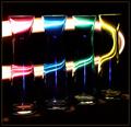
| 04/13/2003 11:00:28 PM |
A Streak of Lightby mariomelComment: Not generally my kind of photo but this one is really done well. Top five for me. The shape of the colored lights is what really makes it IMHO. Great job! |
| Photographer found comment helpful. |
| 04/13/2003 10:59:19 PM |
House of Lightby WarpComment: One of my top five this week. I love the blue and the lighthouse roof is excellent. I wonder how this would have looked with the lighthouse off to the right? |
| 04/13/2003 10:58:01 PM |
Rejuvenationby lbWhaplesComment: My favorite of the week, the color of the blue is awesome. The set up is great as is the lighting. Great job! |
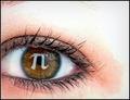
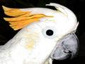
| 04/10/2003 10:46:29 PM |
Freddyby David EyComment: Greetings from the Critique Club };-)
Initial thoughts
Interesting composition, meets the challenge, well composed but a bit over-exposed.
Composition/ Content
Freddy really fills up the frame nicely, either great aim or super cropping. Everything leads you to the eye which is really the focal point. Colors are good although the white is a little washed out. Looks like an on camera flash. A light from the side or 3/4 would have really showed off the texture of his feathers.
Technical
Focus seems really good and contrast is excellent for the difference in light and shadow you have here. I like the black background, it works well here. The lighting is the toughest part and it just needed to be a little softer.
My Opinion On The Photo
I think that it meets the challenge well but could have been improved a little to finish even higher than it did. Good job, and keep up the good work.
I would be happy to talk further about this shot if you would like to contact me.
DougPaz
|
| Photographer found comment helpful. |
Home -
Challenges -
Community -
League -
Photos -
Cameras -
Lenses -
Learn -
Help -
Terms of Use -
Privacy -
Top ^
DPChallenge, and website content and design, Copyright © 2001-2026 Challenging Technologies, LLC.
All digital photo copyrights belong to the photographers and may not be used without permission.
Current Server Time: 06/10/2026 05:12:36 PM EDT.