| Image |
Comment |
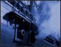
| 08/06/2003 07:38:26 AM |
Pirates of the Caribbean:Curse of the Black Pearlby tfarrell23Comment: Looks really good. Focus and clarity are great, and the way you have caught the smoke coming out of the cannon is great as well. I think this is a wonderful representation of the movie. Did you actually find a ship that was firing cannons or is this a poster or photo of a screen? Nice work either way. I like the blue tint as well. ~Heather~ |
 Photographer found comment helpful. Photographer found comment helpful. |
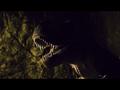
| 08/06/2003 07:36:23 AM |
Jurassic Parkby jenaromComment: This is perfect. I really really love the execution here. The focus and clarity are awesome. Great crispness on those teeth. The lighting is perfect for a mysterious creepy shot. I think that this represents the movie well. It's even in widescreen. lol. The angle and framing/cropping are excellent. Background is perfect as well. I tink that this is a 10 from me. Good luck in the challenge. ~Heather~ |
| Photographer found comment helpful. |
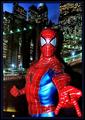
| 08/06/2003 07:34:13 AM |
Spider Manby MiekaComment: Looks like a movie poster, but there are 2 things that bother me a bit. First off is the really harsh shadow behind your spiderman. It really stands out and I think it takes away from the feeling of 'being in the city'. Also, the glare between his eyes which looks like a flash glare. Either way, it's a little distracting to the shot. The glare on his body isn't quite as distracting as the one right between his eyes. As I'm sitting here, I also see you cut off his thumb on his most important feature, the web throwing hand. I do actually like the DOF, and the angle is good. The background is nice minus the harsh shadow from SM. Overall a nice idea and good set up. ~Heather~ |
| Photographer found comment helpful. |
| 08/06/2003 07:29:18 AM |
Dantes Peakby YomiComment: Wide angle lense distortion? Some people like it, some don't. I'm not overly fond of it. I think it makes the buildings look very odd, and seems to 'squish' everything together strangely. The 'scene' is nice. I love this movie. The houses from the movie weren't quite as 'high class', but this is still a perfect representation of the way the thing went up like a bomb. Focus and clarity are really good, and the angle on the smoke is good as well. Love how you 'stopped' the smoke. ~Heather~ |
| Photographer found comment helpful. |
| 08/06/2003 07:17:00 AM |
The Wild Thornberriesby magnetic9999Comment: I don't remember this 'scene' in the movie, but maybe I just missed it. The color of the berry here is great. I think that the lighting on the left leaves could be a little brighter, but not a serious problem. I think your focus and clarity are good, and the angle and framing/cropping are good as well. I like the way you have blurred the background and I find nothing distracting there. Overall a really nice shot. ~Heather~ |
| Photographer found comment helpful. |
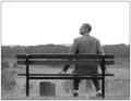
| 08/06/2003 07:15:06 AM |
Forrest Gump by PedroComment: Wonderful! Absolutely wonderful. I really think you did a great job at representing this movie. The suitcase is just perfect. The only problem is that I think there was a bus stop and a road in front of the bench in the movie, but still a very nice shot. Focus and clarity are great, and I love the use of black and white here. I think that the way you have positioned the person is great, and he almost looks like Forest Gump! The sky being so white might normally bother me, but it does not here. I think this is a 9. Great shot. ~Heather~ |
| Photographer found comment helpful. |
| 08/06/2003 07:12:06 AM |
A River Runs Through Itby channeledComment: While I understand that there is a lot of movement in the water and without a fast shutter speed, it might have been difficult to get a crisp focus, I do wish that there were a sharper focus somewhere in the photo. Even the trees are a little too soft for my personal taste. I think it represents the movie well, and I also think that the angle and framing/cropping are good. I like how you have put the people over to the right and left space to the left of the photo. Overall nice, just needs to be a bit crisper. ~Heather~ |
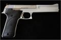
| 08/06/2003 07:09:44 AM |
Lethal Weaponby Chilly0999Comment: While I don't remember thise 'scene' from the movie Lethal Weapon, I think that it represents the title well. The lighting here is good, and the way you have positioned the pistol is good as well. nicely lined up with the edge of the frame. Focus and clarity are good. My only real complaint would be the 'smudging' in the background just to the right of the handle. Looks like some lighter colored debris or material in the background right there. Not noticable if I darken the photo just slightly. |
| Photographer found comment helpful. |
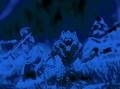
| 08/04/2003 08:45:03 PM |
Vampire Hunter D(Animated Movie)by johnnykillchristComment: Action figures in the grass? Looks interesting, and normally I wouldn't care for the effect at all, but I do think that it does make for a good representation for an animated movie. The blob to the right of the photo is a little odd and distracts a lot from the characters. Otherwise, I like the DOF, with the front guy being really detailed and the back guy being kind of background noise. Nice job. ~Heather~ |
| Photographer found comment helpful. |
| 08/04/2003 08:08:01 PM |
"The Hulk"by svitalComment: I wish the lighting were a bit brighter on the hand to the left, but understand the shiny texture of these might have been a bit difficult to capture. I think that it's a good representation of the movie and I like how the background is dark, and like the shadows on the hand to the right, but the one on the left is just a slight bit too dark. Overall very nice though. Good focus and clarity, and nice framing. ~Heather~ |
Home -
Challenges -
Community -
League -
Photos -
Cameras -
Lenses -
Learn -
Help -
Terms of Use -
Privacy -
Top ^
DPChallenge, and website content and design, Copyright © 2001-2026 Challenging Technologies, LLC.
All digital photo copyrights belong to the photographers and may not be used without permission.
Current Server Time: 07/23/2026 05:48:03 AM EDT.