| Image |
Comment |
| 12/29/2003 04:04:16 PM |
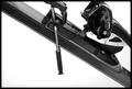
Out of Boundsby rll07Comment: What in the world is this? I was thinking some kind of stapling tool, or something, but I think I'm going to go with a ski? Not really knowing exactly, only limited things I can say. I can say that the focus is good, as is the placement of this object. I'm going to assume it's a ski. Is it 'on the edge' cause you live on the edge if you ski? anyway, lighting is also good and the background is perfect. Technically a good shot, just a little confusing to someone who is not familiar with whatever it is. |
| 12/29/2003 03:55:02 PM |
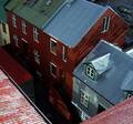
It looks higher up here :Sby poxyComment: I really like how you have included your 'edge' in the photo. it creates nice angles and framing as well. I'm trying this with different croppings, and I think I like this with the ugly roof (the rusty dirty green roof on the house in the upper left) cropped off. The shadows make this interesting. I like how it adds depth. You look down and can't see the ground, makes the 'on the edge' seem more *gasp*. lol. Focus and clarity are good. I like this image. |
| 12/29/2003 03:51:26 PM |
Gated Beautyby channeledComment: Not sure how I feel about the fence going straight through the center of the image. I'm not usually a stickler for the "photography rules" but I think this is one image that would benefit from some dramatic angle or something. I'm guessing that it's the snow that's "on the edge" which definately works. The focus seems a little soft to me though. I'm wondering if that is because the large post in the bottom left is obviously out of focus, and my eyes really aren't following that to a place that IS in focus. The snow looks good in the bottom right, but near the upper part of snow, it seems to be a bit bright and washed out. |
| 12/29/2003 03:47:01 PM |
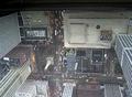
Edge of Roof - Edge of Sanityby flip89Comment: Interesting angle, and the thought is good. I'm not liking the color though. Seems like maybe the weather was not cooperating much, and had put a haze over your whole image. All the cars are out of focus and because there are so many of them, seem to me more of a distraction than anything attractive. The distortion alone the top of your image is also distracting. What caused this? You can mainly see it in the upper left on the windows. It's a different kind of angle, which does make it interesting, and my issues with the shot are really beyond your control, but better lighting and less cars would definately make this more appealing to me. |
 Photographer found comment helpful. Photographer found comment helpful. |
| 12/29/2003 03:42:49 PM |
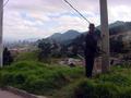
Ilegalby luipeComment: What's illegal? I can't tell what this guy is doing. Is he trying to take a leak on the side of the road? Did he spray paint something on that pole? Is it illegal for a man wearing a suit to overlook a town on tuesdays at noon? The man is pretty dark. Can't tell if he's trying to hide something in his coat or if he's trying to take a leak. The conditions make the photo a bit washed out in places. Focus seems ok, but also hard to tell cause of the lighting. There isn't a lot of detail here. I think you had an idea, but it doesn't come across unless you know exactly what the guy is trying to do. |
| Photographer found comment helpful. |
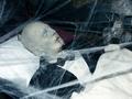
| 11/10/2003 10:53:41 PM |
Portrait of the Deadby OneSweetSinComment: *Critique Club*
This definately fits the theme. Creepy, Halloween style kind of feel. The shot looks good. The angle and framing/cropping are good. I like how you have placed his head in a corner and the rest falls in a diagonal. The batty thing looks a little out of place, but still fits in with the theme of scary.
Focus and clarity are good. Don't really see a DOF, but having the whole thing in focus is not a bad thing. Especially with this case. I think that the only real complaint from me would be the lighting. Looks like conditions were not ideal for the shot. The brights are maybe a little bright for the "dark spooky" theme, and there is a harsh shadow from one of the strands of cob web near the bottom right. Kind of looks like the conditions were beyond your control, but you tried to make the best of it.
Really didn't do bad, but definately could have been better.
Overall, a nice shot for the challenge.
~Heather~ |
| Photographer found comment helpful. |
| 11/08/2003 01:36:57 AM |
Idle Hands by PedroComment: Originally posted by Miah:
validated by admin? how???? this is obviously worked on! look at the stretch marks in the fabric behind his ear.. did i read a separate set of rules?? |
You must have. |
| Photographer found comment helpful. |
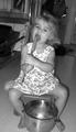
| 10/17/2003 05:33:10 PM |
dada that' some good cookie'sby jbruno1397Comment: Definately something we can all relate to, I'm sure. The background bothers me here. It's crooked and angled. Not enough to be dramatic, but rather just looks like you weren't paying attention to lining up your background, which unfortunately makes it look like more of a snapshot. Which is ok too. I have plenty. lol. I wonder how this would have come out if your angle were just a bit lower. It looks a little more planned if we get down to the kids level and take the shot straight on. Focus looks good, and lighting also looks ok. ~Heather~ |
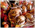
| 10/17/2003 05:27:31 PM |
Rice-Stuffed Cornish Hensby SonifoComment: Too much other clutter. The hens easily get lost in the wide array of other things in the shot. I think the food looks good, and the setup was well thought out, but it turns out way too busy for my personal taste. There are pumpkins, and sunflower patterns, which alone don't go well together. Your focus and clarity seem good, and the colors are good too. ~Heather~ |
| Photographer found comment helpful. |
| 10/17/2003 05:19:01 PM |
The Best Cook I Knowby Darter02Comment: We really don't get to see much food in this shot at all. The main focus seems to be the cook, and that's not really what the challenge was meant to be. I see some potatos and butter, and some salt, but not really much actual food to look at. I realize that this does still fit the challenge by being the "during" of preparing the food, but wish that there were a bit more food in the shot. As for the shot itself, the red tones seem to be jacked up too far. Her skin is an unnatural color and the overall shot seems to have an orangish red tint. ~Heather~ |
| Photographer found comment helpful. |
Home -
Challenges -
Community -
League -
Photos -
Cameras -
Lenses -
Learn -
Help -
Terms of Use -
Privacy -
Top ^
DPChallenge, and website content and design, Copyright © 2001-2026 Challenging Technologies, LLC.
All digital photo copyrights belong to the photographers and may not be used without permission.
Current Server Time: 07/23/2026 02:54:44 AM EDT.