| Image |
Comment |
| 05/18/2004 10:37:06 PM |
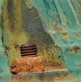
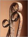
Queen and her Guardsby soccerdadComment: *Critique Club*
I'm not really sure what to say here. I looked at this for a very long time, and I neither like, or dislike it. It's not making me jump out of my seat with excitement, however, it makes me look at it with wonder.
I think that technically it is good. Lighting is alright, the glares on the black do not distract too much. The lighting on the rust is right on, I think.
Focus and clarity are good. The only semi soft parts are the black tops on the lamps, and that could be a result of texture, not focus.
I think that the centeredness of the shot is a little bland. Maybe a dramatic angle could spice it up a bit and be less boring.
This definately fits the challenge, and I like how the color of the rust kind of mingles nicely with the color of the candles. I think that creates a good balance.
I would have rated this probably a 5. Good technically, but not much excitement.
Hope this helps. ~Heather~
|
 Photographer found comment helpful. Photographer found comment helpful. |
| 05/11/2004 11:40:40 PM |
railway exchangeby walblandComment: The background is a bit dull, but doesn't look like you could do much about that. Overall I think that this is an interesting image to look at. Your focus and clarity are good, and the angle at which you decided to take the shot at is interesting as well. Technically well done. ~Heather~ |
| Photographer found comment helpful. |
| 05/11/2004 11:39:39 PM |
Rusty Hydrantby chanComment: It's rusty, but not particularily that interesting. I feel like the image is strangely tilted. Focus and clarity are ok, and lighting looks to have been on your side, but I'm just not drawn in and kept there. ~Heather~ |
| 05/11/2004 11:38:38 PM |
Ethyl Please!by Firstrich1Comment: rusty car, rusty pump. I like it. I like that the rusts are 2 different colors. focus and clarity are right on. lighting is good for the most part. I only see one shadow that is a bit distracting on the wheel. would like to see that a bit brighter. this is an interesting scene, and it's rusty, I feel that you met the challenge very well here. nice one. ~Heather~ |
| Photographer found comment helpful. |
| 05/11/2004 11:37:17 PM |
Rusty nail by the sea...by OrionSComment: I would have liked the focus to be the oposite of what it is now for this challenge. I would like the rusted subject to be in focus. the background is interesting, and you could have it either in focus or not, I'd have to see it to tell which would be better. You need to straighten up your horizon. looks like the water is going to runn right off the left side of the photo. give it a slight right rotation and then recrop. ~Heather~ |
| Photographer found comment helpful. |
| 05/11/2004 11:35:19 PM |
Rusty shadowby aKiwiComment: Interesting take on the challenge. I think that I like the lighting. it makes the photo what it is. Not really sure if I identify the orangeness as rust though. I assume that it is because you say that it is, but honestly it's hard to tell if it's rusted, or just colored to look rusted. either way, I think that originalty is strong here. focus and clarity are hard to judge, but look just fine to me. I would call this abstract too. ~Heather~ |
| 05/11/2004 11:32:32 PM |
Lost and foundby DG1RUEComment: can barely tell what this is, let alone tell if it's rusty. I think I can see a wheel near the top of the photo that is a bit orange, assuming that's the rust. I wonder what this would have turned out like if you had focussed on that one wheel. Maybe be a stronger match for the challenge. Maybe wouldn't be able to tell what it was, but we can barely do that now. I would definatley prefer a tighter close up of that wheel. otherwise, focus and clarity are alright, and lighting seems to have been on your side as well. ~Heather~ |
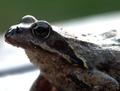
| 05/11/2004 11:30:47 PM |
I am bit rusted, sryby kinksComment: If I were to look at this photo alone, Rusted would be the last thing I would think of. If you were taking a photo and entering it just for the sake of entering it to get comments, well, I guess that's just fine. Unfortunate that you will probably have to undergo a major hit to your average score. As for the photo, your background contains a strong diagonal line that cuts right through your poor subjects head. I'd have put that line somewhere else. focus and clarity seem alright, and i like the froggy. lighting is a bit harsh on his nose. ~Heather~ |
| Photographer found comment helpful. |
| 05/11/2004 11:28:26 PM |
Time and Elementsby HRoxasComment: I like it! Beautiful. You have succeeded in making a rusty old subject interesting. I think the background is perfect. I like the way it goes from light to dar. Your focus and clarity are right on, and lighting is wonderful as well. Both focus and lighting help to bring out the details and textures here. What else can I say? Very nice. 10 ~Heather~ |
| Photographer found comment helpful. |
| 05/11/2004 11:27:00 PM |
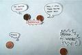
@_@by unikornComment: Does copper get rusty or does it tarnish, are they the same thing? oh well. Anyway, while this is funny, I don't find it particularily interesting as a photograph. We can't see much detail in the pennies at all. You cropped the bottom penny too close, and I'm not really sure of the point of the photo. it could have been drawn better. focus doesn't even seem right on the pennies. Funny, but not the best photo. ~Heather~ |
| Photographer found comment helpful. |
Home -
Challenges -
Community -
League -
Photos -
Cameras -
Lenses -
Learn -
Help -
Terms of Use -
Privacy -
Top ^
DPChallenge, and website content and design, Copyright © 2001-2026 Challenging Technologies, LLC.
All digital photo copyrights belong to the photographers and may not be used without permission.
Current Server Time: 07/22/2026 06:36:35 PM EDT.