|
|
|
Showing 2431 - 2440 of ~2785 |
| Image |
Comment |
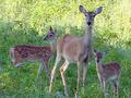
| 08/30/2002 11:50:00 AM | Protective Motherby TomNTexasComment: Very cute. I wonder if you will get comments about not having children in your photo. cause technically, these are her children. Don't really matter, it's still a great photo and i have to commend you on getting that close up of a photo of animals. I wonder where these deer are from, for some reason they look a bit different from our deer. Maybe it's just the angle. Who knows. I love the framing on this photo, and the lighting is nice. I like the contrast of the bright grass in the back, and the dark grass in the front. Good job and good luck in the challenge. |
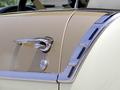
| 08/26/2002 12:04:00 PM | I get the window!by lynnesiteComment: There may be something I am missing about this car, but this looks like the drivers side of the car. I think that it might have been a bit more pwerful if it were in relation to the passenger side of the car, as we don't usually think of children in the drivers seat. However, setting that aside...this is a very nice photo. The lighting is great and the angle is very nicely done as "from the eyes of a child". Great job and good luck in the challenge. |  Photographer found comment helpful. Photographer found comment helpful. |
| 08/30/2002 10:40:00 AM | No One's Here to Playby briansuhComment: Very nice shot. Such a small playground for being so well kept and fancy. With the trimmed bushes, the shaped play area and such. almost looks kind of odd in that way. The lighting is beautiful and I love the angle. Great shot and good luck in the challenge. |
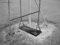
| 08/27/2002 08:19:00 PM | ...by prodigal havocComment: This looks like a really old swing. I would trust sitting on it. LOL. With so many swings, it's hard to judge one over another. I like this one because it's wooden. I don't know what kind of backgrounds there would be from a different angle, so maybe this was the best angle for the situation, but I think the poles in the back are kind of distracting. I would also like to see the color version of this for comparrison. nice job and good luck in the challenge. |
| 08/29/2002 01:16:00 PM | He left me here..by bunniesComment: Focus is very nice on this photo. I like how you can almost see every blade of grass. Definately a childhood thing. Very nice placement. The background is nice to look at as well. Lighting is great. Although there are shadows, the work very nicely and are not distracting at all. Great job and good luck in the challenge. |
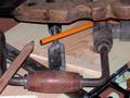
| 08/21/2002 12:54:00 AM | Passion before DPCby Frank BeckmanComment: Great photo, the lighting is nice, and although there are many items in the photo, it doesn't look cluttered, they are very nicely placed. The yellow pencil seems a bit out of place, but I think you did that just in case someone didn't think the carpenters pencil was enough to "meet the challenge". If this were my photo, I'd take the yellow one out (not needing it to "meet the challenge") retake the photo and hang it in your shop. It looks like it would have personal meaning to you, and is pretty cool to look at. It makes me wonder what you used to make with all this. Birdhouses comes to mind. Don't know why. Anyway, great photo and good luck in the challenge. |
| 08/25/2002 11:48:00 PM | chasing its tailby owennnnComment: I used to have a round pencil. didn't work for crap. lol. the lighting is a bit dim here. looks like you may have done it on purpose though. what are all the white speks? I'm not sure exactly what the background is. looks kind of like a fuzzy sweater with a pocket on the front. placement and angle are great. good luck with the challenge. |
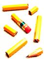
| 08/22/2002 12:57:00 PM | Blueby DannyComment: Great contrast between the blue pencil and the yellow ones. The lighting is good. I wouldn't want the glare on the right side to be any brighter though. The angle is great, but the framing is a slight bit off. Being the type of photo it is, even the very small bit it is off, it is very noticable and would have to go perfectly straight across the top and bottom to not be distracting. I like it, it has a very nice pattern to it. Good luck in the challenge. |
| 08/24/2002 12:40:00 AM | happy trailsby mnewmanComment: I think the title gives this some kind of sexual reference. Makes a person wonder if that was the intent. This is a nice photo. The lighting is ok, but I think that the dark shadow near the tips of the pencils is just a bit too dark. it makes the red pencil almost look like it has no lead. The angle is good and the surface makes for a good skin tone color. Good job and good luck in the challenge. |
| 08/24/2002 12:49:00 AM | One Pencil, Slicedby AmphianComment: This is a pretty neat idea, and really nice placement. The focus is very nice, but the post editing is way too exaggerated, in my opinion. The pencil parts don't look natural and the lack of background except where the shadows were suposed to be is kind of distracting. I am sure you did this on purpose though, so I will hold this a just my opinion and say that if you were going for this look, then you definately did your job. Original and pretty creative. Good luck with the challenge. |
|
Showing 2431 - 2440 of ~2785 |
Home -
Challenges -
Community -
League -
Photos -
Cameras -
Lenses -
Learn -
Help -
Terms of Use -
Privacy -
Top ^
DPChallenge, and website content and design, Copyright © 2001-2026 Challenging Technologies, LLC.
All digital photo copyrights belong to the photographers and may not be used without permission.
Current Server Time: 07/18/2026 03:21:51 AM EDT.
|