| Image |
Comment |
| 12/12/2002 05:51:23 PM |
Steps of the faithfulby Antart101Comment: While not terribly exciting to look at, it does show that there was motion there once upon a time. The title doesn't really make sense to me, but then again, it doesn't have to. The focus seems to be in only a very small area. In the middle of the photo. With this particular shot, I think I would like to see it with full focus. Or at least from the middle all the way to the bottom of the photo. Good luck in the challenge. |
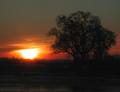
| 12/12/2002 02:01:15 PM |
Minor Sunrise in a Major Keyby inspzilComment: I think this shot would be improved by either darkening or lightening the foreground. Right now, it's dark, like it's suposed to be a silhouette, bt there is still somewhat of detail in it. The black looks cloudy. I think it would be better if totally blacked out. Otherwise, the color is very pretty. Focus seems good to me. Good luck in the challenge. |
 Photographer found comment helpful. Photographer found comment helpful. |
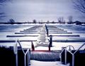
| 12/12/2002 01:59:27 PM |
Marina in Decemberby MorganComment: You have leveled your horizon very nicely. That is something a lot of people (including myself) often forget to do. The pattern is nice. The horizontal lines in combination with the vertical lines on the deck are nice. focus and clarity on the bay seems good to me, however the stair railging in the foreground is a bit distracting to me. Otherwise a nice shot. Good luck in the challenge. |
| 12/12/2002 01:56:54 PM |
Roadside Repairs (Portrait of a friend)by AzrifelComment: They sky is a bit bland, and the buildings in the background are really quite tilted. Taking the background out of the picture though (figuratively speaking) the subject is good. I like how you have a photo of a moment. You can see the concentration on your friends face. I think portraits are best when you get the person doing something to like to do, or something that relates to their person. Focus and clarity are nice. Good luck in the chalelnge. |
| Photographer found comment helpful. |
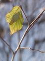
| 12/12/2002 01:53:14 PM |
Enduranceby KarenBComment: I swear I left my comment on this, but apparently it didn\'t stick, or didn\'t go through or something. Anyway, I love the angle and framing/cropping. I like how you have ONLY the leaves in sharp focus and the rest is a blurr. The background is very nice for the shot, and is not distracting in any way. the subtle color is nice, and I like the title very much, it really goes with this shot. Lighting conditions are very nice as well. I like how we see the shadow of the other leaf through this one. Good luck in the challenge. |
| Photographer found comment helpful. |
| 12/12/2002 01:50:04 PM |
Power Cubedby ManicComment: Could this background be becoming a trend? The background is nice, the subject isn't super thrilling, but it does make for a nice abstract-ish photo. The shadows bother me. It has like a double (maybe tripple) shadow and that is what I find myself trying to figure out, rather than looking at the block. The light on the top of the cube seems to me just a tad bright, it almost blends in with the white background. I love the angle and framing/cropping you have chosen. And your focus and clarity are good as well. Good luck in the challenge. |
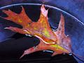
| 12/12/2002 01:43:05 PM |
wet leafby shutterflyComment: I like the subtle difference in the wet part of the leaf and the dry part. The white light reflections add to this shot in my opinion. I think they put just enough variation in the photo that it stays interesting. The colors is very nice, as is your focus and clarity. Good shot. Good luck in the challenge. |
| Photographer found comment helpful. |
| 12/12/2002 01:40:17 PM |
Abstract Martiniby AleciaComment: My only comment about this is an observation really more than it is a complaint. The class seems to not be perfectly even within the frame. That's not a bad thing at all, doesn't matter much to me. just seems at the very top to be more to the left than to the right. Also, another observation is that the black lines that go down the stem make the glass look like it's leaning, when it in fact isn't. (that I can tell) Focus and clarity are great. Colors are wonderful! I think that's what draws my attention to the photo the most is the color. Nice shot. Good luck in the challenge. |
| Photographer found comment helpful. |
| 12/12/2002 01:29:17 PM |
Yuleby KimblyComment: The bulbs on a couple of the lights are a bit washed out by the bright light. The ones around the neck and the ones farthest down seem ok. There is a guy on photosig named Dan Hood that did a shot with this same theme. I know this seems silly to mention, but It would have been nice to have the 3 greens at the top spaced out better, so that there were not the 3 greens right in the same spot. Otherwise, I think the angle and framing/cropping are good. I like how the person is moved to the right of the photo, and the lighting is ok. focus and clarity seem to be just fine. Good luck in the challenge. |
| 12/11/2002 11:59:49 AM |
One Man Bridge Bandby alanfreedComment: I'd have to say I'd be a little upset if that guy banged those snares in my ear. I might have to push him over the edge. lol. Looks like this was taken at a game or something. The angle and framing/cropping are ok. I'm really glad you didn't cut off his foot here. The focus and clarity seem good too. I like the slight motion blurr on his sticks. Good luck in the challenge. |
| Photographer found comment helpful. |
Home -
Challenges -
Community -
League -
Photos -
Cameras -
Lenses -
Learn -
Help -
Terms of Use -
Privacy -
Top ^
DPChallenge, and website content and design, Copyright © 2001-2026 Challenging Technologies, LLC.
All digital photo copyrights belong to the photographers and may not be used without permission.
Current Server Time: 07/25/2026 08:33:10 PM EDT.