| Image |
Comment |
| 02/27/2007 08:21:26 PM |
BW.jpgby mobsterComment: I also prefer this to your entry. It has a strong film feel to it. How did you make the grain so nice? |
 Photographer found comment helpful. Photographer found comment helpful. |
| 02/27/2007 08:19:10 PM |
***by agenkinComment: great shot! (they are both good). Your b/w conversion technique is top notch. |
| Photographer found comment helpful. |
| 02/27/2007 08:15:49 PM |
|
| Photographer found comment helpful. |
| 02/27/2007 08:10:54 PM |
Unfriendly?by SaraRComment: great photo. The b/w conversion I think could be improved: tones are a little bit muddled, at least on my monitor. |
| Photographer found comment helpful. |
| 02/27/2007 08:08:22 PM |
A face in the crowdby SaraRComment: nice shot. It reminds me jjbeguin's photo

except there is no clear eye contact here :). |
| Photographer found comment helpful. |
| 02/26/2007 02:44:38 PM |
BYOBby tfarrell23Comment: Nice photo. I wish I knew what was BYOB (buy your own beer?), I guess I'll have to google it. |
| Photographer found comment helpful. |
| 02/26/2007 02:43:31 PM |
|
| Photographer found comment helpful. |
| 02/26/2007 02:42:33 PM |
|
| Photographer found comment helpful. |
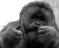
| 02/26/2007 02:40:48 PM |
CEOby vtruanComment: I like the idea, but not the blown background on the left. It makes for a weird edge of the gorilla's fur. |
| Photographer found comment helpful. |
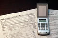
| 02/26/2007 02:27:02 PM |
IRSby EssAreDubyaComment: Good lighting. I would turn the calculator on, some (fake) words/numbers in the 1040, perhaps plaxce a pen or pencil somewhere to bring more life to the shot. I also would use a different, more structured background (solid black looks too artificial here). |
| Photographer found comment helpful. |
Home -
Challenges -
Community -
League -
Photos -
Cameras -
Lenses -
Learn -
Help -
Terms of Use -
Privacy -
Top ^
DPChallenge, and website content and design, Copyright © 2001-2026 Challenging Technologies, LLC.
All digital photo copyrights belong to the photographers and may not be used without permission.
Current Server Time: 06/22/2026 02:58:37 PM EDT.