| Image |
Comment |
| 06/09/2006 01:30:42 PM |
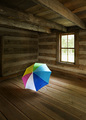
Not Superstitious by rioloboComment: Creative and well done. The natural wood tone works well with the colorful umbrella. Minor distraction of the umbrella shadow on the far wall/floor (fill light flash?). This looks like a historical/tourist type building. I'll have to come back later to find out where. ;^) |
 Photographer found comment helpful. Photographer found comment helpful. |
| 06/09/2006 01:28:25 PM |
Last Whisperby xianartComment: Nice job of processing to direct the viewer to the main subject item. Nicely done. |
| Photographer found comment helpful. |
| 06/09/2006 01:27:36 PM |
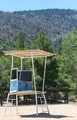
Pre-Season Abandonmentby littlegettComment: Oops! Forgot the empty room... You've framed your subject well. The lighting is a bit harsh (early or late day sun would work better for this). |
| Photographer found comment helpful. |
| 06/09/2006 01:25:03 PM |
Guitar Soloby L1Comment: The room is nearly a non-subject in this image. The guitar is the first item to grab your attention, then the door across the alley, then the doorway of the room. While it's an interesting image I think it's a bit thin on hitting the correct subject matter for this challenge. You've done a nice job of processing this. Good luck in the challenge. 6 |
| Photographer found comment helpful. |
| 06/09/2006 12:16:43 PM |
Good Bye Roseby banmornComment: Need more thorns, less flower - or - no bloom at all. ;^)
Very nice DOF choice and good lighting, focus and clarity. |
| Photographer found comment helpful. |
| 06/09/2006 12:14:48 PM |
Armorvillaby KronusComment: Very creative! The chalkboard might be a second item, chalk a third, and chalkboard eraser ... ;^) Good luck getting past the DNMC crowd.
p.s. - I'm not voting, just cruising thru. |
| Photographer found comment helpful. |
| 06/09/2006 12:14:00 PM |
time and spaceby saintaugustComment: Clean lines. Creative setup. From the thumbnail I thought the clock was put in the top corner of the room. This was easier. ;^) |
| Photographer found comment helpful. |
| 06/07/2006 03:04:35 PM |
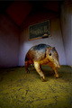
Did you say walkies?by joynimComment: Hi. Saw your post in the forums so I decided to take a peek. Quite honestly, I've looked at this image for a couple of minutes now and I'm having a tough time finding comments to provide. The image is fine. Nothing really jumping out at me that I really find interesting (subject is kind of plain - nothing personal), and nothing screams out to be fixed. :(
Composition is ok. Exposure and lighting is very good. Ummm....what else? Maybe if you could have gotten below the subject's level - like elevate the subject on a table and shoot upwards a little to add another dimension and interest?
Wish I could say more. Sorry. |
| Photographer found comment helpful. |
| 06/07/2006 12:19:27 PM |
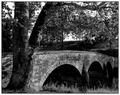
Burnside Bridge at Antietam Creekby novaComment: You did well on your "do-over"! I like this composition much better and you have a nice tonal range in the B/W pp. Good luck! p.s. - I didn't read the comments on your other image, so I'm not sure what changes you were going after. Another p.s. - I didn't vote on this as I'm not voting on any images in this challenge. |
| Photographer found comment helpful. |
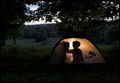
| 06/07/2006 08:04:16 AM |
First Campoutby glad2badadComment: Thanks! You hit it right on the head, as far as what I was attempting to do.
Originally posted by ShutterPug:
Very nice job - love the sihouoettes of Mom and child in the tent by the glow of the inside light. I like the composition too - not too tight cropped, lets me see the area they are camping in without losing the subject matter |
|
Home -
Challenges -
Community -
League -
Photos -
Cameras -
Lenses -
Learn -
Help -
Terms of Use -
Privacy -
Top ^
DPChallenge, and website content and design, Copyright © 2001-2026 Challenging Technologies, LLC.
All digital photo copyrights belong to the photographers and may not be used without permission.
Current Server Time: 05/08/2026 09:56:54 PM EDT.