| Image |
Comment |
| 10/03/2002 05:34:00 AM |
Quiet Reflection - No Mirrorby SimmsComment: Aced… Can't fault this… Lighting is dramatic. I can't quite see how you got the appearance of the double candle flame on the left side of the shot, possibly because there is glass in the frame, but however you did it, it's the icing on an already mouth watering cake… Fantastic inventiveness and superb shooting (10) |
 Photographer found comment helpful. Photographer found comment helpful. |
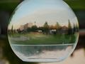
| 10/01/2002 11:20:00 AM |
Heaven on Earthby micalaurrComment: Magic… Love it… Only moan; I would have liked to see the top of the sphere (bubble? If it is, that must have been a tough shot to get), apart from that small, almost pedantic, pathetic little point, I think it's a great shot… (9) |
| 10/04/2002 09:00:00 AM |
|
| Photographer found comment helpful. |
| 09/30/2002 11:31:00 AM |
Umm.. I can't think of oneby pattonxComment: This is a great shot with one small – in my opinion – element that lets it down. The rock at the bottom of picture draws you away, a bit like looking at the finger rather than to where it is pointing. Crop that out and I think it would be a lot closer to the big Oooh factor. Other than that, I think it's a praiseworthy effort (7) |
| 10/01/2002 11:44:00 AM |
One for all, all for oneby AzrifelComment: I really like the idea and the shot itself isn't bad; I just think a splash of colour to offset the power of the green would have added balance to the shot… (7) |
| Photographer found comment helpful. |
| 09/30/2002 09:22:00 AM |
Floating Flameby bayuComment: Great shot, but the people in the picture spoil it quite a bit. I think this is because they break the dramatic diagonal symmetrical pattern within the shot and draw the eye away from the picture as a whole. This is a small point, but it stops a great picture from being an awesome shot… (7) |
| 10/03/2002 09:29:00 AM |
10 PINS by clickerComment: Pinball – wizard shot :o) Love it, great shot – I presume this shot is somehow related to the other pinball shot (just curious) – I like this shot (only slightly) better than the other, mainly because the symmetry adds to the overall composition… (10) |
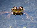
| 10/01/2002 11:15:00 AM |
Four Eyesby vtruanComment: I like the idea – I love frogs… For me, the composition of the shot is a little too central; I'd have been temped to treat a shot like this in much the same way as the negative space challenge and used the background to focus attention onto Froggy. Maybe, zoom out a few feet and place Froggy in the top right third of the image. Hope that doesn't sound too pedantic, good luck, and hey, it's a not a bad shot anyway… (7) |
| Photographer found comment helpful. |
| 10/01/2002 10:54:00 AM |
Life Saverby DCThiessenComment: I'm sure I have seen this shot on PhotoSIG… I thought it was superb then, and I think it's superb now… (10) |
| Photographer found comment helpful. |
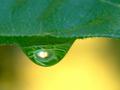
| 09/30/2002 11:59:00 AM |
Inside the Dew Dropby mcraelComment: Love the colours; I think the biggest plus is the fact you haven't tried to make sense of what is reflected in the drop; this is a classic 'less is best' shot that really works. Awesome… (10) |
| Photographer found comment helpful. |
Home -
Challenges -
Community -
League -
Photos -
Cameras -
Lenses -
Learn -
Help -
Terms of Use -
Privacy -
Top ^
DPChallenge, and website content and design, Copyright © 2001-2026 Challenging Technologies, LLC.
All digital photo copyrights belong to the photographers and may not be used without permission.
Current Server Time: 07/16/2026 03:01:20 PM EDT.