| Image |
Comment |
| 05/06/2005 12:09:53 AM |
Portalby admart01Comment: This looks like something that scalvert would make. And I mean it in the best possible manner - I love the execution. The difference in color tone between this side and the other side is just subtle enough to enhance the power of the image. 8. |
 Photographer found comment helpful. Photographer found comment helpful. |
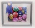
| 05/06/2005 12:04:25 AM |
one day . . .by buzzmomComment: I like the hazy edges, it contributes to the 'dream' feeling. However, with this one I think the blue will remain a dream worth pursuing though. Is that a signature & year in the lower-right? Could have done without it. Suggestion: The ribbon might have been better placed more centrally, to be the main object of the photo... 6. |
| Photographer found comment helpful. |
| 04/29/2005 02:37:26 PM |
Buttonby ckdakeComment: Excellent idea - although would have been better without that mark on the skin from the wardrobe... 7. |
| Photographer found comment helpful. |
| 04/29/2005 11:24:25 AM |
strollby messerschmittComment: I like the positioning of the person in the photo. Apparently there must be something correct with that golden ratio rule. It is pleasing to the eye...
the only thing that seems unnatural is the color of the sky. the edges of the road - the transition from the road to the grass is also unnaturally clean for the rural landscape like this one.
I may be wrong, i.e. it may be like this in nature, but it does not seem like a naturally occurring phenomenon.
-S. |
| Photographer found comment helpful. |
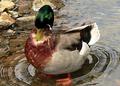
| 04/28/2005 05:23:00 PM |
Preening (larger version)by bcobleComment: If only you'd submitted this one instead - probably would have made a whole point difference. People score photos down if you don't make use of full 640 pts.
by the way, love your shot. Love the ripples in the water.
ps. My personal best is similar:-) |
| Photographer found comment helpful. |
| 04/28/2005 02:13:06 PM |
Leaving the Carcassby jbsmithanaComment: The typical shot of any living thing is expected to let the viewer follow through by following the direction in which the object looks or moves towards.
What I'm trying to say is, the bird belongs to the top-right corner of the photo, not the top left. |
| Photographer found comment helpful. |
| 04/28/2005 02:11:33 PM |
The key to life is to find the key to life of the key, o'key?by bergwaltersComment: The key seems to be too far near the edge of the photo. I normally do not consider the rule of 3rds to be ubiquitous, but in this case I think that the key does belong somewhere in the golden ratio area - with its current orientation, it could go a bit to the left and a bit more towards the top.
Also the light parts of the key looks overblown. |
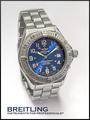
| 04/28/2005 01:54:27 PM |
Who says girls have all the fun? by snackwellsComment: Very nice - the best wristwatch shot of the challenge. One of my top 5.
I like the 10:10 hands setting - many entries ignored this common trick to achieve symmetry and show the background of the watch in a best possible manner.
Like the soft light. Bumping up to 9 on the second pass.
|
| Photographer found comment helpful. |
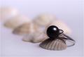
| 04/28/2005 01:51:39 PM |
The Black Pearlby vasilkovayaComment: Good idea with shells. A softer light source might have been a better idea, more diffused light would leave less of the reflection on the pearl and improve the overall image. 7. |
| Photographer found comment helpful. |
| 04/28/2005 01:50:27 PM |
Pinkby rebelgirlComment: I would have preferred to see a different background - white does not provide enough contrast for the advertisement. There is also a shade/reflection of pink on the white that bothers me a little bit. 7. |
| Photographer found comment helpful. |
Home -
Challenges -
Community -
League -
Photos -
Cameras -
Lenses -
Learn -
Help -
Terms of Use -
Privacy -
Top ^
DPChallenge, and website content and design, Copyright © 2001-2026 Challenging Technologies, LLC.
All digital photo copyrights belong to the photographers and may not be used without permission.
Current Server Time: 07/17/2026 10:05:04 PM EDT.