| Image |
Comment |
| 07/10/2005 12:11:01 AM |
Somthing that people should use!by saevarComment: The packaging is distracting here, the condom by itself would have been sufficient. The bright orange color at the same time out of focus really subtracts from the otherwise original concept in this challenge. |
| 07/08/2005 11:43:56 AM |
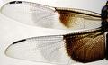
Dragonfly wingsby MarkComment: My favourite - interesting composition, clear image, nice colors given the subject. Bumping up to 9. |
 Photographer found comment helpful. Photographer found comment helpful. |
| 07/08/2005 11:42:49 AM |
Net Shot Gerbera Xby banmornComment: I believe that this is the most original and at the same time well executed photo of this challenge.
I'm not sure if that was possible, but I'd tried to get the flower in the background dead-centered. Or at least, cropped out the top-left empty corner.
This shoud ribbon, IMO. |
| Photographer found comment helpful. |
| 07/06/2005 02:13:23 PM |
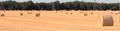
HEY!!by bffatwComment: It is too small (no, I'm not complaining, just realizing that DPC format is not conducive to panoramic photos - you are using max width here). For this reason, I would avoid submitting panoramas to DPC challenges.
It seems as if the bottom and the right side are cut off - that the canvas is a pixel or two bigger than it should be.
Otherwise, in my opinion of course, there should either be more of the sky shown in the photo, or no sky at all. This way it looks artificially cut off. The field itself is lacking contrast in the details. |
| 07/06/2005 02:23:19 AM |
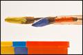
Primary colorsby AranchaComment: Red looks orange on my screen, and I just checked the monitor before writing this comment. But that's besides the point, as this is not the primary colours challenge. Like the brushes and esp. how the middle one is bent. |
| Photographer found comment helpful. |
| 07/06/2005 02:14:42 AM |
Young Sherlock Holmesby dsa157Comment: This one is bound for the home page. You've got the iris, you've got the magnifying glass circle, and the only thing lacking is perhaps a bit of off-centre composition. Might have been better with more negative space to the right, bringing the eye in the lower left 1/3rd of the image... |
| Photographer found comment helpful. |
| 07/06/2005 02:06:20 AM |
|
| 07/06/2005 02:03:18 AM |
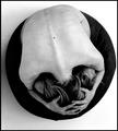
Circle Of Despairby SondaComment: An interesting take on the challenge: it is the most powerful image so far (90 of 550 viewed/voted till now) and the only one that left me thinking and forced me to stop and comment. I'd like to see this one in top 10%... |
| Photographer found comment helpful. |
| 07/02/2005 12:41:14 AM |
SHAMEFULLY not yet obsoleteby greslizzzComment: Wow! Where did you find this? I'm sure that pretty much every country in the world has laws against something like this.
Photo-wise, a tighter crop would be better. |
| Photographer found comment helpful. |
| 07/01/2005 11:33:57 PM |
An Obsolete Way of Lifeby rlinn3Comment: Wow, what a powerful image. I know that it may suffer from the challenge topic ambiguity, but I'd really like to see it in top 10. And the horizon is perfectly OK, it does not need straightening. |
| Photographer found comment helpful. |
Home -
Challenges -
Community -
League -
Photos -
Cameras -
Lenses -
Learn -
Help -
Terms of Use -
Privacy -
Top ^
DPChallenge, and website content and design, Copyright © 2001-2026 Challenging Technologies, LLC.
All digital photo copyrights belong to the photographers and may not be used without permission.
Current Server Time: 07/17/2026 03:51:46 PM EDT.