| Image |
Comment |
| 02/09/2005 06:58:29 AM |
Painfull lifeby DogAngelComment: Could be sharper. If it wasn't for the make-up, the pain would be hardly visible. Maybe you could have included a reason for her pain in the picture. 5. |
 Photographer found comment helpful. Photographer found comment helpful. |
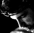
| 02/09/2005 06:57:24 AM |
the passionby charliebakerComment: Nice composition and theme. I thought about this too, but rejected the idea. Your loghting is a bit harsh I think. The right half of the face is blown out. Perhaps you just used too much contrast. The grain is cool. 6. |
| Photographer found comment helpful. |
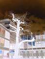
| 02/09/2005 06:54:15 AM |
A Tree in PAINby tazzaComment: Why did you turn this negative? I think it would have been great in it's original colours, with a narrow DOF on the tree. It looks as if the tree was twisting it's branches in pain because some were cut off. The negative really ruins this for me. 4. |
| Photographer found comment helpful. |
| 02/09/2005 06:53:03 AM |
Happy Bootsby KaupsComment: I cannot see the pain in this picture. It actually seems that the kid is smiling... Shouldn't is be sad that the vehicle 'crashed'? Your title also suggests that this doesn't show pain. I don't see the link to the challenge. 3. |
| 02/09/2005 06:51:36 AM |
|
| Photographer found comment helpful. |
| 02/09/2005 06:50:30 AM |
Griefby sfboatrightComment: Oh, not another woody picture... hey wait, this one's godd, actually! I didn't know woodies could show emotions. Nice. Now, if only the second hand was inside the focus, the DOF would really add some athmosphere. Nice colour tone and lighting. 8. |
| Photographer found comment helpful. |
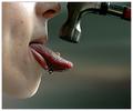
| 02/09/2005 06:48:49 AM |
Ouch! doesn't quite cover itby Glen KingComment: The negative gives your picture an alien look and emphasizes the mark on your arm and hand. But this doesn't suggest pain to me. Your picture is a bit out of focus and shaky. 5. |
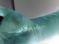
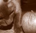
| 02/09/2005 05:03:26 AM |
Kitty Nose with Appelby charliebakerComment: You got me. I had a feeling this might be someone going for the brown but I wasn't sure, so I preferred giving tips to that poor photog who couldn't handle his/her camera. Ouch. |
| Photographer found comment helpful. |
| 02/08/2005 04:57:00 PM |
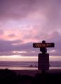
The Flagrant Crossing by CutterComment: Cool colour and composition. The signs is a little too bright for my taste, but at least it really stands out against the baclground. On second thought, it's fine. 8.
Revisit. Bumping to 10. |
| Photographer found comment helpful. |
| 02/08/2005 04:56:15 PM |
|
| Photographer found comment helpful. |
Home -
Challenges -
Community -
League -
Photos -
Cameras -
Lenses -
Learn -
Help -
Terms of Use -
Privacy -
Top ^
DPChallenge, and website content and design, Copyright © 2001-2026 Challenging Technologies, LLC.
All digital photo copyrights belong to the photographers and may not be used without permission.
Current Server Time: 07/22/2026 06:50:11 PM EDT.