| Image |
Comment |
| 04/30/2006 12:37:38 PM |
Delicate Situationby banditComment: Whoa! You definetely ain't afraid of putting yourself in danger for a good photograph! I congratulate you for your bravety. Did you use a lens hood, just in case? :) |
 Photographer found comment helpful. Photographer found comment helpful. |
| 04/30/2006 12:33:50 PM |
Light & Shadowby cmeierComment: Cool balance of light and shadow. I find it interesting that you used a white backdrop, the dark background seems perfect and I'd probably have maken the mistake of taking a dark background from the start. |
| Photographer found comment helpful. |
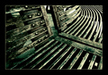
| 04/30/2006 10:17:01 AM |
Urban linesby tonyleesComment: This is one of those images which ended up in my favourites immeadiately because of my appreciation of deep, corroded textures and clear lines and shapes. The eye is drawn nicely around the image, from one corner to another. The dark green tones give it a nice touch. |
| 04/30/2006 10:11:50 AM |
by Joey LawrenceComment: Funny, I realise how my recent image 'Trapped' is somehow similar to this photograph. The funny thing is that this has been in my favourites for some time now, and yet I did not even think of this shot when I took my image. |
| Photographer found comment helpful. |
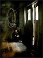
| 04/30/2006 10:09:38 AM |
Death at the Lakeby sherComment: I'm really impressed by the depth of the textures in your image. They reflect they gravity of your subject well, so does the B&W conversion. |
| Photographer found comment helpful. |
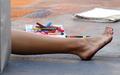
| 04/30/2006 10:04:06 AM |
Pasadena Chalk Fest 3by pidgeComment: An interesting perspective which gives a look behind the scenes of the chalk painting. A slightly higher point of view would have emphasized the pile of chalk and taken the leg out of the center of the composition. |
| Photographer found comment helpful. |
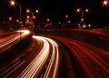
| 04/30/2006 10:00:52 AM |
Nightime Travelsby pidgeComment: You did a good job in portraying the speed and business of City Life. The trails are cool because they are so long, only few of them are 'chopped off'. The highlights look really good, but the rest of the scene might have been a bit brighter. |
| Photographer found comment helpful. |
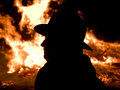
| 04/30/2006 09:56:52 AM |
Fiery Profileby magnusComment: The backlit sitoutaion works well here. The contrast between the black silhouette and the fire as a source of light, trying to reach the face, is quite impressive. The shallow DOF is good as well. |
| Photographer found comment helpful. |
| 04/30/2006 09:54:55 AM |
March of the Penguinsby magnusComment: I see you mention Teger, in fact I was reminded of his work when I saw this image. You gave it a nice twist with the penguins. It might have worked better however, with a deeper DOF, it would have given the impression of a smaller scale, less like a macro. |
| Photographer found comment helpful. |
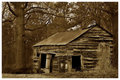
| 04/29/2006 06:38:01 AM |
This Old Houseby SDWComment: Lovely tones here. The brown really conveys a sense of decay and isolation. The house looks as abandoned as it could be. I like how it merges, in a way, with its surroundings, nature is again taking control of this place.
The poem is also nice to read, it goes well with the image. |
| Photographer found comment helpful. |
Home -
Challenges -
Community -
League -
Photos -
Cameras -
Lenses -
Learn -
Help -
Terms of Use -
Privacy -
Top ^
DPChallenge, and website content and design, Copyright © 2001-2026 Challenging Technologies, LLC.
All digital photo copyrights belong to the photographers and may not be used without permission.
Current Server Time: 07/17/2026 12:42:37 AM EDT.