| Image |
Comment |
| 12/23/2004 05:33:19 PM |
Vigilanceby spreadcomComment: Nice idea, I like how you show the connection between man and animal. It would have been much better if you had taken the picture form the other side - the one where both the kid and the dog are looking at. The text of the book is unimportant, the cover might even look better. This way, you might also have left the desk lamp out of the picture, which - IMO - you should have cropped anyway. 5. |
 Photographer found comment helpful. Photographer found comment helpful. |
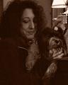
| 12/23/2004 05:30:31 PM |
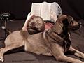
Mom's babyby PaulinaRDComment: I don't like this one. It' hard to see the dog, I have to guess where it's eyes are and seeing any limbs. The direct light is quite unspectacular and the flash created some ugly reflections on every metallic surface and in the eyes. I don't want to offend you, but that couch is really ugly. This is of some importance to the picture, as is is part of the background. There's almost more detail on the couch than on the dog. 2. Sorry. PM me after the challenge if you think I voted unfair on your picture. |
| 12/23/2004 05:26:50 PM |
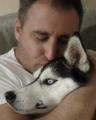
Love Me Tenderby secondglantzComment: This picture shows the relationship man-dog very well. It would have been even better if the dog had closed his eyes, like his owner. You might have used a more uniform background, the limit between couch and wall is distracting. 6. |
| Photographer found comment helpful. |
| 12/23/2004 05:25:12 PM |
Secretsby PaigeComment: Uh, I'm having trouble feeling the emotion in this. The dog looks quite disinterested and bored, as if he wanted to get away from the kid. Not a very good thing, considering you wanted to show the profound relationship between both. 3. |
| Photographer found comment helpful. |
| 12/23/2004 05:23:30 PM |
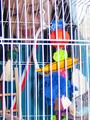
Mama's gonna buy you...by basia03Comment: Nice idea. Though I don't think a cage in a shop would look like this. The bars are really distracting. They destroy the image, cut it in slices. They distract from both the bird and the girl. You might have let the girl watch the bird though a window, pressing her cheeks against it or looking with happiness at her future friend. 2. |
| Photographer found comment helpful. |
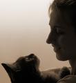
| 12/23/2004 05:20:49 PM |
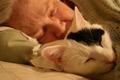
Sleep Togetherby scottswanComment: Nice, I like the paralellism between pet and person! The woman (?) in the background is either to blurred or not blurred enough. This grade of blur is distracting. Getting her even more out of focus would have put more emphasis on the cat, having her sharper would have given both an equal importance to the composition. I hope this helps. Keep'em coming! 5. |
| 12/23/2004 05:17:40 PM |
Judy and Daliby banmornComment: Is it me or do they look alike? :) The woman really seams to love 'Dali'. Is he named after Salvador Dalí?
There are too many details in the background: the lamp, the figurine, the window curtains. They distract from the main subject.
Consider running images with lots of noise through a program like Neat Image or Noise Ninja. PSP9 has an anti-noise function, too. Sometimes noise is an interesting image feature but for this shot it's distracting. |
| Photographer found comment helpful. |
| 12/23/2004 05:14:03 PM |
Charm by AlbireoComment: Great. The duotone works well, so does the negative space. I'd have mirrored the picture (my eyes ar used to start at the upper-left, like most European, American etc eyes). This would have given a stronger effect to the guiding lines. I like how the picture is split into two triangles, whether that was intended or not, it look very harmonic. The soft focus adds to this. I guess you earn a 10 :) |
| Photographer found comment helpful. |
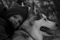
| 12/23/2004 05:10:18 PM |
Meg and Scrappyby blancericComment: You could have cropped away most of the left side. The right shoulder is out of focus, but it's too important to be shallow. Showing the kid's (?) eyes would have brought in a lot more emotion. |
| Photographer found comment helpful. |
| 12/23/2004 05:08:34 PM |
My Friend Nikitaby mzuriComment: Sooo cute! Nice DOF, the B&W was a good choice, the dog might look a bit more into your direction (but it's hard to tell a dog to look into the cam ;). I'd have liked to see some more details on the kid's clothes. Good job. |
Home -
Challenges -
Community -
League -
Photos -
Cameras -
Lenses -
Learn -
Help -
Terms of Use -
Privacy -
Top ^
DPChallenge, and website content and design, Copyright © 2001-2026 Challenging Technologies, LLC.
All digital photo copyrights belong to the photographers and may not be used without permission.
Current Server Time: 07/18/2026 07:53:51 AM EDT.