| Image |
Comment |
| 01/02/2005 06:04:34 AM |
For Whom The Bell Tollsby plumber711Comment: Ah, a Hemingway fan :) Or John Donne?
Looks nice, but I'd have kept this image for another challenge. A gong is not mechanical, it's acoustic, isn't it? In our physics classes, there were two different chapters for each. You'll surely tell me after the challenge if I'm wrong. A church clock would have been more mechanical, as you have to pull a rope to make it toll. Anyways, the picture is nice, but because of the weak link to the challenge, I give you a 6. |
 Photographer found comment helpful. Photographer found comment helpful. |
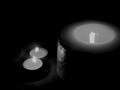
| 01/02/2005 05:58:22 AM |
Truth In Lightby thewritersideComment: I can't see the link to the challenge. I can't see too much of the light either. There are no interesting shadows, just darkness. 1. |
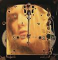
| 01/02/2005 05:46:09 AM |
Clock Faceby MarieWComment: Wohooo! I didn't see the face at first. Great! Looks a bit oversharpened though, there's a halo around the edges. It's definately the face that makes me give you a 7. Message edited by author 2005-01-05 11:04:47. |
| Photographer found comment helpful. |
| 01/02/2005 05:26:04 AM |
Fire toolsby miriam_mrbComment: I'cant see why fire tool should be mechanic. I can't see the fire tools at all! Or almost not. The picture is just too dark, the one thing you refer to can barely be seen. 2. |
| 01/02/2005 05:24:57 AM |
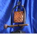
Hammer and Stringsby sbeaumontComment: Cool composition. I'd have preferred a b&w version. Maybe you'll post one in the forums after the challenge. 7. |
| Photographer found comment helpful. |
| 01/02/2005 04:56:39 AM |
Pop goes the Santa....by HornOUBetComment: Seems too easy, simple. The picture doesn't look as if you tried to do something special.
It's mechanical all right, but it doesn't show too much of it, except for the lever at the right. The lighting is okay, the details come out well. 4. |
| Photographer found comment helpful. |
| 01/02/2005 04:54:39 AM |
"Old School"by cwalmyeComment: Nice sepia toning. A bit out of focus, USM might help. The streak in the background is distracting. 6. |
| Photographer found comment helpful. |
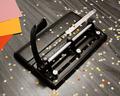
| 01/01/2005 06:24:27 PM |
Gearby HalimComment: Nice colours. Were they like that or did you add them during post processing?
What the heck did you do with that border? It's completely irregular and thus distracting. That really costs you a point. So, only a 6. |
| Photographer found comment helpful. |
| 01/01/2005 06:21:06 PM |
|
| Photographer found comment helpful. |
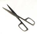
| 01/01/2005 06:17:10 PM |
Simple Sissorsby jimmspComment: A bit too simple. Yes, it's mechanical, but it's just too easy, flat.
You might have shown the cissors in action.
Or in perspective.
Or a cissors' shadow cutting the background.
Or some weird mechanism that handles the cissors.
At least it's sharp and the background is pure white. 3. |
Home -
Challenges -
Community -
League -
Photos -
Cameras -
Lenses -
Learn -
Help -
Terms of Use -
Privacy -
Top ^
DPChallenge, and website content and design, Copyright © 2001-2026 Challenging Technologies, LLC.
All digital photo copyrights belong to the photographers and may not be used without permission.
Current Server Time: 07/18/2026 08:02:16 AM EDT.