| Image |
Comment |
| 10/17/2003 10:30:52 AM |
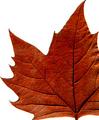
Colour of Fallby tommy_tComment: Very nice. I like how the thin border is in proportion to the veins on the leaf. Interesting visuals created by the negative space. 9 |
 Photographer found comment helpful. Photographer found comment helpful. |
| 10/17/2003 10:27:23 AM |
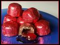
Rigatoni Loversby A WeaverComment: This is lovely. Is it tilred ever so slightly to the right? I think the level of the wine should be straightened to match the frame (nice frame too). 8 |
| Photographer found comment helpful. |
| 10/16/2003 09:41:23 AM |
|
| Photographer found comment helpful. |
| 10/16/2003 09:39:59 AM |
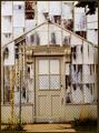
Exposing A New Dimensionby ColeyComment: Would a vertical crop be better? Does all the negative space on the right and left contribute anything to the composition? |
| 10/16/2003 09:18:57 AM |
|
| Photographer found comment helpful. |
| 10/10/2003 12:34:16 PM |
|
| Photographer found comment helpful. |
| 10/10/2003 12:23:31 PM |
|
| Photographer found comment helpful. |
| 10/10/2003 10:47:38 AM |
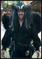
Devil Knightby GordonComment: Great charactre, great costume. not a great photo. Needs a more interesting angle to make him truely frightening or threatening, the straight on approach is boring. Could use some post processing boost in contrast. There is too much (albeit interesting) stuff going on in the photo. I would have prefered a better look at hs horns, or his claws, or the skull on his belt. Does he have feathered wings? The colored stuff at the top is also distracting. |
| Photographer found comment helpful. |
| 10/10/2003 10:43:13 AM |
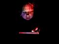
Daydream Believerby channeledComment: This is a flat image. I mean it has not much dynamic or interesting. If you think of the quote "Photography is all about light" as you shoot you will get more interesting photos. I forget who to attribute the quote to. What did you mean to convey with this picture? And have you made that idea the focal point? I would think that the eyes should be the most intersting but they are slightly out of focus and not well lit. The hair and the lips are actually what stand out the sharpest. I bet with some minor post processing adjustments you could make this image much better. |
| 10/07/2003 04:26:34 PM |
.. an angel dream ..by magnetic9999Comment: This is nice- It is almost but not quite great. She feels very crowded at the top, why is it cropped so close to her head?? and she feels a littlee crowded at the bottom, a little more room would make the cloud like feling better, Also what's with the foot stool. couldn't that be moved out of the way? or is it supposed to be a bed? Maybe if it was white it wouldn't dominate that corner of the photo so much. The rest I love- I like the glint on her ring and bracelt that matches the glint on her shoes. I like the way her hair looks like the feathers on her wings. I like the smokey cloudy background. I wonder if you could have done more with er pose - she looks a little slouchy. 7 |
| Photographer found comment helpful. |
Home -
Challenges -
Community -
League -
Photos -
Cameras -
Lenses -
Learn -
Help -
Terms of Use -
Privacy -
Top ^
DPChallenge, and website content and design, Copyright © 2001-2026 Challenging Technologies, LLC.
All digital photo copyrights belong to the photographers and may not be used without permission.
Current Server Time: 07/24/2026 10:18:15 AM EDT.