| Image |
Comment |
| 05/10/2006 08:30:53 AM |
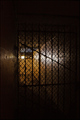
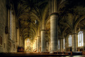
Secret WWII-Era Prison Discoveredby chaliceComment: [[Trading Post]]
Sorry I hadn't gotten around to commenting on this one yet! I really like the lighting. There may be other better ways to do it, but this screams "prison" to me. Some of the stuff in the background is a little confusing, though, and I spend too much time trying to decipher what it is. Probably would have given this a 5 or 6.
EDIT - for a PJ shot, this IS a bit too dark, IMHO. Message edited by author 2006-05-10 08:31:40. |
 Photographer found comment helpful. Photographer found comment helpful. |
| 05/10/2006 08:27:50 AM |
Every Day Rhythmsby tngrndreamComment: [[Trading Post]]
Others may disagree, but I like this lighting. It does create a touch of a glare, but the shadows are still filled with detail and interest, and I think that is good. It does fall a little short of making me think "rhythm" at first look. I see what you've done and I think I understand the point, but the circular shape just doesn't feel rhythmic, even though it is repetitious and continuous. I would have probably given this a 6. |
| Photographer found comment helpful. |
| 05/10/2006 08:24:04 AM |
A Day Outby tngrndreamComment: [[Trading Post]]
I really like this composition! There's something odd, though, in the blooms. I suspect you had to really compress this to meet the size and thus lost a lot of detail. That's just the appearance, I'm not positive. The little branch at the lower right is a little disctracting, too. The exposure is good, with the obvious exception of the sky. This is a good shot, just not a lot to keep the interest up. |
| Photographer found comment helpful. |
| 05/10/2006 08:12:57 AM |
|
| Photographer found comment helpful. |
| 05/10/2006 08:08:29 AM |
|
| Photographer found comment helpful. |
| 05/10/2006 08:07:36 AM |
|
| Photographer found comment helpful. |
| 05/10/2006 08:07:07 AM |
Rainbow Rythm by timfythetooComment: Trading Post....
Wow, Tim. This is cool! It's an excellent shot, with awesome colors. There's not a lot of critiquing to do; the sky does seem a touch noisy, but congratulations none the less! |
| Photographer found comment helpful. |
| 05/10/2006 07:51:16 AM |
|
| Photographer found comment helpful. |
| 05/03/2006 12:35:06 PM |
Naturallly Complementedby ericwooComment: [[Trading Post]]
My first impression is "Great Color!" My second is "Neat Image? Maybe a hair too much, maybe none at all???" A sheet of white paper stuck down on the right side to blank out that background area would have probably given you a full point in the score (my opinion). Excellent composition; the yellows are a BIT oppressive, but not terribly so. |
| Photographer found comment helpful. |
| 05/03/2006 12:32:14 PM |
...rorrim ,rorriMby timfythetooComment: [[Trading Post]]
In general, it looks like it served you pretty well. The image doesn't really appeal to me that much, but it is a clever technique, and I probably would have given you a 6 or 7. While I like blue skies, blue images just don't appeal to me for some reason, and there's a lot of blue here. Excellent idea, and well done. |
| Photographer found comment helpful. |
Home -
Challenges -
Community -
League -
Photos -
Cameras -
Lenses -
Learn -
Help -
Terms of Use -
Privacy -
Top ^
DPChallenge, and website content and design, Copyright © 2001-2026 Challenging Technologies, LLC.
All digital photo copyrights belong to the photographers and may not be used without permission.
Current Server Time: 07/23/2026 12:17:42 PM EDT.