it meets the challenge, but that's it, pictures of kitchenware usually never score above bottom 20%, there has to be something spectacular in the image to do that, and unfortunately your image is not spectacular, it's rather boring... something you see every day at the dinnertable and would never think about photographing.
sorry to be so harch, but that's what we learn from :)
--Trading Post Comment--
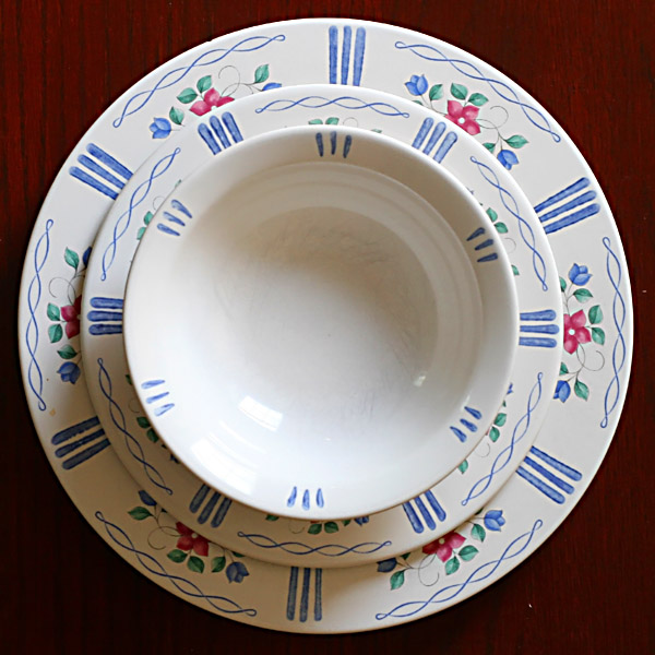
You met the challenge well here, but I think that this one was just too commonplace for most voters. I like the tight, square crop for this one, and the focus is crisp. Technically, its a nice shot, and would work well for a product photography challenge.
I think this would have made a much more interesting composition had you focussed on just a section, maybe a quarter of this view, to make it more of a study of the patterns & curves rather than a set of dinner 'things'. The lighting seems good, but could maybe do with a touch more contrast to bring out the colours, or maybe hue/sat.
The idea suits challenge fine, but I think the square-on centred format makes it a touch static.
Hmmm. This one left me a bit flat. Its nice that you have the decorations arranged symmetrically. I dont know if its the decoratiosn or the focus but it seems just a wee bit soft. The colors are a bit flat - but I think thats just the way they are. I think what would have made this better would be to crop the shot or take the shot that takes in only a quarter of your objects. When I resize my page to just show the lower right corner from the center of the bowl the pic becomes a bit more interesting. Even a hlaf shot may have been better. The whole plate set in the square crop just doesnt do much for me. Half shot could give more of an interesting balance of light and shadows and maybe even make you look at it a bitlonger to think about what it was you were looking at instead of opening up the shot and seeing "plate, plate, bowl".
Trading Post comment
I liked this as a choice for the challenge, particularly given the title. I may have preferred less of a direct angle, though that may not have created the pattern as well. I do think a more colorful background would have brought out the subject better, and maybe red berries in the bowl - though that may be too much. Lighting looks pretty good to me. Focus is a bit soft but may just need a touch more unsharp mask to correct. By the way, it's pretty striking if you desaturate it to black and white.
Trading post...
I see the rhythms in the line placement. This is a nice setup but not really eye catching. The things that could be improved (don't take this the wrong way) would be using dishes that were newer looking, you can see the scratches at the bottom of the bowl as well as a small spot (or stain) on the side of the largest plate. Also, maybe a matching blue background. I didn't score this challenge, but would have given you a 5.
Others may disagree, but I like this lighting. It does create a touch of a glare, but the shadows are still filled with detail and interest, and I think that is good. It does fall a little short of making me think "rhythm" at first look. I see what you've done and I think I understand the point, but the circular shape just doesn't feel rhythmic, even though it is repetitious and continuous. I would have probably given this a 6.
Very nice pattern and you've captured the detail well. I think using a solid colorful background(maybe matching the green in the pattern)or even plain white would have improved this presentation. I would also suggest more even lighting allowing the viewer to see the inside depth all the way around the bowl without the reflection because of this being a rhythm challenge. Just my
humble opinion.






 Add photograph to your favorites
 Add photographer to your favorites


 Photographer found comment helpful.


