| Image |
Comment |
| 06/21/2006 07:28:56 AM |
|
 Photographer found comment helpful. Photographer found comment helpful. |
| 06/15/2006 02:49:04 PM |
Lighthouse on the HIll - revisitedby ShutterPugComment: ==Greetings from the Critique Club==
Composition
I really like this composition. My eye goes immediately to the subject, and the lines make me look around. I like the fact that the red contrasts so completely with the other colors.
Camera Technicals
Trees always frustrate me when it comes to focus. They never look to really be in focus, especially at a distance, and JPEG compression is never friendly to them. I think you were "bit" by that a little bit, and the rocks have a bit of the same problem. The exposure is perfect.
Post Processing
I like the burning that I think you've done. Bringing out the shadows makes the picture feel deep, and helps establish the feeling of distance while also making me feel close to the subject.
Challenge
Obviously it's a retake of your shot, so I don't think there's any question here.
Overall Impression
The shadows on the water bother me. Not that they are "wrong", just that I keep wondering "what caused them?" The colors seem a bit muted, but just slightly. This is a HUGE improvement over your original, by a factor of 2 to 1, IMHO. Very good "redux".
These are just my impressions and thoughts; I hope you find them to be helpful, constructive, and instructional. Thanks for entering; keep up the good work. |
| Photographer found comment helpful. |
| 06/15/2006 10:03:24 AM |
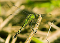
Dragons Fly?by tngrndreamComment: ==Trading Post==
This is a good "opportunity" shot, and I like the blurred background. It is a bit of a problem, though, that the background color is SO similar to the dragonfly coloring. Makes for a lot of green, which is good for the challenge, but takes away from the impact due to the loss of "color contrast."
Keep shooting! |
| Photographer found comment helpful. |
| 06/15/2006 10:01:18 AM |
Persian Pedistal at Duskby chaliceComment: ==Trading Post==
This feels rather "plain", but that could also be defined as "empty". Using something with more color, as opposed to creating a monochrome look, would probably have been worth a half point or more. It almost has a color cast to it, but I don't THINK it's a white balance thing. Just a low contrast pic. More contrast, from lighting, color, and post processing, would have helped, IMHO. :) Keep shooting! |
| Photographer found comment helpful. |
| 06/15/2006 09:56:28 AM |
Rebridgedby MelethiaComment: ==Trading Post==
It does look processed, and it does look soft, but I LOVE this use of Gothic glow. It makes for a foggy look, to me, which is nice when combined with a river and a bridge. I also like the green that results. This is a great improvement, IMHO, over the original, but it's so different that it doesn't seem anything like it. Well done. |
| Photographer found comment helpful. |
| 06/15/2006 09:53:47 AM |
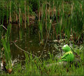
Maybe it is easy being green.by timfythetooComment: ==Trading Post==
I would have liked this better if Kermit had been in tan grass instead of so much green. He's not hard to find, but some color contrast would have really made him "pop".
Love the Kermits :) |
| Photographer found comment helpful. |
| 06/15/2006 09:52:24 AM |
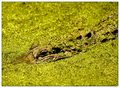
Don't Feed the Gatorsby ericwooComment: ==Trading Post==
It's definitely green :) It does look like you had to manipulate it to achieve this level of green. I like the diagonal, but the blurry "background" bothers me, pulling my eye away from the gator. |
| Photographer found comment helpful. |
| 06/15/2006 07:25:05 AM |
|
| Photographer found comment helpful. |
| 06/10/2006 07:41:56 AM |
|
| Photographer found comment helpful. |
| 06/10/2006 07:41:16 AM |
|
| Photographer found comment helpful. |
Home -
Challenges -
Community -
League -
Photos -
Cameras -
Lenses -
Learn -
Help -
Terms of Use -
Privacy -
Top ^
DPChallenge, and website content and design, Copyright © 2001-2026 Challenging Technologies, LLC.
All digital photo copyrights belong to the photographers and may not be used without permission.
Current Server Time: 07/23/2026 01:40:04 AM EDT.