| Image |
Comment |
| 11/01/2004 01:11:41 AM |
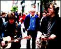
My Buddyby debitiptonComment: i like the way you cleaned this up. beautiful eyelashes. good luck! |
 Photographer found comment helpful. Photographer found comment helpful. |
| 11/01/2004 12:45:54 AM |
|
| Photographer found comment helpful. |
| 10/29/2004 05:43:41 PM |
No substitute for the real thing.by afarlandComment: hope you don't mind, but i have some free time and thought i start making comments on randomly selected images...
i gave this shot a 6 because i thought it was technically proficient, on topic, and i liked the composition. you also scored high with the commenters; the problem is, obviously, you didn't get enough comments (that seems to be my biggest problem, as well). maybe it could have been a little sharper. and maybe it might have benefited from shooting straight on, rather than from an angle, with the blue book positioned more towards the left hand corner. hard to say. sometimes all you can do is scratch your head and move on to the next challenge. good luck, and keep on shooting! |
| 10/29/2004 05:35:25 PM |
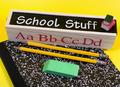
School Stuffby webkingComment: hope you don't mind, but i have some free time and thought i start making comments on randomly selected images...
i took a quick look at your other shots, and what i would say here fits with most of them as well. all of your shots exhibit technical proficiency in that they are well-lit and focused. they also have more of a dead-on, documentary feel than images that inspire 'wow'. my scores for your shots have ranged from 4 (here) to 7 (parts). my suggestion to you is to take advantage of the digital equipment and shoot from as many different angles and settings as possible until you hit something that blows you away. i think you're just a spark away from ribboning. keep shooting! |
| 10/29/2004 05:21:16 PM |
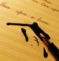
once upon a timeby carlosmfernandesComment: hope you don't mind, but i have some free time and thought i start making comments on randomly selected images...
i gave this a 6. i found it technically ok and on topic. what could make it better? two things come to mind. probably some more interesting verbiage that would grab the reader's attention, then make them wish for more once they got to the ink splotch. another would be shooting from a slightly lower angle that would show more of the page. the colors, lighting, and lines are nice. |
| Photographer found comment helpful. |
| 10/29/2004 01:23:05 PM |
|
| Photographer found comment helpful. |
| 10/29/2004 01:20:36 PM |
A Growing Bandby KeysComment: while i get your idea, and understand the plight of a new band, this image would probably have been more effective in the music challenge than in representing what poverty means to you (at least in terms of what you want to convey to the viewing audience...). as far as the image goes, it does have a certain vitality to it, but i would either include all of the orange dude, or crop him out completely. also, the red object to the left is a distraction. keep in mind, this is a challenge site, and images where all the elements tie together will score higher. |
| Photographer found comment helpful. |
| 10/29/2004 01:15:25 PM |
"Lack of"by nruterComment: i get your idea, but the lighting is washing out the details on the coin. it also looks like the lighting on your shooting surface is uneven. |
| Photographer found comment helpful. |
| 10/29/2004 01:13:57 PM |
EMPTY AND DARKby maney3Comment: while i get the idea, the execution could use a little help. sharper focus and backing off just a hair might help. |
| 10/29/2004 12:07:02 PM |
Skid Rowby flip89Comment: i wonder if you caught the irony of your shot, that you are looking down... |
Home -
Challenges -
Community -
League -
Photos -
Cameras -
Lenses -
Learn -
Help -
Terms of Use -
Privacy -
Top ^
DPChallenge, and website content and design, Copyright © 2001-2026 Challenging Technologies, LLC.
All digital photo copyrights belong to the photographers and may not be used without permission.
Current Server Time: 06/19/2026 11:55:30 PM EDT.