| Author | Thread |
Comments Made During the Challenge  |
|
|
11/02/2004 01:47:32 PM |
|
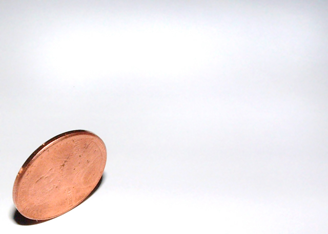
Too much light on the penny, and not enough detail. Like the concept and title. |
|
 Photographer found comment helpful. Photographer found comment helpful. |
|
|
10/31/2004 03:30:37 PM |
|
| Photographer found comment helpful. |
|
|
10/30/2004 08:33:14 PM |
|
I would have liked to have seen more detail on the penny, but this is a great idea, and well executed. |
|
| Photographer found comment helpful. |
|
|
10/30/2004 08:28:01 AM |
|
I like the use of empty space - makes a good composition. I wish the detail on the coin was a bit sharper, but that might be because the coin is old and hasn't got much detail left of course. Good image. |
|
| Photographer found comment helpful. |
|
|
10/29/2004 01:15:25 PM |
|
i get your idea, but the lighting is washing out the details on the coin. it also looks like the lighting on your shooting surface is uneven. |
|
| Photographer found comment helpful. |
|
|
10/29/2004 12:37:31 PM |
|
would like to see it done with lighting from lower left...to give more detail to the coin face and cast a longer shadow across the area....good contrast |
|
| Photographer found comment helpful. |
|
|
10/29/2004 11:34:46 AM |
|
Idea is surely good... just you could use the lights and angle more for your best. It would look more interesting if i could see whats on coin. |
|
| Photographer found comment helpful. |
|
|
10/29/2004 07:43:31 AM |
|
|
|
10/27/2004 05:52:12 PM |
|
good idea and well thought out. |
|
| Photographer found comment helpful. |
|
|
10/27/2004 08:11:23 AM |
|
some contrast in the face of the coin would have made it a much better photo. |
|
| Photographer found comment helpful. |
|
|
10/27/2004 03:59:54 AM |
|
Very interesting composition. I like the simplicity of the message and shot. |
|
| Photographer found comment helpful. |
|
|
10/27/2004 12:57:02 AM |
|
I would like to see more of the penny's detail, but otherwise, a very nice shot. |
|
| Photographer found comment helpful. |
Home -
Challenges -
Community -
League -
Photos -
Cameras -
Lenses -
Learn -
Help -
Terms of Use -
Privacy -
Top ^
DPChallenge, and website content and design, Copyright © 2001-2026 Challenging Technologies, LLC.
All digital photo copyrights belong to the photographers and may not be used without permission.
Current Server Time: 06/30/2026 11:16:51 AM EDT.