| Image |
Comment |
| 08/11/2006 10:02:02 AM |
Out of the Gate (scratch #9)by VinceDossComment: excellent opportunity, but not quite there. the horizon is tilted without adding anything to the image. it's a bit dark (maybe try the shadow/highlights filter), and it is relatively soft. you might have gotten better dpc results had you focused in tightly on one or two of the horses as they came by you. |
 Photographer found comment helpful. Photographer found comment helpful. |
| 08/11/2006 10:00:05 AM |
|
| 08/11/2006 09:59:45 AM |
|
| Photographer found comment helpful. |
| 08/11/2006 09:58:43 AM |
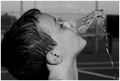
Cooling Offby L1Comment: nice, solid piece of work. might have been better to have been able to see more of his face. |
| Photographer found comment helpful. |
| 08/11/2006 09:57:24 AM |
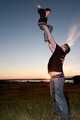
Catch the kid!by russiComment: nice idea, but the position of the sun really takes away from the image. some images, like a nice landscape or sunset, do not always need a strong subject. however, most images DO need a strong subject, where the essence of the image is conveyed instantly. here, your subject is competing with it's background. it's a nice idea, just poorly executed. i imagine this would make a fantastic photo, if you had been between the man and the sun, with the man's back to you. then, without using the flash, you would have had the sunlight in the boy's joyous face--and that would have been good for at least another point or two... |
| Photographer found comment helpful. |
| 08/11/2006 09:57:21 AM |
Frosen Fireby GunnsiComment: nice idea, but not really frozen enough or interesting enough. |
| Photographer found comment helpful. |
| 08/11/2006 09:57:18 AM |
A Little Tuneby macrothingComment: this is nice enough, but doesn't really strike me as spectacular. some subjects are just hard to shoot in such a way as make them really wow ya. |
| Photographer found comment helpful. |
| 08/11/2006 09:57:15 AM |
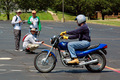
The Testby fatLouieComment: yes, you've stopped motion, but it's not really that dramatic. this comes off looking more like a documentary snapshot for a county driver's ed website. from a different perspective, without such a busy/distracting background, you might could have gotten something much more dramatic. |
| Photographer found comment helpful. |
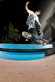
| 08/11/2006 09:55:58 AM |
Kickflip Nosegrindby hstegComment: cool shot, just wish you had framed it a bit tighter. all that foreground doesn't really do anything. also looks like it could have been just a bit sharper. |
| Photographer found comment helpful. |
| 08/11/2006 09:55:05 AM |
I have a feeling about this next oneby Elvis_LComment: nice idea, but needs work. the horizon is tilted without adding anything to the image. it could be a lot sharrper. and, the coloration is just on the edge where you should have gone just a bit further, taking it more to that 60s look, or where you should have pulled back to what is a little more realistic. |
| Photographer found comment helpful. |
Home -
Challenges -
Community -
League -
Photos -
Cameras -
Lenses -
Learn -
Help -
Terms of Use -
Privacy -
Top ^
DPChallenge, and website content and design, Copyright © 2001-2026 Challenging Technologies, LLC.
All digital photo copyrights belong to the photographers and may not be used without permission.
Current Server Time: 06/24/2026 02:11:57 PM EDT.