| Image |
Comment |
| 07/17/2002 09:38:00 AM |
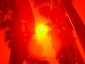
Summer Heatby djbdjComment: This may be a great shot, but if so, it's over my head. (Which is not your fault of course) The first thing that popped into my mind when I saw it was "too intense". I can't make out what the two poles in the foreground are (stop sign on left? Another sign on the right?) but I understand that you may not have MEANT for me to see them clearly. But it all went over my head I'm afraid. |
| 07/17/2002 09:31:00 AM |
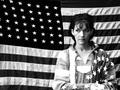
Indivisibleby connieComment: Would hang this on my wall in a heartbeat! My wife was a little upset that you used a flag that left out Hawaii, but she'll get over it :) |
 Photographer found comment helpful. Photographer found comment helpful. |
| 07/17/2002 09:41:00 AM |
Get in Your Corner!by CreativeFlyPhotoComment: Looks a little snapshotish... From what I can see the audiance looks like a real interesting subject. Maybe if you go to another of whatever this is, you should try shooting the folks around you that are watching. |
| Photographer found comment helpful. |
| 07/15/2002 03:02:00 AM |
|
| 07/16/2002 12:11:00 AM |
Grifoby AlemmsanComment: The timestamp doesn't really help this shot. The rest of the shot is kind of dark with flat colors. If that was your intent, you hit it on the money, but it doesn't work for me. |
| 07/15/2002 03:05:00 AM |
Bottle Rocketby Frank BeckmanComment: Umm, you should have titled this "Kids! DON'T try this at home!!!" Great shot, hope you're alright. |
| 07/18/2002 02:05:00 AM |
American Prideby AquaGoddess12880Comment: nice concept, but there are a couple of problems with it. At least from my point of view. The lower right flag on the floor shows the white (plastic bag?) thing you used to set up with. The focus could have been sharper (I know focus is a matter of taste, but a flag shot usually lives and dies on 'sharp') and the flag would likely have looked better if the 'bend' in it wasn't there... Maybe some starch? This would be an interesting shot to try to reshoot. It has real potential. One last thing... If you could find a way to cover the white strip in the center with something red, white and blue, I think it would help a lot. Qyl 5 |
| 07/18/2002 01:46:00 AM |
Nicholasby basia03Comment: Nice perceptive. Seems a little 'Low Res"... Was this a crop from a much larger shot? The color of the shirt is great, but the logo keeps stealing my eyes away. Kind of distracting. Great model! Very photogenic :) |
| Photographer found comment helpful. |
| 07/18/2002 01:42:00 AM |
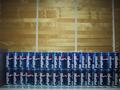
Addicted to Pepsi?by snergurComment: This didn't inspire me much either way... Technically, I think a closer crop that excluded the space on the right and left of the cans. The blinds are kind of interesting, but there's too much of it for my taste. |
| 07/20/2002 10:36:00 PM |
Steam Powerby jmsetzlerComment: Sorry, this shot doesn't meet the challenge. I don't see any Free and there is no Study at all :) ~ Just kidding ~ Great shot! a solid 10 :) |
Home -
Challenges -
Community -
League -
Photos -
Cameras -
Lenses -
Learn -
Help -
Terms of Use -
Privacy -
Top ^
DPChallenge, and website content and design, Copyright © 2001-2026 Challenging Technologies, LLC.
All digital photo copyrights belong to the photographers and may not be used without permission.
Current Server Time: 06/21/2026 09:24:27 PM EDT.