| Image |
Comment |
| 08/21/2002 02:55:00 PM |
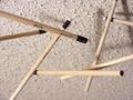
Pureby PatellaComment: Is this and UP shot or a DOWN shot, I really can't tell.....I also tried to get some floating pencils this week but gave up after 6 hours or so. Well done except for the out of focus background in the lower right corner and the flash on a few of the pencils....Just a personal opinion....not a criticism. This is very eye appealing...=7 syamjonimi ;'-D |
 Photographer found comment helpful. Photographer found comment helpful. |
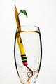
| 08/21/2002 02:22:00 PM |
Disappearing Actby mciComment: =7 and I hope you will share how you did this in a tutorial. I am going to make a guess and say you did an overlay and then took the photo. I find thelighting and distortion on the pencil to be a little distracting and a bit grainy. It is really a good analogy of what is happening to our money these days....syamjonimi ;'-D |
| 08/23/2002 11:00:00 PM |
|
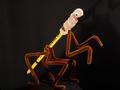
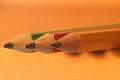
| 08/19/2002 01:37:00 AM |
Form Precludes Functionby sjgleahComment: Interesting conception.With a different background I would have scored this higher. The wood grain reminds me of school though....=7syamjonimi |
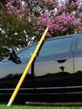
| 08/20/2002 01:16:00 AM |
Walking Stickby darylbrownComment: Many of the entries this challenge are just so darn funny. Intelligence, dexterity, imagination and humor....all in one singel entry. And a dran impressive photograph too!!! The only improvement i can see would maybe be cropping and ROT's. =8 syamjonimi ;-D |
| 08/24/2002 10:34:00 PM |
Ticonderoga Cutting by mcmurmaComment: Does this work for growning new pencil trees? Interesting idea and a good shot without getting a bunch of reflection from the water and glass. It actually looks as if the roots are growing from the eraser. White on white is good. My only problem is that you don't get pencils from Ivy. It doesn't detract from the quality of the photo at all. My first impression wasn't great and I am ashamed to tell you where I first scored your photo. Rest assurred that is being remedied at this moment. =9 syamjonimi ;'-D |
| Photographer found comment helpful. |
| 08/20/2002 12:56:00 AM |
Find the Pencilby #1 Bronco FanComment: This would have worked much better with a stark black, red, or white background. Pretty innovative though. Good idea. |
| Photographer found comment helpful. |
| 08/19/2002 01:54:00 PM |
threeby FranziskaLangComment: I love the rich colors and complimentary DOF and background. Aug 19, 9:45pm PST - upgraded from =8 to =9 syamjonimi |
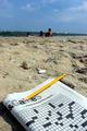
| 08/21/2002 02:08:00 PM |
17 across.... BEACHby karen_vComment: I can't find 17 across..... when I count it out 17 begins in the middle of a word, so, at best it would have to be 17 down. This is a pleasant concept for the pencil challenge. The picture has a nice warm comfortable feeling. I think I would score it higher if it was cropped closer to the sea shells and leave the horizon and people out. The background get so out of focus that it draws my eye up instead of keeping it focused on the challenge topic. |
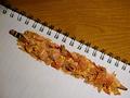
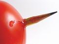
| 08/25/2002 08:17:00 AM |
Pencil Holderby normwComment: Seems this photo could almost be called "Birth" or "Vicious Intruder." I personally prefer something without the challenge topic in the title. This is a very colorful photo. How you came up with this idea just stumps me totally. (Not that I think it's a bad idea, just the opposite.) The two things that are distracting me are - The softened edges of the red tomato and the blown highlight on the tomato . To me, soft edge needs to be crisp and sharp and softening the lighting glare on the tomato would make it lok rounder and fuller and more luscious. |
Home -
Challenges -
Community -
League -
Photos -
Cameras -
Lenses -
Learn -
Help -
Terms of Use -
Privacy -
Top ^
DPChallenge, and website content and design, Copyright © 2001-2026 Challenging Technologies, LLC.
All digital photo copyrights belong to the photographers and may not be used without permission.
Current Server Time: 07/16/2026 05:04:50 AM EDT.