| Image |
Comment |
| 07/17/2002 12:31:00 AM |
Purple Heartby karen_vComment: The lighting on this shot really detracts from its effectiveness. The shadows and darks spots are very distracting. I'd also like to see the colors a little bolder and more saturated. |
| 07/15/2002 05:08:00 PM |
Panache by KarenBComment: The composition of this shot is really wonderful. I think if the grass were as bold and bright as her dress is, I'd give this one a 10. You might want to play with the levels/saturation on this shot. |
 Photographer found comment helpful. Photographer found comment helpful. |
| 07/21/2002 11:25:00 PM |
A Summer Day in Kentuckyby lecalanComment: Your colors are beautiful in the image. I'd like to see it centered better. Did you shoot this from any other angles? |
| 07/21/2002 11:52:00 PM |
Y2K compatibleby drealmerComment: I think this image would be more exciting with more noticable highlights on the record -- a little more light or maybe a longer exposure. |
| 07/21/2002 11:18:00 PM |
No matter how ugly...it's still Mama.by rkymtndreamComment: I love the hippos, and I think the idea is great -- the two things that stick out that I don't like are the overall brightness of the image (it seems overexposed to me) and the framing (both subject have no real grounding point in the image, as they fade off into their corners). |
| 07/21/2002 11:16:00 PM |
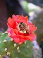
Breakfastby amnonComment: The photo subject itself is very overdone, but you've done a very nice job of presenting it. Very nice detail and colors on the cactus. |
| 07/17/2002 12:39:00 AM |
|
| 07/21/2002 11:53:00 PM |
Barrierby tommccabeComment: I love the idea, but I hate that the ocean and sky are all the way at the bottom. I'd like to see them little higher. Maybe the fence line and the ocean could break the image into thirds!! |
| 07/17/2002 12:38:00 AM |
Workoutby NitenComment: It surprises me that I like this shot so much. It's so complex, yet so organized. Simple shapes, simple lines -- all forming an intriquite design. Great tones as well. Very nice photogrpah. |
| Photographer found comment helpful. |
| 07/15/2002 12:39:00 PM |
Cameliasby andrewmComment: I like the lighting you've used here. I think the jar at the bottom is distracting, though -- maybe cover it with black cloth? |
Home -
Challenges -
Community -
League -
Photos -
Cameras -
Lenses -
Learn -
Help -
Terms of Use -
Privacy -
Top ^
DPChallenge, and website content and design, Copyright © 2001-2026 Challenging Technologies, LLC.
All digital photo copyrights belong to the photographers and may not be used without permission.
Current Server Time: 07/17/2026 01:33:15 PM EDT.