| Image |
Comment |
| 06/22/2006 12:38:08 AM |
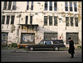
Forsakenby muur88Comment: Wow, I can only imagine at the circumstances that lent themselves to this shot, but I find it a very thought provoking and stimulating image. I feel very drawn into the photo and my imagination racing about the story behind it. I like that trait in a shot very much. Good sound composition also. Nice job, I like it! |
 Photographer found comment helpful. Photographer found comment helpful. |
| 06/22/2006 12:30:23 AM |
Untitled by TejComment: For some reason this image makes me think of the end of the book of Jonah, from the Old Testament. Cool shot. |
| Photographer found comment helpful. |
| 06/21/2006 03:59:51 AM |
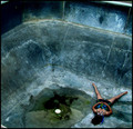
The Desolate Swimmerby ShermyComment: An interesting, creative concept, and a quirky composition. I like it though. It's unique. Nice job :-) |
| Photographer found comment helpful. |
| 06/21/2006 03:55:54 AM |
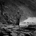
Aloneby HrutsenComment: Very nice job with the processing. Great tonal range. You've made the centered comp work well, but I wonder if off centered could be even stronger in this case? |
| Photographer found comment helpful. |
| 06/21/2006 03:53:42 AM |
|
| Photographer found comment helpful. |
| 06/21/2006 03:49:50 AM |
Barrenby annahComment: Very sound composition. Great processing. Image just looks really good. Nice technicals. Awesome location. Nice job! |
| Photographer found comment helpful. |
| 06/21/2006 03:38:31 AM |
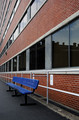
Empty Benchby TonyTComment: Wow, great use of leading lines and repetition here. The blue bench really stands out well, and placed very nice within the composition. Good job. |
| Photographer found comment helpful. |
| 06/21/2006 03:35:45 AM |
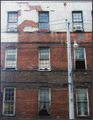
Sad Windowsby Rae-AnnComment: Seems like an interesting choice of subject that works for the challenge. There appears to be focus issues though. If not already using one, a tripod could make a big difference, especially if the lighting conditions cause slower shutter speed. Or even any solid surface to shoot from. Even placing a bean bag on the ground or something like that. Also, the exposure seems a little hot in the upper left area. |
| Photographer found comment helpful. |
| 06/21/2006 03:27:25 AM |
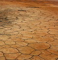
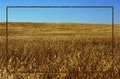
Amber Waves of Grainby DelRioPhotoComment: Normally, borders aren't really a big deal to me. A good one on the right image, can really enhance the presentation sometimes. Other than that, they are just there. Fine. But in this case, the black border thing I feel is detrimental to this photo. It just doesn't seem to have any purpose, and is just really strongly drawing attention to it, and away from the photo. |
| Photographer found comment helpful. |
| 06/21/2006 03:19:22 AM |
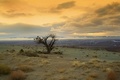
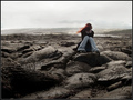
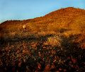
Nowhereby thegrandwazooComment: This is a good idea, and a great location. Technically is pretty good. I think the person doesn't stand out very strongly, especially with the color of the umbrella, kind of blends in with the surrounding area, in fact, I almost missed it. Perhaps placing the subject somewhere else in the composition could be stronger? Possibilities I see- lower in the frame, where the dark rocks are, the lighter colored umbrella would contrast with the darker area more. Or up towards the upper right thirds intersection, where there is no brush, and a little redder. Or somewhere along the actual ridge, where they would stand out against the sky. Although the person is placed on the left thirds line, any of these other possibilities would also place them stronger on a thirds intersection. A cool concept, fits the challenge, but I feel if the person were more prominent, it could boost the score some. |
| Photographer found comment helpful. |
Home -
Challenges -
Community -
League -
Photos -
Cameras -
Lenses -
Learn -
Help -
Terms of Use -
Privacy -
Top ^
DPChallenge, and website content and design, Copyright © 2001-2026 Challenging Technologies, LLC.
All digital photo copyrights belong to the photographers and may not be used without permission.
Current Server Time: 07/24/2026 07:15:36 PM EDT.