| Image |
Comment |
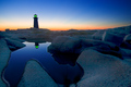
| 09/07/2006 01:25:54 AM |
Guiding Reflectionby BeagleboyComment: Very nice tones and deep colors.
Aside from a little halo clean-up in the water along the rocks, nothing else i could suggest to make this better. Well done! |
 Photographer found comment helpful. Photographer found comment helpful. |
| 09/07/2006 01:21:45 AM |
Distractedby angela6571Comment: I think a tighter crop would have made this a lot better with having a lot less forehead in it, thus placing the eye less dead-center.
Overall could use a white balance adjustment to render more realistic skin tones. |
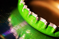
| 09/07/2006 01:19:35 AM |
Uncappedby moonwellComment: Certainly an explosion of color on my screen with this shot.
I really don't think I have ever seen a bottle cap quite like this before. |
| Photographer found comment helpful. |
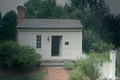
| 09/07/2006 01:17:53 AM |
Small Houseby photobytesComment: The upper portion of this image is lacking contrast and makes the overall appearance unbalanced in my opinion. The subject matter is pleasant and could use a little counter-clockwise rotation to level it. |
| 09/07/2006 01:15:03 AM |
Delicateby shamrockComment: Overall seems to be a bit lacking in detail and texture. Perhaps too much noise reduction? Could benefit from some sharpness in the central part of the flower to aid in the focal point. |
| Photographer found comment helpful. |
| 09/07/2006 01:13:04 AM |
Life Returns!by Delta_6Comment: A very unusual entry.
I can see the fit to the title, but overall isn't realy much here in clear focus, or sharp enough to show much detail. |
| Photographer found comment helpful. |
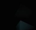
| 09/07/2006 01:10:05 AM |
Creepby NiteseadComment: I ask myself why.
Why would someone enter this?
Monitor so far off that it looked normal?
Trying for last place? I see 2 pyramids, one barely though, and the title doesn't seem to fit the image, or what little there is viewabale anyway.
I'm still asking myself why. Guess you get my brown ribbon vote. |
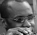
| 09/07/2006 12:55:53 AM |
Blues Riffby MacDonaldComment: Your crop/composition really works very well here.
Nice to see the image grain in a great black & white, when the trend seems to be smooth things over, even to the point of looking like plastic skin.
Only thing I could suggest would be having the crop in such a way as he is looking into the frame, rather than out of it, but then again it wouldn't have the smae feel. Nevermind ignore me, I'm a lunatic - lol
Well done! |
| Photographer found comment helpful. |
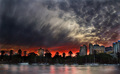
| 09/07/2006 12:52:59 AM |
Riverfireby MichaelCComment: Hard to know what to say other than Wow!
Looks like something out of Hollywood, for a movie like End of Days.
Only thing I kind of disliked was the lower corner vignette/darkened corners. |
| Photographer found comment helpful. |
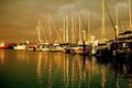
| 09/07/2006 12:50:18 AM |
Boat Harbour By Nightby coolblueComment: Composition-wise seems a bit busy, but that's just what it is.
Overall, the white balance and/or tones is not really appealing, and wasn't sure what to suggest, so I took it into Photoshop, adjusted the white balance and then dropped the levels and was a really big difference, especially in the sky. |
| Photographer found comment helpful. |
Home -
Challenges -
Community -
League -
Photos -
Cameras -
Lenses -
Learn -
Help -
Terms of Use -
Privacy -
Top ^
DPChallenge, and website content and design, Copyright © 2001-2026 Challenging Technologies, LLC.
All digital photo copyrights belong to the photographers and may not be used without permission.
Current Server Time: 06/21/2026 11:59:52 AM EDT.