|
|
| Image |
Comment |
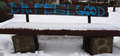
| 02/03/2010 09:21:11 PM | Dr. Feelgoodby Jon66Comment: Hi, Critique Club here...
By reading your comments you didn't expect much from this, and as it turns out,you were right.
I think what hurt this was the WOW factor. As you know, an image pretty much has to knock the collective voters socks off to score well and this one obviously didn't do that.
Now why?
Your colors are good, the images is reasonably sharp, you exposed well, the white snow is actually white and not a shade of gray like so many others.
So technical merit is not the problem.
I think it's composition, and maybe subject matter.
To me, the image is too linear and therefor very static which means not very interesting. Maybe the shot from an angle would be more exciting, but then maybe the graphic wouldn't show all that well, I don't know. Personally, I always try to shoot an object like this from a 3/4 angle and then experiment with how it might look at different elevations. I also think the crop is too tight which makes the bench see very constrained. I'm guessing the background was distracting so that's why your choice of cropping.
Maybe the voters didn't think this was a good representation of graffiti?
I hope my thoughts on this have been at least somewhat helpful. Message edited by author 2010-02-04 09:13:32. |
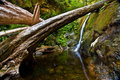
| 01/31/2010 01:38:28 PM | Forgotten by Timeby PhotoDaveComment: Greetings from the Critique Club...
Congrats on a good example of a long exposure shot. Very sharp, very well exposed and the colors are great.
I think what hurts the image IMO is the composition, even though many commenters spoke of how much they liked it. I think the busy left side distracts from a relatively small waterfall, which by your comments, is the subject of the image. I would suggest you play around with different crops. I moved the window around on my screen and found the waterfall to be much more the subject of interest when I cropped vertically and gotten rid of all the stuff on the left right up to where the top tree crosses over, and then a bit off the right, may an inch. That would have focused the attention on the waterfall as well as eliminated all the distracting stuff on the left while keeping the one tree that creates such a great leading line.
If I had voted in this challenge, I would have given this a 6 as is and an 8 with a different crop.
Hope this is somewhat helpful for another point of view. |  Photographer found comment helpful. Photographer found comment helpful. |
| 01/30/2010 09:39:10 PM | Miss Malayaby tjbel05Comment: Greetings from the Critique Club...
Boy, this is a really nice picture, tough to find constructive critiques. Keep in mind my comments are all merely suggestions and musings from my point of view.
I love the expression on her face! Who couldn't have happy feelings looking at this? The exposure is right on the money and the colors really pop.
I feel slightly disconnected from her and think it's because she is looking away. I think if she had the same expression but was looking at the camera, this would have scored a full point higher. Speaking of her eyes, they are really sharp, almost unnaturally so. To me, perhaps a bit over done probably because they contrast so much with the softened skin. I would have liked to have seen the crop a little different regarding the hands. In general, it is not good to bisect a joint or to cut off fingers and I think that hurts the image a little. Just a minor nit, since this is advanced editing, I think I would have toned down the bright spot above her head. You might have even cropped a little tighter on top.
Overall, I like this image and probably would have given it a 6 to 7 had I voted in the challenge.
Hopefully these comments are somewhat helpful to you.
| | Photographer found comment helpful. |
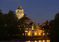
| 01/30/2010 06:07:36 PM | Müller'sches Volksbad, Munichby bjoernComment: Greetings from the Critique Club...
This is a lovely night shot architecture shot that still has a bit of twilight colored sky it it which really adds interest. I think it's sharp and interesting in terms of the building itself. I like the water in the shot for added interest.
As someone said below, there is a feeling of a slight list to the right, particularly the tower. I don't think those bushes on the left are doing you any favors, as they just block out too much of the building and because they are very dark, don't hold much interest themselves. I think they are the major element holding your score back. Since you took multiple images, I would have liked to have seen the yellow lights toned down a bit. They are so bright that they compel the eye to go there and not take the time to look around and see what other goodies are in the scene.
If I voted this challenge I would have voted a 5 or a 6.
I hope this is somewhat helpful. | | Photographer found comment helpful. |
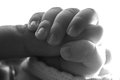
| 01/29/2010 11:50:09 PM | Tenuousby InsomniacComment: Hi, Critique Club here...
I like this image and the dirty nails don't bother me in the least ;) I like the DOF, I think it's just right. I also like the conversion to the soft sepia. I think the dynamic color range of the hands themselves is right on the money except for the right side (see below).
The only two criticisms I have are that I think it's a bit hot on the right side which causes the eyes to move off to that part of the image. Not what you want. The other thing is it's a bit linear so not very compelling to look at for very long, at least for me. I wonder if a bit of a diagonal rotation might have added more interest and popped this over the edge into the 6's. Being REALLY nit-picky, there is something shiny in the lower left that I wish wasn't there. A ring maybe? Its just a bit of clutter with a beacon on it that calls for me to look at it.
I think this was a good choice for this challenge but it may have suffered score-wise because it's not a new look at the subject matter for people here. I didn't vote in this challenge but would have given this a six if I had.
Hope this is at least somewhat helpful. | | Photographer found comment helpful. |
| 01/29/2010 11:34:25 PM | Often, the unaffected face disguises susceptible soul.by TabbyComment: Hi, Critique Club here.
I like a lot of things about this image. I like the placement of the hand and pills; I like the slightly out of focus face and I really like the blank stare in her eyes. I think the slightly edgy color adds to the mood. I like the diagonal of her hand that takes the viewer from the brightly color pills to her face.
I think I might have cropped a little tighter on the right and get rid of the pill, I'm a bit distracted by that, a nit though. I think the hand is just a little too large here, maybe if you'd backed up and used a longer lens it would have compressed the image a bit. Not to say it's wrong as is because there is artistic merit to it the way it is as well. I agree with the commenter regarding the expression and think I would have rather seen the mouth expressionless like the eyes.
I didn't vote in this challenge, but would have given this an eight.
I think this was voted down for reasons other than the quality of the image. I think many didn't connect it to the challenge, and many do not like this subject matter - I've seen it happen before.
I hope this is somewhat helpful. | | Photographer found comment helpful. |
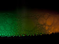
| 01/29/2010 11:19:18 PM | Bubblesby JToddHigginsComment: Hi, Critique Club here...
This is a difficult image to critique because it is kind of an abstract and is so subjective by nature.
But here goes.
First what I like:
I think the texture on the green side is very cool, almost reptilian with the varied shapes of the bubbles. It's sharp and the color really pops. I rather like the transition to orange as well. I like the linear line with reservations (see below)
What I'm not so keen on:
I find myself distracted by the out of focus bubbles along the bottom edge as well as the out of focus right side. I find myself wishing the lower edge of the bubbles was more of a strait line, but once again, purely a taste thing. I'm not particularly keen on all the darkness at the top and bottom and think the image should be cropped tighter - top, bottom, and from the right side. As is, there really isn't a place for my eye to focus, it's kind of all over the place. I might play with the diagonal idea that one commenter pointed out, that might make a more dynamic presentation.
I hope this is somewhat helpful.
|
| 01/13/2010 05:47:26 PM | | | Photographer found comment helpful. |
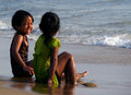
| 01/08/2010 01:21:17 AM | Best friends by mani_samvaComment: Great shot and very deserving of a ribbon. For the life of me I don't get the voters in this place. How could this image have possibly gotten 9 votes of three or less? Stupid!
Regarding one of the comments - people, calibrate your monitors, please. | | Photographer found comment helpful. |
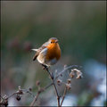
| 01/04/2010 12:18:40 AM | The Robinby MAKComment: This was one of my favorite images but I wish it wasn't so centered. | | Photographer found comment helpful. |
Home -
Challenges -
Community -
League -
Photos -
Cameras -
Lenses -
Learn -
Help -
Terms of Use -
Privacy -
Top ^
DPChallenge, and website content and design, Copyright © 2001-2026 Challenging Technologies, LLC.
All digital photo copyrights belong to the photographers and may not be used without permission.
Current Server Time: 07/18/2026 03:43:50 AM EDT.
|