DPChallenge: A Digital Photography Contest You are not logged in. (log in or register
 
Challenge Entries
Portfolio Images
This image is not part of a public portfolio.
Dr. Feelgood
Dr. Feelgood
Jon66


Photograph Information Photographer's Comments
Challenge: Graffiti (Basic Editing)
Camera: Olympus E-420
Lens: Olympus 14-42mm f/3.5-5.6
Location: Stanley Park, Ottawa
Date: Jan 26, 2010
Aperture: f/10
ISO: 100
Shutter: 1/60
Galleries: Cityscape, Urban
Date Uploaded: Jan 26, 2010

I saw this park bench on a friend's facebook page and i thought it would be a good entry for this challenge. Unfortunately it didn't come out as well as i hoped, so im entering just to get feedback. I'm not really expecting to get a high ranking.

Statistics
Place: 112 out of 128
Avg (all users): 4.5072
Avg (commenters): 4.5000
Avg (participants): 3.9412
Avg (non-participants): 4.6923
Views since voting: 692
Views during voting: 326
Votes: 207
Comments: 3
Favorites: 0


Please log in or register to add your comments!

AuthorThread
02/03/2010 09:21:11 PM
Hi, Critique Club here...

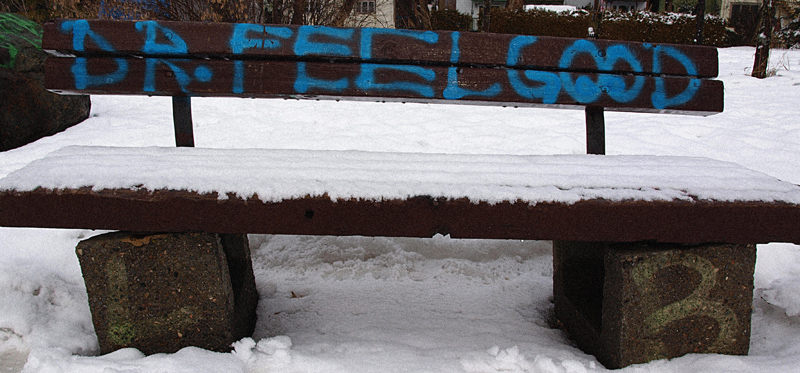
By reading your comments you didn't expect much from this, and as it turns out,you were right.

I think what hurt this was the WOW factor. As you know, an image pretty much has to knock the collective voters socks off to score well and this one obviously didn't do that.

Now why?

Your colors are good, the images is reasonably sharp, you exposed well, the white snow is actually white and not a shade of gray like so many others.

So technical merit is not the problem.

I think it's composition, and maybe subject matter.

To me, the image is too linear and therefor very static which means not very interesting. Maybe the shot from an angle would be more exciting, but then maybe the graphic wouldn't show all that well, I don't know. Personally, I always try to shoot an object like this from a 3/4 angle and then experiment with how it might look at different elevations. I also think the crop is too tight which makes the bench see very constrained. I'm guessing the background was distracting so that's why your choice of cropping.

Maybe the voters didn't think this was a good representation of graffiti?

I hope my thoughts on this have been at least somewhat helpful.

Message edited by author 2010-02-04 09:13:32.
 Comments Made During the Challenge
01/30/2010 10:33:37 AM
Nicely seen, nicely shown. (just what the doctor ordered).
01/30/2010 09:44:08 AM
A different angle or crop may have worked better here and I think blurring the background would also help to isolate the bench.


Home - Challenges - Community - League - Photos - Cameras - Lenses - Learn - Prints! - Help - Terms of Use - Privacy - Top ^
DPChallenge, and website content and design, Copyright © 2001-2024 Challenging Technologies, LLC.
All digital photo copyrights belong to the photographers and may not be used without permission.
Current Server Time: 03/29/2024 01:20:46 AM EDT.