| Image |
Comment |
| 05/09/2004 01:02:36 PM |
|
 Photographer found comment helpful. Photographer found comment helpful. |
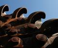
| 05/09/2004 01:00:53 PM |
Still Hangin Onby jen1979Comment: Less of the real light area at the top and less of the out of focus link in the foreground might draw the eye quicker to the nice detail in the center. |
| Photographer found comment helpful. |
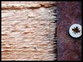
| 05/09/2004 12:55:28 PM |
Screw!by zeus68Comment: Possibly a vertical orientation with less of the lighter area would give more emphasis to the rust color and texture on the right. |
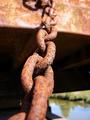
| 05/09/2004 12:47:58 PM |
Bloody Tubeby carodaniComment: Composition might be more effective with the central object less centered. Vertical orientation might strengthen it also. |
| Photographer found comment helpful. |
| 05/09/2004 12:44:45 PM |
Gold Plated Rustby highpriceComment: No real strong focal point. The "flat" area in the lower right of the photo takes away from the stronger areas of contrast and texture higher up. |
| Photographer found comment helpful. |
| 05/09/2004 12:40:41 PM |
Oxi-diesby thelselComment: Your focus is nice and crisp on the liquid, however, there are some distracting reflections, especially the large one on the left part of the sign. It detracts from the strong elements of the rest of the photo. |
| Photographer found comment helpful. |
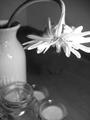
| 05/06/2004 12:26:17 PM |
Wilted Flowerby Dyl2007Comment: Maybe it's just me, but I don't really see how this incorporates the challenge theme. That said, the elements of composition, lighting and focus fall short. I think it would have been much more effective without the glass, etc. on lower left. With a darker background it would have had some impact. I wouldn't mind the white container being a little fuzzy since your flower is sharp. The jar, etc. are distracting. With a black background it might look quite nice. |
| 04/08/2003 12:27:47 PM |
|
| Photographer found comment helpful. |
| 04/08/2003 12:20:42 PM |
Capitol Tulipsby elemessComment: Nice, but the limbs and the dome at the top distract and seem to pull away from some otherwise good composition. The lower part of the building with the statue there would, perhaps, have served as an ample background. Otherwise very good. |
| Photographer found comment helpful. |
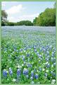
| 04/08/2003 12:16:21 PM |
Blues and Greensby GordonComment: Nice shot, but two things bother me a little about it. The blue flowers "flowing" toward the trees in the back are nice, but the sky "pulls" my eye up and out of the picture. It might have been more effective to crop out most of the sky. Also, I know borders are allowed, but I don't think the green of the border compliments the photo at all. Perhaps no border or a very dark green or black would be better. Just my opinion. |
Home -
Challenges -
Community -
League -
Photos -
Cameras -
Lenses -
Learn -
Help -
Terms of Use -
Privacy -
Top ^
DPChallenge, and website content and design, Copyright © 2001-2026 Challenging Technologies, LLC.
All digital photo copyrights belong to the photographers and may not be used without permission.
Current Server Time: 05/05/2026 07:52:35 PM EDT.