| Image |
Comment |
| 04/19/2006 12:47:14 AM |
|
 Photographer found comment helpful. Photographer found comment helpful. |
| 04/19/2006 12:43:33 AM |
|
| 04/19/2006 12:39:44 AM |
|
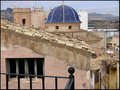
| 04/19/2006 12:35:53 AM |
Old townby imagine74Comment: Composition seems to have distacting elements with the railing in the front pulling away from the real subject of the photo. In my opinion, lines would be nice if it were cropped, leaving out the rail in the forground. Nice colors |
| Photographer found comment helpful. |
| 02/23/2006 10:53:06 PM |
Beetleby SimonkasprzakComment: There's white, arced shape on the left side of the background that is very distracting---I keep looking at it trying to figure out what it is. A different crop might eliminate that. Otherwise the duotone effect is nice and the photo is well composed. Try cropping it without that "white scratch thing". I suspect that it wouldn't lose anything composition-wise and enhance it considerably. |
| Photographer found comment helpful. |
| 02/23/2006 10:48:51 PM |
Warm Frostby pointandshootComment: I don't usually comment on titles, but the title here seems to contradict the effect the photo conveys. I didn't score you down on that, but thought it was worth mentioning. Composition is nice, but I'm not sure that the choice of duotone hues does the image the justice it deserves. |
| Photographer found comment helpful. |
| 02/23/2006 10:40:09 PM |
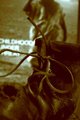
Right Foot Forward...Childhood Under Threatby h_sikkaComment: Duotone effect is ok, composition ok, but nothing seems to be in focus. Your subject has some potentially interesting textures, but that seems to be lost with the lack of focus on something. |
| Photographer found comment helpful. |
| 02/23/2006 10:29:30 PM |
The farm in the mistby alpharichComment: Duotone effect is nice. For me, the bush on the left dominates the composition of the photo too much and the bit of the bush on the right seems unnecessary. For me, it is distracting. If it was your intent to have the horizon sloping off to the right so much, with this wide view, then so be it. If it were me, I'd try to level up the horizon a bit. |
| Photographer found comment helpful. |
| 02/23/2006 07:41:17 PM |
Plant Shadowby greignerComment: Might have been more effective with less of the bright white area to the right. You might look at cropping it a bit to the right of the table, and appropriately at the top to maintain proportion and in such a way that the subject is not too centered. I like the duotone effect otherwise. Don't know about the frame. |
| 02/23/2006 07:07:40 PM |
Childhood Daysby JudiComment: Light area to right distracts from the subject, however the depth of field is nice and the photo is effective otherwise. |
| Photographer found comment helpful. |
Home -
Challenges -
Community -
League -
Photos -
Cameras -
Lenses -
Learn -
Help -
Terms of Use -
Privacy -
Top ^
DPChallenge, and website content and design, Copyright © 2001-2026 Challenging Technologies, LLC.
All digital photo copyrights belong to the photographers and may not be used without permission.
Current Server Time: 05/05/2026 08:44:15 AM EDT.