| Author | Thread |
Comments Made During the Challenge  |
|
|
02/28/2006 12:47:20 PM |
|
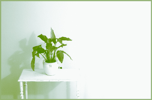
This appears to simply be a color photo, not a duotone. And the lighting is pretty harsh. |
|
|
|
02/28/2006 11:40:22 AM |
|
i like the color but could use more contrast IMO - it's a little washed out. |
|
|
|
02/27/2006 02:24:32 PM |
|
So light and airy...the tones work quite nicely for the subject at hand...well done. |
|
|
|
02/27/2006 12:58:15 PM |
|
It all seems too washed out, not sure if this was the effect you were going for but it doesn't do it for me. I think this was work much better if there was more tone in the leaves of the plant. |
|
|
|
02/23/2006 10:34:01 PM |
|
I know this will get blasted but I really like the funky tone and treatment of this image 9 |
|
|
|
02/23/2006 07:41:17 PM |
|
Might have been more effective with less of the bright white area to the right. You might look at cropping it a bit to the right of the table, and appropriately at the top to maintain proportion and in such a way that the subject is not too centered. I like the duotone effect otherwise. Don't know about the frame. |
|
|
|
02/23/2006 03:44:38 PM |
|
you lost some detail on the right side of the table it seems overexposed maybe |
|
|
|
02/23/2006 10:51:36 AM |
|
Simple composition, clean. I thinlk the right side of the frame is a little to bright. I do like your attention to the details of the shadows. |
|
|
|
02/22/2006 09:12:37 AM |
|
I really like this idea - darker leaves/shadow would have boosted the pop factor |
|
 Photographer found comment helpful. Photographer found comment helpful. |
|
|
02/22/2006 08:04:33 AM |
|
too much light on the right... detracts from the image on the left |
|
Home -
Challenges -
Community -
League -
Photos -
Cameras -
Lenses -
Learn -
Help -
Terms of Use -
Privacy -
Top ^
DPChallenge, and website content and design, Copyright © 2001-2026 Challenging Technologies, LLC.
All digital photo copyrights belong to the photographers and may not be used without permission.
Current Server Time: 06/29/2026 08:21:28 AM EDT.