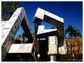
DPChallenge: A Digital Photography Contest You are not logged in. (log in or register
 
Browse Settings
Currently viewing:
Registered Usermycelium

Show comments:

Per page:

Order:

Comments:


Comments Made by mycelium
Pages:   ... [241] [242] [243] [244] [245] [246] [247] ... [372]
Showing 2431 - 2440 of ~3713
Image Comment
ShOe aRt
09/13/2005 12:51:34 AM
ShOe aRt
by senoj

Comment:
Greetings, Ms. Manson, from the Critique Club!

Based on your commentary, I can only guess that you were speaking somewhat tongue in cheek. I'm less sure if that means this entry was tongue in cheek. It finished pretty strongly in last place, which, if intentional, is a feat all its own--it's nearly as difficult to take a bottom-placing photo as a top-placing one!

I'm proceeding on the assumption that you're seriously interested in critique here. The shapes in the photo hold compositional promise, but of course you also have serious focus issues. Make sure your camera is in the macro setting (usually a small flower icon is visible on the LCD viewfinder) and if it was, try backing up a bit and then cropping the image. Of course, with any camera, there's only so much you can do, and sometimes ideas have to be thrown out because they're technically impossible.

Of course, if your profile picture is a self-portrait (as I'm guessing it is), then the whole preceding paragraph is probably largely useless to you, and I'm left wondering what your purpose was in submitting this!

I'm afraid I can't do more than I have here without knowing more--the contradiction between the evidently in-the-know sardonic commentary and the photography is too great for me to take in stride without more information.

Cheers!
Photographer found comment helpful.
Contrasting Colors
09/12/2005 04:21:24 PM
Contrasting Colors
by troberge

Comment:
wow, I have no idea why people missed the link to the challenge! I gave this a 7, and I don't hand out votes above 6 very often at all! I thought your inclusion of red, blue, green, and yellow was wonderful, and I thought that (despite the small size and fairly soft focus) people would recognize the merit of this picture. I can't believe all the 4's! Gah! It's a good picture anyway :)
Photographer found comment helpful.
Ecola Point View
09/12/2005 03:56:41 PM
Ecola Point View
by Mick

Comment:
this is an obscenely picturesque photo, and the high saturation works very well here. a wonderful piece of work I'm sure any photographer would be happy to have in their portfolio.
Photographer found comment helpful.
At the Flea Market
09/12/2005 01:40:51 PM
At the Flea Market
by fixedintime

Comment:
I like your choice of subject, and his expression. This picture however suffers heavily from compression artifacts-- at under 30KB you're using less than 20% of the available filespace! Try to compress your images as little as possible and get their filesize closer to 150KB.
Photographer found comment helpful.
Sandra
09/12/2005 01:38:18 PM
Sandra
by tfarrell23

Comment:
weird processing has made this look like a painting more than a photo, and her head looks like it has no body!
N O S T A L G I A
09/12/2005 01:37:42 PM
N O S T A L G I A
by librodo

Comment:
hi manny!
Photographer found comment helpful.
Innocence
09/12/2005 01:37:09 PM
Innocence
by Judi

Comment:
if I had to pick a single word to describe this photo, it wouldn't be "innocence" - she appears to be pouting more than being innocent.
Photographer found comment helpful.
Deconstruction (Falls)
09/12/2005 02:51:26 AM
Deconstruction (Falls)
by Rikki

Comment:
My first impression is that this picture did, indeed, get scored lower than it deserved. I think there's a perfectly good explanation why, which I'll take a shot at shortly--

The colors, especially in the sky, are good, and the rest of your color scheme (grey, brown, green) fits together well. The shapes are interesting, and there is good texture detail in the darker areas.

On the critical side, as some have noted, the kids stick out in this picture and distract from the architecture. As the kids are clearly not the purpose of the picture and they don't really add to it, they don't belong there. The highlights in this picture have suffered a lot of detail loss from either the glare of the sun or the post-processing, with the end result being areas of rather harsh brightness with little visual interest.

Now my shot at an explanation, and some suggestions thrown in with it--

I urge you to remember that votes are given one by one, and each person has to look at this photograph and give it a whole-number vote. This is admittedly woefully imprecise in many cases, but it's what we're stuck with. The most common votes are always 4, 5, and 6; roughly speaking, they stand for "bad, average, good." Voters give out more of these three numbers than anything else.

The bell curve of votes on this picture is skewed heavily towards 5, which is statistically interesting. If this were a more classically formed bell curve, a fair chunk of the 5 votes should be more or less equally distributed between 4 and 6. It will be useful to explore why the votes that one would probabilistically expect to fall on 4 and 6 instead fell on 5.

I'm going to imagine myself as a "typical voter," as much as I can do so. Okay, so I'm voting on the High Contrast entries, and yours comes up. I think, does it meet the challenge? Yes, sure does, plenty of contrast here, no doubt about it. Then: Does this photograph stand out to me? Sort of, the sky is better than most, but otherwise the picture is much like many others, and the bright spots are a little too bright.

Again, remember that most votes are in the 4 to 6 range. That your picture clearly meets the challenge and has a good sky kept most people from classing your photo "bad" (4), though its flaws also kept them from classing it "good" (6). Then the only remaining option is 5.

I bet if there were a 5.5 vote, you'd have gotten a lot of those. That would have been more reflective of its photographic merit, I think, but between the choice of 5 and 6, it looks like most would give it a 5.

My suggestion: keep this, the sociological background of DPC scores, in mind when you're choosing what to submit. Think about what it takes to get a voter to click "6" instead of "5." Look at the images that score close to 6, and see what's done differently there. Let me give you an example from my own recent work:


Note that the peak on my graph is at 6, with more 6's than one would statistically expect. I took this photo with the intent of getting exactly that effect--a lot of votes of 6--rather than trying to take a "10" photo. My thinking was that if I have strong colors and good lighting, a lot of people will see it as generically "good" and vote me above 5 even if they don't really like the photo.

I hope this is helpful :)
Photographer found comment helpful.
broom vendor
09/12/2005 12:14:37 AM
broom vendor1st Place
by whiteroom

Comment:
I am quite pleased and unsurprised to see this excellent photo on the front page. Highest congratulations.
Photographer found comment helpful.
I Got Lost.jpg
09/11/2005 11:35:13 PM
I Got Lost.jpg
by jellyoooo

Comment:
omg@! that's great
Photographer found comment helpful.
Pages:   ... [241] [242] [243] [244] [245] [246] [247] ... [372]
Showing 2431 - 2440 of ~3713


Home - Challenges - Community - League - Photos - Cameras - Lenses - Learn - Help - Terms of Use - Privacy - Top ^
DPChallenge, and website content and design, Copyright © 2001-2025 Challenging Technologies, LLC.
All digital photo copyrights belong to the photographers and may not be used without permission.
Current Server Time: 09/13/2025 09:30:59 PM EDT.