| Image |
Comment |
| 07/17/2006 04:58:17 PM |
|
 Photographer found comment helpful. Photographer found comment helpful. |
| 07/17/2006 04:57:45 PM |
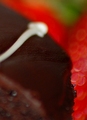
Obsessionby macrothingComment: my eye is drawn most to the light area of the picture (the white frosting), but it's all blurry... better control of the focus would lead to a stronger image. |
| Photographer found comment helpful. |
| 07/17/2006 04:50:14 PM |
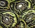
Kiwiby Faye PekasComment: zowie. those looks like they're made out of leather.
The pixellation patterns you have created are fascinating |
| Photographer found comment helpful. |
| 07/17/2006 04:47:56 PM |
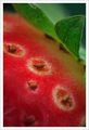
Strawberry Nipplesby JudiComment: great abstraction!
the colors and shapes are lovely. i have two suggestions that you can take or leave as you please:
- don't feel married to the 3x2 format of your camera. in this case, i think there's a bit at the top and a bit more at the bottom that could be cropped off. the seeds and the veins in the leaves are beautiful, but the top and bottom of the frame are nothing but blurred areas. possibly 5x7 or 4x3 would have suited you better.
- IMHO, the importance of capturing a full tonal range (in most cases) cannot be overstated. you have lovely gradients and lighting, but virtually no white. especially with a solid white border, the image itself winds up looking dark and underarticulated. for this picture, possibly some dodging on the light areas circling the seeds would have added a bit of welcome 'pop.'
good luck :) |
| Photographer found comment helpful. |
| 07/17/2006 04:42:05 PM |
Passing Lanesby pwm6Comment: I'm sorry, but I can't recognize this as food at all... it's an interesting image, but I have no idea what it is! |
| Photographer found comment helpful. |
| 07/17/2006 04:41:24 PM |
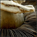
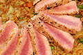
nature's rays by RikkiComment: great choice of subject for this challenge. the DOF and lighting are great. not sure how i feel about the overhanging chunk of stem. |
| Photographer found comment helpful. |
| 07/17/2006 04:40:30 PM |
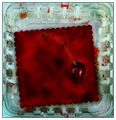
the last cherryby smccComment: very surreal, technically and conceptually strong, lovely colors - but not what i would call abstract. |
| Photographer found comment helpful. |
| 07/17/2006 04:39:04 PM |
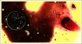
PRIMORDIAL SOUPby grainman9Comment: cool shapes and colors. contrast is a bit high for my tastes - pushes this away from photography toward graphic design. |
| 07/17/2006 04:37:54 PM |
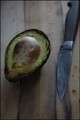
breakfastby latidaComment: i think this falls more in the category of 'still life' than 'abstract.' try to use a light source that will give you stronger contrast between highlight and shadow. this looks like it came from indirect windowlight - which is a great source of light, but placement, time of day, and nearby reflective surfaces all make a difference. |
| Photographer found comment helpful. |
| 07/17/2006 04:36:35 PM |
|
| Photographer found comment helpful. |
Home -
Challenges -
Community -
League -
Photos -
Cameras -
Lenses -
Learn -
Help -
Terms of Use -
Privacy -
Top ^
DPChallenge, and website content and design, Copyright © 2001-2026 Challenging Technologies, LLC.
All digital photo copyrights belong to the photographers and may not be used without permission.
Current Server Time: 05/09/2026 08:38:52 AM EDT.