| Image |
Comment |
| 09/18/2005 12:08:26 AM |
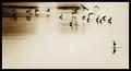
Who Took My Branch Away....! HELP!!!by JudiComment: Critique Club:
This is a very cute set-up with bright, cheerful colors. The little piece of green leaves is a nice touch.
While I do like the white background, the lighting seems a bit harsh or the levels/curves were overly adjusted. The hard shadows are a little distracting and could be softened a bit by moving your subjects farther away from the background.
The close crop on the right is effective in conveying the sense of urgency on the part of the bird to leave the scene.
I noticed the processing steps in your comments. I'm not sure if you've listed them in the order in which you performed the steps but if you did, I would suggest cropping and resizing before you sharpen. Sharpening should be the last step in processing.
Good luck in future challenges!
|
 Photographer found comment helpful. Photographer found comment helpful. |
| 09/17/2005 03:17:35 PM |
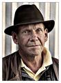
Roninby NazgulComment: outstanding shot! i love the muted colors and textured feel. perfect! even the background :P |
| Photographer found comment helpful. |
| 09/17/2005 03:06:54 PM |
|
| Photographer found comment helpful. |
| 09/17/2005 03:44:52 AM |
Taupo Duskby rayz1Comment: Critique Club:
This certainly is high contrast and I think it met the challenge topic very well. There are a couple of things you could work on to make photos such as this even better.
1. Pay close attention to your horizon. While it's hard to tell here how level the horizon is by looking at the tops of the trees, you can tell that it's slightly off by looking at the water line.
2. The sillhouette os the clump of grass/reeds is very nice but it's so close to the center of the pic that it's competing with the sunset for my attention. Composing the shot with the grass in the corner would still give you some nice foreground interest but wouldn't be in the way of your sunset.
The color banding in the sky is kinda hard to avoid given the small file size we have to work with so there is often nothing you can do about that.
All in all, a very nice shot. Good luck in future challenges! :) |
| Photographer found comment helpful. |
| 09/17/2005 12:46:06 AM |
|
| Photographer found comment helpful. |
| 09/15/2005 10:55:44 PM |
|
| Photographer found comment helpful. |
| 09/15/2005 02:34:28 AM |
|
| Photographer found comment helpful. |
| 09/14/2005 09:57:13 PM |
|
| 09/14/2005 12:38:48 AM |
Different Drummerby sherComment: Originally posted by Joey Lawrence:
sher rawks more than my rocking-chair grama on speed! |
go granny go!
lol...you're thilly :) |
| 09/13/2005 12:54:59 PM |
|
| Photographer found comment helpful. |
Home -
Challenges -
Community -
League -
Photos -
Cameras -
Lenses -
Learn -
Help -
Terms of Use -
Privacy -
Top ^
DPChallenge, and website content and design, Copyright © 2001-2026 Challenging Technologies, LLC.
All digital photo copyrights belong to the photographers and may not be used without permission.
Current Server Time: 07/24/2026 08:04:50 AM EDT.